Graphs
Edward Tufte has informed and inspired data practitioners for, literally, decades. A lot has been said about his forthright opinions on information design and one can draw a direct link between his work and the attention to detail many aspire to when they create visualizations for consumption.
His original triumph “The Visual Display of Quantitative Information” was self-published in 1983 after potential publishers wouldn’t grant the creative control Tufte required. It’s a stellar introduction to a meticulous craft, even with diminishing returns from his later books.
(Tufte is often referred to by his initials, ET. I can’t bring myself to do this as I can’t shake the image of the famous globular alien claiming credit as a lauded design professional)
This week I’m going to apply Tuftean thinking to what I see as a vital visualization and thought device – interactive network graphs.
The most viral ideas from Tufte are those with catchy titles like “data-ink ratios”, “lie factors” and “sparklines” – these are all valuable concepts but minimize the value of artistic license. To take a purely Tuftean view, creative license is unacceptable. All design decisions should be made in service of the data and scientific process. This is a noble aim but somewhat rigid.
I found the discussion in the latest edition of Data Stories to be extremely enlightening. Hosts Enrico Bertini and Moritz Stefaner are joined by guest Sandra Rendgen to discuss how Tufte’s work is a direct response to the informational reality of the late 20th century – one where historical data visualizations were compiled through extensive travel and painstaking curation of rare manuscripts, a far cry from the Google-powered hive mind of today. They also described a prevalence of underwhelming visuals found in newspapers and media limited by analogue typewriters and printing presses.
(As a mid-millenial referring to the 1980s as “late 20th century” chills my bones)
Interactive, immersive data visualization experiences are common today and stand in contrast to traditional, flat typesetting and printed materials. Tufte’s pithy description of “overview first, details on demand” is something we take for granted in most interactive data visualizations we see today.
“whatever evidence it takes to understand what is going on”
We don’t have to look too hard to find relevant material in Tufte’s work. The chapter “Links & Causal Arrows” in “Beautiful Evidence” is a goldmine for network thinking nuggets.
We’re very comfortable drawing circles or boxes around the nodes in our networks but is this really necessary? As Tufte notes “maps don’t put boxes around city names” – why not use the space taken up by the shapes to display extra information or draw attention to the content? I’ve used this to great effect by letting typography and the words themselves be the star players in a visualization – see my lyrics and typography pairing graphs for examples of this.
Leaning heavily on cartographic standards with a philosophical angle, Tufte goes to great lengths to discuss the core question posted by network graphs: “what exactly do the arrows mean?”
Ducking Graphs
A common suggestion from Tufte is to abolish any use of “chart junk,” that occlude data and distract from the point you’re trying to make. So what is network graph junk?
- It’s the widgets and gizmos you put on your nodes and links to highlight details of interest
- It’s that intrusive chart background that makes it harder to see the network context
- It includes, I’m afraid to say, 3D and pseudo-3D graph interfaces – at least those rendered on a 2D surface
- It’s also the whizzy animation that distracts or overwhelms the consumer of your visualization.
On the last point I advocate for extreme restraint for network animations. Ideally constrained to a few milliseconds – slow enough to allow the user to understand what’s changing but fast enough to get out of the way. There should also be a logical flow from a user interaction to an animation:
Find a node with a particular name -> grow and shrink it
Run a new layout -> animate nodes to position.
A strict reading of Tufte implies that the use of semi-decorative icons and symbols is inappropriate in network visualization. This ignores the need for visualizations to be memorable and attractive. There’s a hope that if you follow recommendations your graph will be attractively minimalist but I don’t think there’s an issue with some colors and icons.
Another famous term used for chart junk is that of The Duck – “When a graphic is taken over by decorative forms or computer debris.” The term brings to mind some of the infographics we discussed in source/target #33.
The biggest duck of them all in graphs is that of the hairball, an ornament of chaos that intends to impress rather than reveal.
ET Giveth and Taketh Away
One of my favorite takeaways from Tufte’s Qualitative Design was the idea of showing additional variables, not just by adding, but by removing ink from the page. The instrumental example is that of truncating grid lines to denote the range and median values in your data (find a good explanation of that here.) I had never considered this as an option!
A more extreme example in a network graph could be to completely forgo the display of links in a network and let the (now invisible) connections pull the network together. This places severe emphasis on the network structure in a way that may be beyond comfort. Nevertheless, depending on the structure of the data this could be a valuable approach to reduce clutter.
With interactive, dynamic network views we can afford to make bold design decisions. Mouse clicks or touches on network can reveal insights on demand.
Graphsetting
On the topic of layouts, network graphs have the unusual property of allowing absolute flexibility in their presentation. You can literally place nodes anywhere and those positions may tell us something! It doesn’t always illuminate, but the possibility is significant. In practice we need to be careful to choose a complementary layout – sometimes a challenge if we don’t have the hardware or patience to tune them.
Tufte argues that graphical excellence is nearly always multivariate, that is it shows measurements across multiple axes. In our layouts this is second nature – the output of a graph layout algorithm is the ultimate multivariate calculation; forces and constraints define the network structure and informs our understanding of the underlying data.
For extreme multi-variation we also have a number of well-used tools at our disposal, the size and color of nodes and links.
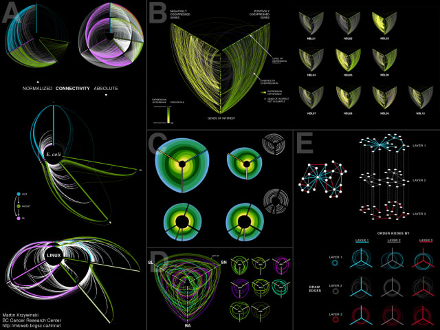
Perhaps we could do better. Why not introduce more rigid constraints in service of an incisive presentation? Krzywinski et al present a persuasive argument that Hive Plots are a particularly good example of a network view with rigid constraints that maximize utility.
Again, interaction affords us some flexibility. Like Tufte’s picture book flaps, we can introduce comparisons through a quick touch or hover over a network area. We can also avoid references to distant footnotes and figures by embedding visuals right there rather than in a separate page/widget.
In the Data Stories podcast I was interested to hear the argument that the influential nature of Tufte’s work likely obstructed other voices and opinions on information design. It’s true that we are very much in debt to Tufte as a leading voice advocating for truthful and concise information design but his work has a surprising lack of reference to psychological literature and actual studies. As noted on the podcast:
All about science apart from his science about data viz!
After ploughing through each of Tufte’s volumes I look forward to learning from those he inspired. As we embrace new mediums, technologies and studies it’s helpful to seek out on the best practices that will bubble up throughout the 21st century.
Links
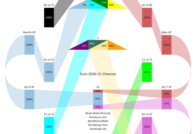
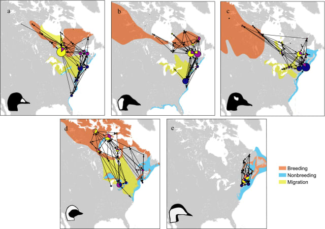
- I’m mesmerized by these trapezoidal charts showing the evolution of betting odds of throughout the Euro cup
- Also on a football bent: Three Sportviz Inventions By a Hungarian Newspaper
- Are You Not Entertained?: Part 4 of a Yearlong Personal Data Project – I have a soft spot for personal data projects and the visuals collated here are neat
- Speeding Up the Webcola Graph Viz Library with Rust + WebAssembly – an interesting look at the lengths one could go to when tuning graph algorithms
- I’m a sucker for submarine cable maps, so naturally love this updated visualization for 2021. See also this interactive 3D alternative view
- I just finished Brian Christian’s excellent book on machine learning safety, The Alignment Problem, and would love to spend more time in this area. This Pathfinding Visualizer is a fun way to explore a cornerstone of the field: pathfinding algorithms
Nodes
I’m going to lean into my newfound summer cycle of writing and stick to a 3-weekly (triweekly?) cadence for a bit. As you’ve probably seen on the news it’s been pretty hot here in British Columbia. I’m safe and sound (despite being a no-A/C-hold-out) but it’s awful to hear of the wildfires spreading throughout the province and US states.
A couple of the links above are from Nightingale, the journal from the Data Visualization Society. They just launched an optional membership program and I’m happy to support the organization as they continue to grow and do great work. I’m also pleased to see that the fabulous writing output will be freed from the Medium paywall.
I was on a call with someone last week who told me how they were juggling a full-time job with the final stages of their ten-year-long PhD journey. I asked that fateful question: “what is your thesis on?” Over Zoom I heard the appropriate resigned pause followed by a weary intake of breath.
Their description reminded me of “cartographic generalization”, mentioned in the last source/target. “That’s exactly it” he responded, “why were you reading about that?”
It was my turn to breathe before a bashful “well, I write this little newsletter…”
After listening politely and another short pause he said “Oh huh, so this stuff is, like, your passion? Wow.”
I was surprised by this response. Despite starting this newsletter to reflect on the passion on display in the world of network visualization I had never considered that it was also my passion. That’s something else I’m going to lean into.
Thanks for reading source/target, my triweekly newsletter on my passion: graph visualization.