Hi, I’m Christian and this is a newsletter with interesting content and links orbiting the world of graph.
It’s been almost a month since I’ve emailed—it didn’t feel right to send out source/target two weeks ago. I was torn between sending a note of solidarity and support for Black Lives Matter and adding to the noise when I should instead be listening.
As ever, continue to send me any links or content that you think your fellow subscribers would find interesting. I’m particularly interested in highlighting the work of marginalized creators in the field and I will showcase and amplify these voices in my newsletter.
Graphs
Last time, in source/target #9, I discussed the role of moderators on social networking websites like Reddit. I was particularly interested in the news and fallout from the release of an incendiary list of moderators that pointed to potential content collusion across subreddits.
David Pierce at Protocol has written an in-depth article of some of these issues and others at the end of last month and it’s worth a read. I figured it would be fun to take some time to do my own original analysis for source/target.
My first step was to do some web scraping of RedditMetrics to get a list of subreddits in descending order of popularity. I figured it made the most sense to focus on the most popular subreddits as they have the furthest reach on the site. Other explorations of the moderator graph have focused on the smaller communities.
I ended up downloading an ordered list of nearly 20,000 subreddits—I took each of these in turn in turn and parsed them to get a list of moderators using Reddit’s built-in Moderators API. I really shouldn’t have been surprised by this but there are a lot of subreddits and, in turn, a lot of moderators for those subreddits.
Due to the rapid pace of change online this data is already stale; as noted by Pierce some moderators have quit Reddit as a direct result of the public posts about potential moderator collusion. Regardless we still have an interesting snapshot of moderators from the middle of April.
I usually start with the most naive data model possible to get an idea of the form of the graph I’m working with. In this case it’s the moderator, subreddit network.
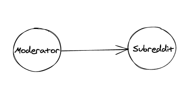
I took this opportunity to try the JavaScript/TypeScript Open Source library graphology, a sort of “standard library” for working with graph data. I like to leverage existing libraries whenever possible and the graph API is well thought-out and allows me to define and manipulate a graph structure with NodeJS. This means I can write minimal code to export to common formats for other libraries and tools. These tools include Gephi for some heavy-duty visual network analysis lifting and various web libraries once I have an understanding of the data and wish to share it online.
Upon loading my data into Gephi the first thing I spot is the large amount of bots in the dataset. These aren’t as malicious as you may expect; bots play a valuable role in the Reddit ecosystem as moderators or in detecting bad behavior. As helpful bots are self-declared (they typically have “Bot” in their name), it’s easy to do a naive removal using their names. Bots are interesting to me but not too relevant to this exploration of human moderators, so I pruned them out of the dataset.
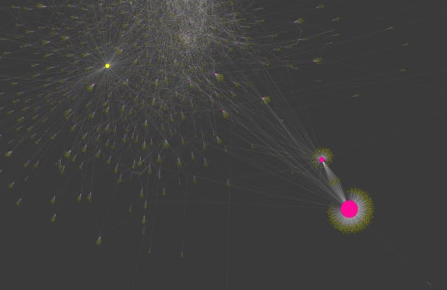
Next up for pruning: the science and askscience subreddits, which have the most moderators by a large margin.
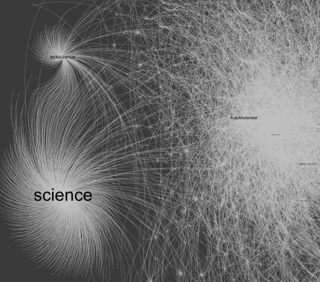
It’s unlikely that a few moderators of these subreddits would have a disproportionate amount of power so I took them out of my visualization.
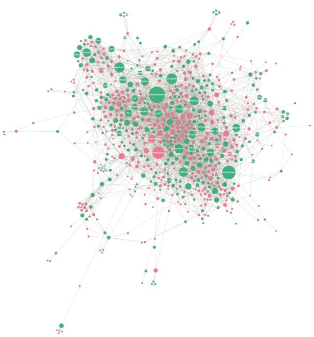
So, after these manual tweaks what does the network look like? This is my first time trying Gephi with large data sources so it took me lots of trial and error clicks in the GUI to get something that look reasonable. Part of the challenge is providing the right parameters to the ForceAtlas2 layout to produce a visual that isn’t just a cluttered mess. I’m not convinced I succeeded, but for now, here’s a look at the network of 82,578 nodes and 96,297 edges. Pink nodes are moderators, green nodes are subreddits.
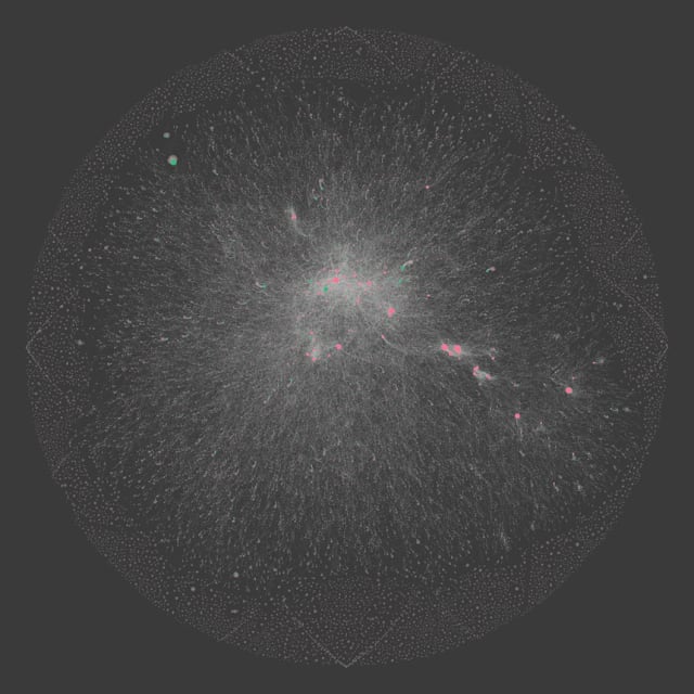
As you can see above, there’s a very long tail of smaller subreddit communities here. To filter these out and focus on the most influential subreddits, I sized nodes by Page Rank and reduced the network down to the most commonly-connected nodes and edges (around 4% of the full network). Now, a number of prolific moderators against key subreddits jump out.
My work on this so far has been fairly rudimentary but after tinkering with various tools I have a stronger understanding of the dataset I’m working with. Stay tuned for further exploration of this data next month. In the meantime, if you have any helpful materials to get the most out of Gephi or parameters for your favorite layout algorithm I’m all ears!
Nodes
Long-time readers of this newsletter will recall the first edition focused on networked-thought tool Roam Research. Since then Roam has exploded in popularity and there’s a prolific set of individuals and tools in the space scratching the connected-note-taking itch.
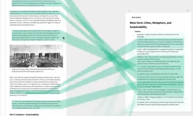
Recent addition of a bare-bones theming capability appears to have unleashed a wide array of creativity from users. Particularly exciting is this CSS + JavaScript attempt at interactive, live references between writing and sources. It’s a wizzy, modern take on “zippered lists” of compounded documents, a form coined and popularized by Ted Nelson back in 1960.
A number of Roam alternatives and complementary tools to be found in this collaborative Notion database. One that caught my attention due to the fast development cycles, support for offline notes and transparent pricing is Obsidian. Notes in Obsidian are written in Markdown and have the wiki-style, bi-directional links that help to build a network map of knowledge.
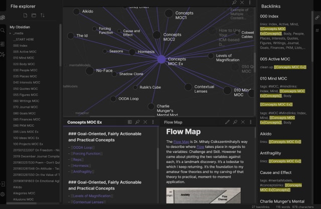
Obsidian has a strong WebGL graph component that scales well and works with a higher volume of notes than other tools. As with Roam, it shows how topics can be useful in connecting potentially disparate notes, both with recollection and discovery of themes across your work and research.
Speaking of research, a new visual web application “Connected Papers” was released earlier this month and makes good on the oft-referenced potential of drawing connections between academic papers, their authors, related citations and prior work.
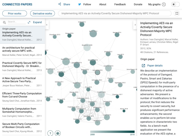
These sorts of graphs have been promoted heavily in the COVID-19-related marketing sphere—here’s a similar static example of a co-citation graph. I’m impressed by the design and accessibility of Connected Papers. See here for more context on how the graphs are built and check out the selected examples on their homepage.
For more context on the connected notes phenomenon and how it relates to the world of knowledge graphs, Anne-Laure Le Cunff’s new essay is a wonderful look at the history of “maps” with a number of arresting examples.
Links
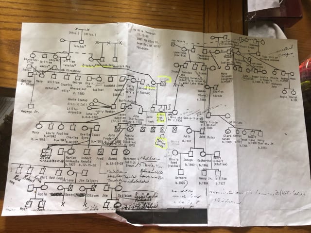
- A beautiful, hand-drawn family tree from Rachel (@Si_Si_Gwa_d)
This is definitely a candidate for the topic of a future source/target edition. Do you have any favorite family trees you’d like to share? It’s amazing to think of each symbol in this chart as a real person in the real world and to reflect on their individual impact.
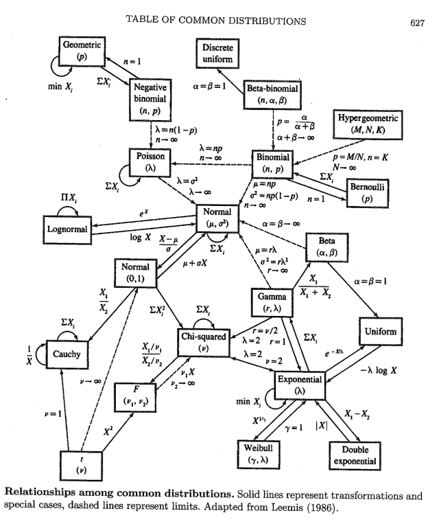
- Xavier Bresson (@xbresson) shared this intricate graph of statistical distributions and the parameter translation between them.
Central to the graph is the Normal distribution but there are interesting discussions in the comments on how this graph representation reflects the relative “centrality” of each distribution.
Turns out this is a relatively simplified version of the relationships between distributions. Check out this site for an interactive version.
- Alcohol sales across North America (and the world) have increased over the last few months and there’s been a corresponding uptick in alcohol-related graph content.
Lju Lazarevic (Neo4j) has been diligently streaming and documenting the creation of a “Wine Graph” in Neo4j, it’s not too late to join their streams on the official Neo4j Twitch channel.
Stay safe, I’ll see you again in a few weeks.