This week in source/target we look at the boundaries between mediums, messages, maps and territories. #16 is a slightly more dense & rich chocolate cake than usual—let me know what you think.
I’m Christian (👋) and this is my bi-weekly (fortnightly?) newsletter with interesting content and links orbiting the world of graph
Graphs
Large
Lewis Carroll’s Sylvie and Bruno Concluded has the following exchange:
“What do you consider the largest map that would be really useful?”
“About six inches to the mile.”
“Only six inches!” exclaimed Mein Herr. “We very soon got to six yards to the mile. Then we tried a hundred yards to the mile. And then came the grandest idea of all! We actually made a map of the country on the scale of a mile to the mile!”
“Have you used it much?” I enquired.
“It has never been spread out, yet,” said Mein Herr: “the farmers objected: they said it would cover the whole country and shut out the sunlight! So we now use the country itself, as its own map, and I assure you it does nearly as well.”
In 1931, Alfred Korzybski, a mathematician from New Orleans, coined the phrase “the map is not the territory” to describe Carroll’s notion of confusing models of reality with reality itself.
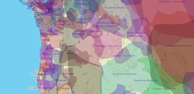
The reality of territories can be extremely complicated. One organization bringing this complexity to life is a Canadian non-profit, Native Land Digital. Their crowd-sourced map, Native-Land.ca, shows how ancestral territories, languages and treaties are interwoven with other ways of understanding our world. In embracing the entanglement it paints a much fuller picture of reality.
When the map website first loads a caveat is posted:
this map is not perfect
While this understatement reflects the complex nature of the data depicted in the tool, it prompts a larger question: what would a perfect map even look like? Surely it would have to be an exact replica, just like Carroll’s mile-to-the-mile map. But what purpose would this map have?
Perhaps I could re-formulate the beloved aphorism from statistician George Box:
Some maps are useful, but they’re all not perfect
Medium
Marshall McLuhan, a Canadian communication thinker echoed Korzybski in 1964 when he devised another now-ubiquitous phrase:
The medium is the message
In short, McLuhan is highlighting that the methods we use to communicate can be more significant and influential than the message we’re communicating. And it’s mediums all the way down: the content of a medium is always another medium. As McLuhan notes:
thus, speech is the content of writing, writing is the content of print, and print itself is the content of the telegraph.
Small
For us, graphs are our maps. We traverse to highlight paths & connections. We apply common tasks to read networks and get insights. We use constructs such as the small world network to model the density of relationships in the world around us.
When visualizing graphs the depiction of the network is the medium: from the lowly static infographic to the dynamic interactive application. Our choice of medium betrays the supposed complexity of our data and signposts to others that connections need to be seen to be understood.
A perfect graph model of the world would be a vast knowledge graph of reality, a plethora of connections replicating the world in its entirety. But by choosing this medium what sunlight are we shutting out?
Links
A long read on the resiliency of global supply chains from McKinsey
A Twitter thread summarizing a network analysis of Ireland’s climate action plan
Wikipedia corner: Five Room Puzzle
The adorably-named Little ball of fur graph sampling library
A musing on belief networks prompted by, of all things, Disney’s Wreck-it-Ralph
Nodes
Gender portrayal in film
You’ve probably heard of the The Bechdel test; a quick litmus test to consider the representation of women in fiction. Since it’s (re-)formulation in 1985 it’s reached a level of ubiquity in film criticism and persists as an interesting rule of thumb.
I hadn’t heard of the technological-formation of the test until this week: source code could be said to pass this test if it:
- contains a function written by a woman developer
- which calls a function written by a different woman developer
US Government agency 18F attempted to evaluate their software repositories against this test and documented their process and results. I think this analysis would be interesting to map out as a network graph although I suspect code attribution would be the hardest challenge.
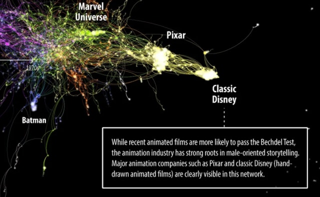
Movie data is eminently more available and used to great effect in this poster from Jill Marie Hackett exploring gender portrayal in film.
The write-up of the process behind the poster creation is excellent — the behind-the-scenes explanation and analysis goes hand-in-hand with the visual analysis of a dense network such as this one.
I also love the description of “guerrilla user testing at Starbucks” used as a method of getting feedback from unsuspecting coffee shop patrons. Feedback is important and who better to consult than a bunch of caffeine-addled PSL drinkers?
School cohort network analysis
Although there’s significant overlap between COVID-19 topics and the topics I cover in source/target I’m a little averse to sharing COVID-19 articles for the sake of it. I therefore benched this document a few weeks ago after reading the fateful phrase “I’m not an epidemiologist, but”…
In this case, at least, it turns out my concerns don’t apply: the author, Dr. Brooke Foucault Welles, PhD is extremely qualified to apply network science to the thorny challenge of reopening schools in a “safe and pedagogically sound” way.
Reminiscent of the ground-breaking Washington Post article with mesmerizing blobs representing each other as they bounced around the screen, Foucault Welles uses multiple small networks to illustrate important details in the strategy to re-open schools. Data and additional context are also available.
I love the node styles for this Madrid subway station complaints by station. It reminds me of the visuals in this classic article from Elijah Meeks.
I’m often asked for a dead simple application to explore and visualize data in one of the many Apache TinkerPop-enabled databases including JanusGraph, Neptune & DSE Graph.
Graph Explorer from Ravi Raja Merugu is an early release of a promising application that fits that description. Check out the latest demo video here and a background article here. Definitely one to watch!
Well, here we are again. Don’t be upset but this is the end of source/target for this week. Next time we’ll be looking at some further content curation through particularly lo-fi graph visualizations.