100,000 years ago, early humans were using a blend of red iron oxide, charcoal and bone marrow as a form of paint. Around 40,000 years later an improved mixture of materials such as sap, blood and berry juice was used on cave walls for creative depictions of hunters and herders.
The ancient Egyptians are the first known civilization to write with pens, which allowed them to record and share ideas with others.
The invention of the printing press in 1440 helped start the Age of Enlightenment. The cost of books was driven down, making them much more accessible to the working class. And in 1996, Macromedia Flash enabled a creative renaissance for a generation of artists, creators and technologists.
To be a Flash developer in the late 90s was to use software directly inspired by decades of attempts at accessible development environments. Creativity enabled by Flash was perfectly paired with the potent power of mass dissemination via the burgeoning World Wide Web.
Jer Thorp was one of these visionaries. After blagging a job as a Flash developer he spent his evenings learning all he needed to know to deliver on his projects when clocking in at work.
Flash was the tooling Thorp needed to kick-start a career working with data. His approach can be summarized by his simple, aspirational thought:
lots of people do normal things, fewer people do weird things
Data time and the livin’ is easy
A rare podcast appearance gives the impression Thorp is a shy, charismatic nerd; someone who obsesses over the details in service of some greater whole. He has a wry humor that glints as he recounts stories.
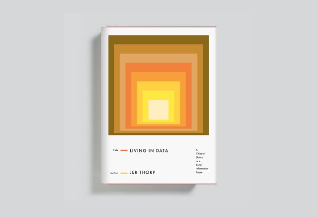
But Jer Thorp’s resume and experiences may be betrayed by this casual demeanour: National Geographic Explorer, data artist in residence at The New York Times and innovator in residence at the Library of Congress. His book, Living in Data was published last year. It’s a feat of a book about working with data, producing data art and creating compelling visualizations.
Thorp talks about data in a way that crackles and zips. Without shying from technical specifics, Thorp provides just enough narrative to keep you hooked. Living in Data is a 21st century take on decades of data analysis and visualization; taking a celebratory yet critical look behind the scenes. I marveled at the threads brought together by someone with a rich background across industries.
I attribute some of the book’s success to Thorp’s keen eye for design and analysis; appearing, surprisingly, even in the book’s dense appendices. Here there are deep considerations on the inclusion and exclusion of certain works, fascinating backstories and extra discussions that illuminate the core text. Not to be overlooked, the appendices provide the complex context behind the research, connections, doubts and triumphs of three years of writing a book and the life lived to enable it.
I N T E R D A T A
Thorp recognizes that our use of data is still fresh and evolves at a higher rate than other technical ideas. The book explores some linguistic flights of fancy which allow us to consider data from fresh angles.
We live and breathe metadata – data about data gives us context clues and is as important as the data it itself describes. The metadata is the message.
To complement metadata, Thorp defines “interdata” as the bits of data that link other data, crucial keys that draw connections across sources. This is something we talk a lot about in source/target. Links are intrinsic to our network thinking.
The power of interdata can be surprising. Jarring adverts for products apparently only discussed verbally prompt evergreen concerns that Facebook is listening in on private conversations. The reality is likely to be more mundane: you’re sharing a Wifi network with others who have probably surfed for that exact topic. The cookie-shaped interdata here is all that’s needed to target someone supposed-spooky ads.
Messrs. and Mmes. Data
I respect and sometimes allow myself to treat data as a plural noun (“data are being collected”) but can’t help feel a little uncomfortable about it. If it was “pompous” back in 2010 I’m not sure what that makes it in 2022. Perhaps informed from my experience wrangling datasets I struggle not to think of tables and files as a homogenous blob of data (“the data is messy”).
To make things even more uncomfortable, Thorp suggests we could elevate data from a noun into a form of verb:
I data you. You data me. We data you. You data us. They data me. They data us. We data them.
His argument is that data is far from a passive observance of attributes and statistics, it’s an active process of extraction and transformation with countless little, imperceptible decisions. To collect data is to bring bias to the table. Even if unintentional, the impact is important.
Data is not inert, yet its perceived passivity is one of its most dangerous properties. When we are warned that a government is collecting data about its citizens, we may be underwhelmed specifically because this act of collection seems to be so harmless, so indifferent.
But of course data is not collected and then left alone: it is used as a substrate for decision making; and as an instrument for differentiation, discrimination and damage. Putting an active form of the word data into common parlance could serve as a reminder that the systems of data collection and uses are humming with capacity for influence, action and violence.
I’m not so sure we’re going to be talking about dataing people any time soon but I admire the sentiment.
Sit by me
Back in 1931, a young woman called Helen Hall Jennings asked a class of seventh-grade students in Brooklyn, New York a simple question:
Given the choice, who in this classroom would you sit beside?
Along with her collaborator J.L. Moreno, Jennings took the answers and drew what are considered the first depiction of social networks. Nearly one hundred years later these “sociograms” look familiar to us: lines drawn between boxes on a page. And the value of the data in this form still shines through. Reciprocal friendships, unrequited preferences and the – in the case of students on the periphery – the wrench into isolation from the wider network.
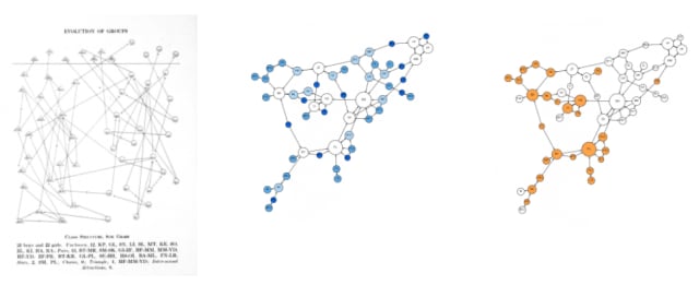
But as Thorp notes there’s a core consideration that isn’t obvious: these social networks aren’t depictions of a world that is, rather they are an aspirational sketch of the world we want. Knotty, complex familial desires are laid bare in stark pencil-and-paper plots.
As reflected by notes in the appendix, it’s hard to parse fact from fiction when researching Moreno. He takes up most of the oxygen in discussions about sociograms and the wider sociometry and Jenning’s contribution has been minimized. Thorp suggests she was the one to draw the original sociograms.
Three years ago the inimitable Martin Grandjean revisited the sociograms for a blog post and released a dataset for easy consumption. His intent was to compare the hand-drawn graphs with the modern equivalent to understand the visual bias that may have been introduced.
A camera above
Like me, you might faintly remember a news story about a humanitarian project bankrolled by a famous actor. It was an impressive yet mad libs-worthy project – George Clooney enlists human rights investigator to use satellite imagery and machine learning to detect and predict human atrocities – but what happened to it?
The aim of this “Satellite Sentinel Project” were quickly realized in 2011 once the team uncovered images of “recent grave sites in the state of South Sudan.”
Later they documented the razing of Maker Abior, Todach, and Tajalei, villages in a region where the Sudanese military had been targeting ethic minorities.
Other imagery showed construction and preparation that indicated impending military action.
The project suffered a blow in 2012 when a report highlighting road construction appeared to directly result in casualties and hostages being taken from the very same groups highlighted in the imagery. Efforts to anonymize the data were insufficient compared to the context on the ground – in this case overlooked and unique landscape features.
It turns out there was no guarantee that the very technology that was enabling relief to thousands could also be used to further the very same atrocities it was intended to prevent.
How do we know if we’re helping if we showed this? How may we be mutating the battle space in ways that could harm the very people we’re trying to help? — Nathanial Raymond, Human rights activist
Faced with this realization the project was disbanded and inspired the creation of five human rights in crisis situations:
- The Right to Information
- The Right to Protection
- The Right to Data Privacy and Security
- The Right to Data Agency
- The Right to Redress and Rectification
It’s all shockingly relevant as we traverse a very 21st-century war unfolding over Telegram and the wider internet. The fine line between productive and destructive appears ever finer with artificial intelligence in the picture.
Skin and Bones
At times in Living in Data, Thorp sounds weary. He’s been burned by incessant outside forces seeking to market and monetize his work and it shows on the page.
In a quest to avoid the daunting specter of bias, data visualization practitioners too often adhere rigidly to best practice, scrubbing and scraping at the excesses of “decoration” until, they hope, there’s nothing but the clean white bone of truth.
The result of all this is that there’s a kind of meal-replacement logic at work—a conviction that a story might be blended down into a neat, easily consumed slurry, with all the essential vitamins and absent the pesky nuance. That none of us should miss the crisp snap of an apple’s skin.
Yet he still strives to create, to discover and to learn. He is generous with his praise and support of others and shares his platform with specialists who have even more interesting things to say.
One of the most striking projects highlighted in the book is Mimi Ọnụọha’s Library of Missing Datasets – an inspired attempt to catalogue the uncatalogable.
Since 2015, Onuoha has been assembling a collection of data sets that aren’t. People excluded from public housing because of criminal records, undocumented immigrants currently incarcerated, trans people killed or injured in hate crimes, sales and prices in the art world, how much Spotify pays each of its artists per play of song, publicly available gun trace data. These are all data sets that for some reason don’t exist or are not acknowledged to exist by those who hold them.
In the book, Onuoha outlines four reasons for this which align with Thorp’s persistent on the paradoxical: truly good data work has to consider the very data that wasn’t collected or included.
”We talk about marginalize a lot to the effect it becomes meaningless. But data is one of those places where marginalization is a real thing, if you’re not in the dataset you’re in the margins, we don’t compute in the margins.”
At the recent Outlier conference, keynote speaker Andy Kirk zoomed out to show a perspective on the history, present and future of data visualization. It reminded me that what’s old to many is likely new to others, especially those of us (all of us!) who are still learning. Disagreements over the “correct” or “appropriate” representation for some data are rehashing the same party lines drawn a decade or more ago.
This cycle is reflected by Thorp’s trajectory. He made the conscious decision to avoid “traditional data visualization” in favor of hybrid, multidisciplinary data projects, grounded in reality. Living in Data provides a blueprint for an approach to data work that’s always in search of that Flash of inspiration that crystallizes our experience of being oh so very alive, in data.