Life is an unending, interminable, unrepentant, flow of dependencies. To do this, I have to do that. I can’t start something until I’ve completed something else.
When you think about a process or task, how does it appear in your brain?
You’ll often have an intuitive understanding of the dependencies in a process but what happens when you want to share and – gasp – communicate those processes with others? What tools do you reach for?
In the vein of “the best camera is the one you have with you” many opt for tools they have on hand – usually something ubiquitous like Excel. Powerpoint is another common foil for this, the lure of the blank canvas, obvious shapes and flexible positioning.
Fatigued productivity pros advocate for stripping back to the basics and leaning heavily on plain text. Writing lists, perhaps even nested lists replete with ascii arrows -->, is portable and even creative (if you like typing) but not suitable for sharing or collaboration.
Web-based diagramming tools reduce the friction for getting processes out of your brain and onto the page. These vary from the enterprise-leaning draw.io, excellently sketchy (as in hand-drawn) Excalidraw to those that lean heavily on sometimes arcane domain-specific language like Mermaid.JS or the perennial favorite, Graphviz.
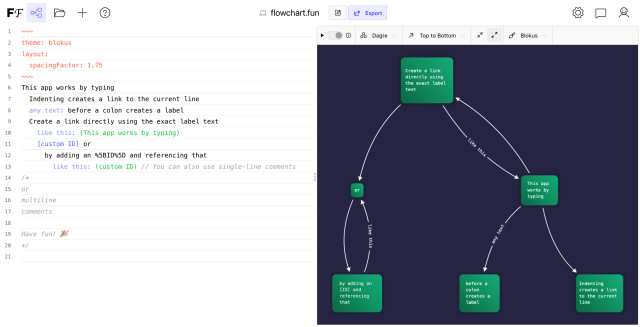
flowchart.fun is a bit different. It combines the accessibility of drag-and-drop tools with the power of text-based, wrapped in a shareable webapp.
I’ve been a fan of flowchart.fun for a while and I reached out to its creator, Rob Gordon, aka Tone Row to see if he would be interested in answering a few questions on the project. I can tell from flowchart.fun that real care and consideration had been put into its development and this was pleasantly confirmed by Rob’s inspirations and motivations. What follows is an email exchange between us both, lightly edited for clarity. I hope you enjoy it.
Tell us a little bit about your background, how did you find yourself making tools for the web?
I don’t have a background in computer science or math. I went to art school and studied music composition. My main interest in learning to develop software was to make tools for computer-aided algorithmic composition. Only by some meandering process did I end up building tools for the web.
There’s a certain joviality to the name Tone Row and smiley face logo – to me they introduce a collection of friendly tools built with care. Is there a backstory to them?
I definitely don’t want to take myself too seriously! The smiley face was a drawing by my wife, who is a graphic designer and who is also the only reason flowchart.fun visually passes as an app (Merci Camille!); I’m an abysmal designer.
I knew I wanted a vague-sounding name (think, ACME corporation) so I wrote a small generator and fed in words I liked and out popped Tone Row. Incidentally tone row, despite sounding vague, has an historical meaning in music composition. Here’s the wiki, but roughly-speaking it’s a technique of composing where you force yourself to use all 12 notes in the scale once before using them again. I find some pieces more listenable than others, but what resonates with me is the idea of approaching a familiar and complex problem like music composition with a surprisingly simple, repeatable solution.
That’s fascinating, I had no idea that a tone row was an actual thing. Isn’t it surprising that adding constraints can lead to greater creativity rather than limiting it?
In the world of diagramming tools, I think there’s a massive divide between drag-and-drop tools (draw.io, excalidraw, etc.) and diagram libraries for developers. Would you agree that flowchart.fun seems to occupy a sweet spot between the two worlds?
I haven’t framed it like that before, but that sums up how it came to be. One morning I needed to make a flowchart and couldn’t find the right tool for the job. I wanted to type (being developer-y and whatnot) and get a graph in return. I thought of the basic syntax immediately and already had some experience with cytoscape.js. About 30 minutes later I had a working prototype.
As to whether flowchart.fun lives up to being the “sweet spot” between the two, I would say it’s in the spot but I’m hoping to make it a lot sweeter. There are some impressive features at each end of the spectrum you mention (from draw.io to mermaid.js) Visual diagram editors easily let you customize everything: arrowheads, edges, colors, etc, while Mermaid.js can generate everything from swimlanes to pie charts.
Despite lacking many of these features, I think flowchart.fun distinguishes itself in a way that’s a bit difficult to describe. My best attempt is, the flowchart.fun feature-set is a bit of a “greatest common denominator”. The syntax is less capable than Mermaid.js but is (in my opinion, of course) easier to wrap one’s head around more quickly. Owing to and abetting that is the immediate feedback loop of getting a visualization in real-time as one is typing. Another way of describing it is that the syntax tries to be close to natural language, e.g.,
this
  belongs to: that
Along with animated, immediate feedback (passed through the graph layout algorithms of people much smarter than me!) it really becomes a kind of thinking-aid, or a tool to help organize thoughts. I’m digressing into “second brain” rhetoric so I’ll leave it at that, but I do think that is where flowchart.fun achieves something unique in the spectrum of available tools. I’m hoping to really dig into and enhance that quality in 2022.
The immediate feedback loop is an important piece! I wrote a little about that last edition. Using flowchart.fun truly clicks the first time you write a word and see it added with a smooth animation. You’re right that makes it a powerful aid for thinking.
I have a lot of experience with musical interfaces (midi controllers with lots of knobs and sliders). They generally have the requirement of processing input in real-time. I think the idea that fast feedback loops can help with creativity and creation is definitely part of what underpins flowchart.fun.
You might be interested in work by Information Designer, Duncan Geere, he often writes about the intersection of music and data visualization, often through his work with Miriam Quick on Loud Numbers.
In your words: what’s the draw to helping people build flowcharts?
If I’m honest, I don’t wake up everyday thinking, “how can I help people build flowcharts today?”
Ha! You’re right, that would be a bit weird. You mean helping people make flowcharts isn’t your sole reason for existence? How reasonable!
I’m attracted to the process as a whole: putting a tool into the world, seeing how people use it and respond to it, absorbing that and channeling it back into the honing of the tool. Flowchart.fun has ended up being a great project for me to practice both sharing what I create, receiving feedback, and trying to build a community around it along the way.
From a broader lense, flowchart.fun (like everything in the spectrum of tools you mentioned) exists because of this ever-growing role of information in our lives. I think as a result, we as a species (zooming out here, haha) need ways to make information more precise/expressive– a kind of signal-to-noise effect is in play. If flowchart.fun can help people arrive at and/or express ideas more clearly and concisely then that makes me happy!
What’s remarkable to me is that even the functionality added in your first 30 minutes of work has unlocked countless hours of thinking for people around the world. Little websites can still be fun! And helpful!
What is the most inspiring use of flowchart.fun you’ve seen?
The latest use-case that struck me as a “no-brainer” is someone who uses it for decision trees for the technical support team on their product. One of the app’s biggest fans is a German with a passion for a type of chart I had never heard of, a Wardley map, that seems to be primarily used by the government in the UK.
It’s also been making the rounds in Law Student Twitter recently, though I haven’t seen an example of exactly how it’s used by people studying law. All of that to say more than any individual use-case, I’m really blown away by the diversity of users and use-cases. I’m really glad I made the decision to translate the app into other languages. I think that’s made it more successful for a global audience. (I already had a passion for looking at fonts, but now I get to look at fonts in other languages as well and I absolutely love it).
Wardley maps look interesting, a sort of graph layout where the positions of nodes are plotted against a continuous scale. When using most force-directed graph layouts, the reasoning behind the positions of nodes and links can be a little mysterious. Grounding those positions in an axis is a smart way to help communicate more information.
Open Source developers contribute an inestimable amount of value to our collective technology stack but often struggle with knotty problems like independence, longevity and self-sufficiency. What are your plans for sustainable, supported development?
This question is especially relevant for me because I recently decided to leave my job to pursue Tone Row full time. I was inspired by the success of people like Steve Ruizok (tldraw) and Matt Perry (motion.dev) in leveraging Github sponsorship to support their open source work, so I tried that first without much luck. I added the $1/month sponsorship features in November and that’s been more successful, although when I decided to charge one dollar per month I hadn’t really considered that Stripe takes 33 cents per transaction and the other third will go to taxes… honestly, my severe lack of business acumen never fails to make me laugh.
My plan is to keep adding features that make sponsorship more appealing throughout 2022. There will be new themes, new layouts, some additions to the syntax that enable more complex graphs, and better ways to share and distribute charts– not to mention other apps!
What are you most excited about working on next?
I’ve had a deep appreciation for building design systems / component libraries for a long time. I’m hoping to innovate a little bit in that space and hopefully build more of a reputation for Tone Row at the same time. I also might have another flowchart–adjacent productivity tool up my sleeve. Too many ideas, not enough time.
I hear you! Thanks so much for your time, Rob, this was great.
You can try out flowchart.fun here and follow Rob’s progress on Twitter. Oh and those of you who are web-development-inclined, check out his amazing CSS gradient generator tool.
Do you want to be featured in a future edition? Perhaps you know of a project or person who would love to share their story of working with networks? Hit reply and let me know.
Until next time!