I’m Christian (👋) and this is my bi-weekly (fortnightly?) newsletter with interesting content and links orbiting the world of graph
Hello to all the new joiners from Neo4j’s NODES conference this week — it’s lovely to have you here. To get a feel for the newsletter you should check out the archive. Subscribers have enjoyed editions #7 (the movie one), #13 (the design one) and #17 (the ASCII one).
Regular sourcerers might notice something different this week. Thanks to Lis Xu for bringing a fresh look to the newsletter – you should definitely check out her fantastic work.
Graphs
Have you ever wondered how you might visualize life? Y’know the thing we’re all experiencing right now? Birth to death. Cradle to grave. Everything.
Let’s start with a concrete approach. Right now you’re reading source/target from some real-world geospatial location. It’s easy to represent that: a dot on a map. This dot represents a snapshot of you at this precise moment in time.
Over time your position will change and that dot will move. Geospatial positioning over time is something we’re comfortable visualizing. Here’s an example from a recent run I recorded with my Garmin watch:

This is a linear time-sliced ribbon of me on a run. In this example my pace is encoded as a color gradient; you can see where I picked up speed (running in the road to avoid coughing people) and slowed down (hills).
If we were to take this idea and extrapolate to life more broadly, what other variables could we encode? Perhaps general state (e.g. awake, asleep) or emotions (e.g. happy, angry)?
I recall that back in 2012 Stephen Wolfram plotted a variety of his personal analytics from logs of composed emails and files.

From Wolfram’s plot we have a pretty good idea of the times that he was asleep. Eight years laterwe have lots of tools that make this state data easier to collect. Quantified self analysis through devices to track sleep and heart rate is very popular.
The story told by this dot plot has the potential to be more interesting than focusing on your coordinates in the real world. For my visualization, let’s keep the time component but instead of a ribbon unfurling over a geospatial map let’s imagine a multi-dimensional ribbon showing the many facets of your life.
For a similar 2D example of this check out the influential Movie Narrative Charts from XKCD and this recent work on building these charts with reinforcement learning techniques.
My life visualization would be animated with the velocity of the ribbon reflecting how fast time appears to be passing. The direction along a certain axis could mirror emotions. The color of the ribbon could represent whether you are achieving your goals (unconsciously or not).
Bear with me…
Personal connections and relationships are an important part of life. If we piled everyone who’s ever lived into the same chart and applied a form of force-directed physics we could model the alignment between individuals as ribbons converging. Repelling forces could represent a difference of opinion or ethics.
One thing’s for sure: a visualization of everyone who’s ever lived would result in the hairball to end all hairballs.
Humans can’t perceive enough dimensions to fully comprehend how this could look (plus it’s a pretty half-baked idea) but I do sometimes envision myself as this little ribbon in time and space.
It’s about time

Time Curves is a project from 2015 with an innovative way of depicting lives or “patterns of evolution.” The curve bends and twists to show the degree of difference between states. Color gradients are used instead of animation and the resulting plots are compelling 2D representations.
These Time Curves are largely data agnostic, they provide similar depictions whether the input is derived from changes between frames in a video or the deltas between Wikipedia pages. I’m fascinated in how these beautiful ribbons give you an instinctive understanding of how something transitions over time.
Early versions of Time Curves “folded like a snake” — a comparison which reminds me a little of the “Clover” motif commonly found when visualizing song lyrics
Check out the paper for the gory details and some illuminating figures. If you’re feeling brave you can generate your own Time Curve over on the project page.
Get a life
In a case of life imitating, uh, life, there’s a wide array of bioinformatic visualization tools that share similarities with Time Curves.
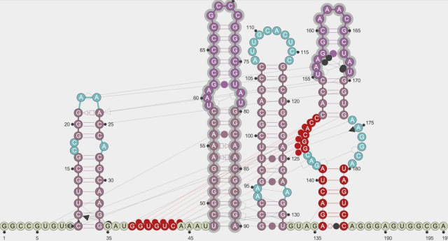
RNArtist from Fabrice Jossinet is a work-in-progress application to design and visualize RNA 2D structures. These dense ribbons of Ribonucleic Acid, one of the three major biological components essential for all known forms of life, can be drawn, arranged, annotated and exported.
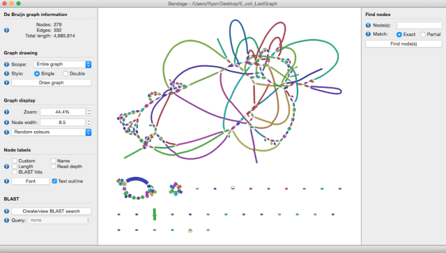
Another tool that comes to mind is Bandage from Ryan Wick. Bandage can be used to visualize de novo assembly graphs, a specific type of DNA sequencing. The visualization of the force directed loops can help computational biologists to “better understand, troubleshoot and improve their assemblies.”
To me, graph visualization is strongest when it borrows gratuitously from physics to provide an natural depiction of the attracting and repelling forces between nodes. The Time Curves and similar loopy approaches are a solid example of this in action.
Links

Wikipedia corner: Cat gap
Nodes
Scott Aaronson’s essay “Who Can Name the Bigger Number” was a gateway for me into the world of computer science and math. It introduced me to a curious concept that’s rattled around in my brain since – the Ackermann sequence.
Ackermann’s idea was to create an endless procession of arithmetic operations, each more powerful than the last. First comes addition. Second comes multiplication, which we can think of as repeated addition […] Third comes exponentiation, which we can think of as repeated multiplication. Fourth comes … what? Well, we have to invent a weird new operation, for repeated exponentiation.
Aaronson goes on to describe this sequence:
If each operation were a candy flavor, then the Ackermann sequence would be the sampler pack, mixing one number of each flavor. First in the sequence is 1+1, or (don’t hold your breath) 2. Second is 2´2, or 4. Third is 3 raised to the 3rd power, or 27. Hey, these numbers aren’t so big!
Fee. Fi. Fo. Fum.
Fourth is 4 tetrated to the 4, or , which has 10154 digits. If you’re planning to write this number out, better start now. Fifth is 5 pentated to the 5, or with ‘5 pentated to the 4’ numerals in the stack. This number is too colossal to describe in any ordinary terms. And the numbers just get bigger from there.
That escalated quickly.
This week I learned about a similar sequence that has an even greater acceleration in size: TREE. I was delighted to learn it had roots (pun intended) in graph theory. This Popular Mechanics article gives a good summary of the sequence. The embedded video from Numberphile is also a great watch.
Books In Action
Sourcerers Dave Bechberger & Josh Perryman have completed their book “Graph Databases in Action”. Dave & Josh have actual, bone fide experience building production graph applications and it’s exciting to get their smarts distilled into book form.

I notice their publisher Manning has a nifty graph widget on their catalog pages. This is a neat way to show similar books via the purchasing habits of their readers.
Piling On
A key aim for many graph layout algorithms is to minimise the number of overlaps between nodes. This prevents nodes hidden behind one another, skewing the perspective. However, some use-cases it may be desirable to show these overlaps – manual clustering or aesthetic preference come to mind. Piling.js is a JavaScript library for Interactive Visual Piling. Used for scalable “small multiple” visualizations the library would be well-suited for use in graph visualization. Check out the background and introductory video.
Congratulations to Scott Dobbin for rising up to the challenge to find a better Ghibli graph pun than “The Graph Returns”… “Graph of the Fireflies” is a much better title and I’m ashamed I didn’t think of it.
My Ghibli Galaxy from last edition is getting rave reviews from around the world. I particularly enjoyed the following description:
“Бесполезно, но красивенько.”
Quite! ;-)
The next time you hear from me your clocks will have changed (if you’re into that sort of thing). Stay safe, warm and well.
Why not share this edition with someone you think would enjoy it?