Graphs
Last week I took a long weekend to go surfing in beautiful Tofino. It’s still winter so there’s no way to avoid a thick wetsuit, hood and gloves. It’s been a few years since I last tried it and while I’m only marginally better than I remember, there’s something about the randomness and persistence of the waves that makes it addictive. Falling asleep at night I can still feel the waves rushing towards me (just before another mouthful of saltwater.)
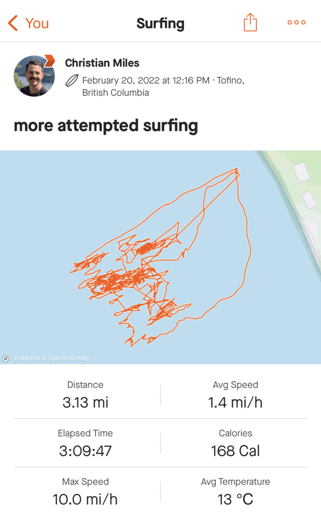
I tracked my sessions in the water this time and was intrigued by the organic fronds that appear as I attempted to ride the waves. I think they tell a story of someone who doesn’t quite know what he’s doing. I can’t seem to find examples of “good” surf tracks online but one would expect more straight lines (representing actual surfing) and fewer scrunchy bits (minimizing all the splashing around and getting pummelled by the waves as I did.)
Knowledge Workings
It’s been just over two years since I started this newsletter and, while my output has slowed somewhat, I’m still interested in keeping it going.
The Pudding’s fantastic interactive article on plain writing reminded me of an edition back from May of 2020.Back then I was finding some takeaways from a virtual conference on Knowledge Graphs. Nearly two years later the use of the term “knowledge graphs” has exploded - in the industry we’re really just speaking about “graphs”. It’s like the crypto/cryptography/cryptocurrency conflation – something cryptography researchers have begrudgingly embraced if it means increased funding and visibility for their work.
Perhaps it’s that adding the word “knowledge” to whatever you’re working on makes it sounds more definitive. Geospatial visualization behemoth Esri have co-opted the term with their new ArcGIS offering, “Knowledge.” Other terms are ripe for the picking: take the new decentralized finance company “The Graph” and blockchain “Ontology” – both translucent attempts to sound weighty, absolute.
Steering in Data
I just finished Jer Thorp’s “Living in Data” – a thoughtful, lyrical book that goes into great detail on the responsibilities and realities of transforming data into something meaningful.
Almost all of my visualization work has taken the form of exploratory tools. Even in the case where the result is a static image (like the PopSci piece), I build my own vehicles, to make it easy for me to range widely across a data set’s terrain. More often, I let others drive.
The Pudding article articulates it’s point so well simply by toggling between a “traditional” and plain version of the same text. The toggle is a simple steering wheel. Combined with animations, this direct, visual comparison goes a long way to highlighting the different approaches.
The article also delves into some of the techniques used to model the complexity of text. These include some “black box” proprietary algorithms where there’s limited public information of the approach and weightings of the algorithm.
It reminds me of “what3words” – touted as a potentially life-saving method of defining specific coordinates on a map with simple English words, it’s a flawed proprietary algorithm that could cause further confusion from the use of similar or pluralized words for locations in close proximity.
Tom MacWright didn’t hold back in a recent book review aside:
But seriously, there’s no validity to this idea of what3words. If you’re in the middle of the woods, and you have internet access, and you open the app and memorize the words and tell the ambulance them and spend 30 seconds explaining what what3words is, well, are you real, or a marketing story. Wait, no, even in that situation it’s way to easy to say a word wrong and send the ambulance to the wrong place.
That link, by the way, takes the use of a “hairball” – an overwhelming mass of graph nodes and links in a visualization – to great effect. It shows just how many points in an area could be confused.
Any sufficiently hard problem results in a market for commercial solutions. And those commercial offerings will compete to solve the problem in opaque, proprietary ways to attempt to gain an advantage.
Gödel, Escher, Graph
Parsing language is hard enough on a syntactic level but once semantics are introduced it can seem insurmountable. Take the sentence:
More people have been to Berlin than I have
This sentence seems to make perfect sense. It has the right mouthfeel, the correct form, the appropriate notion. But it falls apart with the faintest bit of scrutiny. “Of course more people have been to Berlin than me, there are so many more people than me!” Here’s another one:
While I was surfing the internet went down
These are sometimes known as Escher sentences, reminiscent of the twisty, inconsistent drawings from the 20th century artist.
Garden-path sentences are a similar construct – the reader is “tricked” into parsing the sentence incorrectly. One succinct example is “the old man the boat.” Your brain follows the parsing path it expects to when reading and there’s a moment of disorientation when everything suddenly seems nonsensical and non-grammatical. Is the old man IN the boat? ON the boat?
Speaking of Escher and mind-bending writing, Douglas Hofstadter’s influential “Gödel, Escher, Bach”, describes a curious device and names it a “quine” – as per Wikipedia:
A quine is a computer program that takes no input and produces only it’s own source code as output
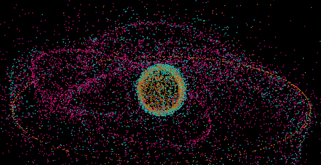
I stumbled upon this fantastic quine on Twitter, blending code golf, the visualization abomination technique “metaballs”, fogs of war into a remarkable tweet-sized snippet.
But it’s the unfurled version of the code that tipped it into inclusion this week – I love the snaking indented view with expository comments for the casual reader. It’s not like I understand the code any better without extreme close examination but it goes a long way to help me parse it.
Space Farce
As graph technology reaches more mainstream interest there’s a blurring of semantic lines between concepts in the space.
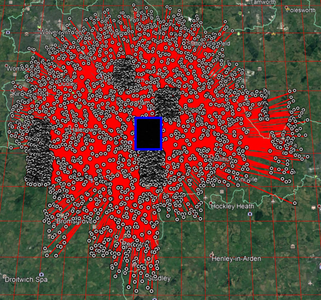
For example, here’s an article about a project to track tens of thousands of objects in space. Out of 26,000 objects orbiting the Earth, only around 3,500 – that’s around 13% of it – is actually used for a purpose. It’s an illuminating project that enables some mind-blowing visualizations.
Pan around the 3D globe here and you get a much greater understanding of just how severe this problem is. At points you can barely see the earth for the dots floating in mid-space.
But in describing the project, concepts like knowledge graphs, graph databases and visualization are smooshed together into a homogenous blob.
A family tree is a simple graph database.
I mean, sure, this isn’t wrong, per say, but a family tree is as much of a graph database as sketching a route to the nearest train station is a simple atlas of the world.
Even experts in traditional semantic graphs get confused by fundamental ideas in graph visualization – in this seminar summary from Juan Sequeda feels around the domain trying to massage some Spark Notes, but misses the creative, ephemeral angle of why we visualize data at all.
Over in the intelligence trap that is the Personal Knowledge Management space – where the pursuit of knowledge is put on hold while the vessel for the knowledge is polished and tweaked for optimal polishing and tweaking. The term “graph” and “knowledge graphs” are co-opted with grandiose soundbites like “second brain” to give some faux structure to what is, essentially, writing shit down.
As one of many who strives toward accessible communication in the graph technology space, it’s tempting to declare inconsistent language and definitions as outright incorrect. But there’s a path of least resistance when it comes to the adoption and acceptance of technical techniques. I’m a strong advocate for real-world applications over academic navel-gazing; if people are inspired by technology to create interesting projects what does it matter what they call the technology? If the space is accessible and adaptable, then it is more conducive to creativity.
Nodes
Many thanks for Asaf Sharif for the mention of source/target on his Social Network Analytics podcast, NETfrix. I’ve been going back through the archive but particularly enjoyed his latest episode: a skeptical review of Dunbar’s Number. In it he traces the sources of some bold, eye-catching summaries of human nature and pulls a little at the threads. The podcast is well worth a listen for a thorough yet friendly look at of some of the topics we touch upon in source/target.
Off the Charts is The Economist’s weekly newsletter on the process behind their data journalism – it’s a must-subscribe. This week they walk through charting air traffic over eastern Europe after Russia launched its attack last week.
Hey, thanks for reading. I hope you’re good – see you next time!