Hi, I’m Christian and this is a newsletter with interesting content and links orbiting the world of graph.
source/target will share content that uses “graph-thinking” to find real insight into the world around us.
Thanks for signing up! I’d love to know what you think. Please feel free to reply to this email with comments, suggestions & criticism. Don’t worry, I can take it.
Graphs
As with any novel technology, there is an expectation that applying graph techniques to your data and model will immediately generate insights. This isn’t the case. Visualization or analytics based on connections needs to be approached just like any other project: with an understanding of which tools to use and the output you’re expecting to generate. The great thing is that this doesn’t have to be complex!
This week I’m featuring a developer of compelling, graph-centric applications whose understanding of this is apparent from his work.
I first became aware of Andrei Kashcha’s work when I stumbled upon his Amazon product graph site, YASIV. Here you can provide a keyword or title and be rewarded with a rich visualization of the connections.
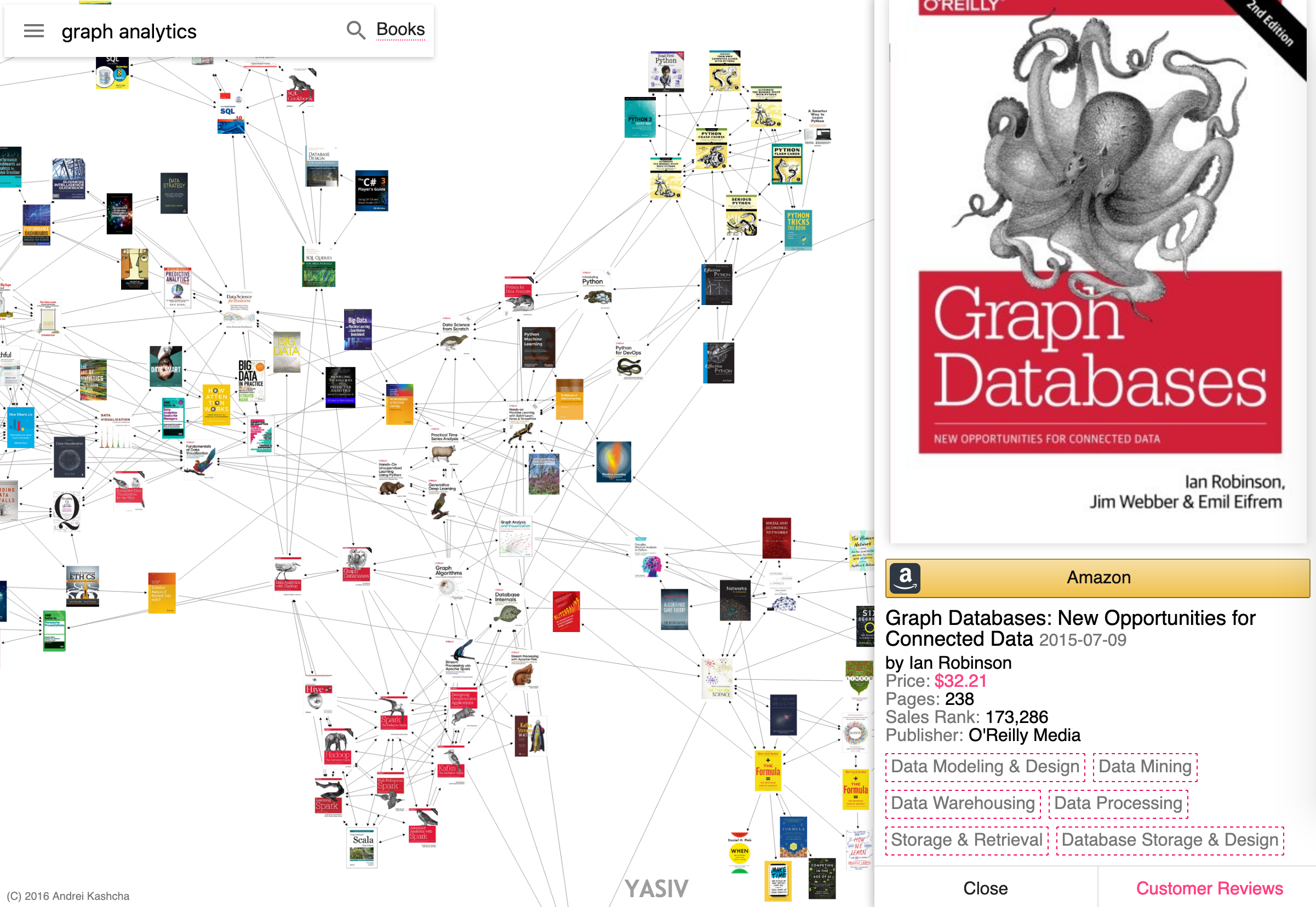
The intent is clear and by showing the organic clusters of books people buy, one immediately spots patterns:
- The most commonly purchased book for a particular topic or domain, likely to be near the center of the network
- The product on the outskirts of the network: perhaps a new entry on the market or a niche sub-topic that could be of interest
- Books in a series or from the same publisher are likely to be dense clusters in the network as readers often prefer books with similar editorial standards
I’ve previously used techniques such as frequent itemset mining to efficiently generate sets of objects that are often seen together. In the case of YASIV we’re leveraging Amazon’s vast product graph API for our networks.
Since 2016 I’ve enjoyed seeing Andrei’s projects bubble up all over the internet. It’s a testament to his creative eye and enthusiasm that his projects capture the imagination of users around the world.
Take his “vs” graph app. As with the Amazon product graph Andrei leverages the vast amount of data collected by Google’s search bar. The app scrapes the suggestions when users start typing a query. Doing this we can effectively crowdsource suggestions when users type “[X] vs” to give a visual model of the alternatives or contrasting topics.
Here’s an example for the popular data visualization library, d3.js:
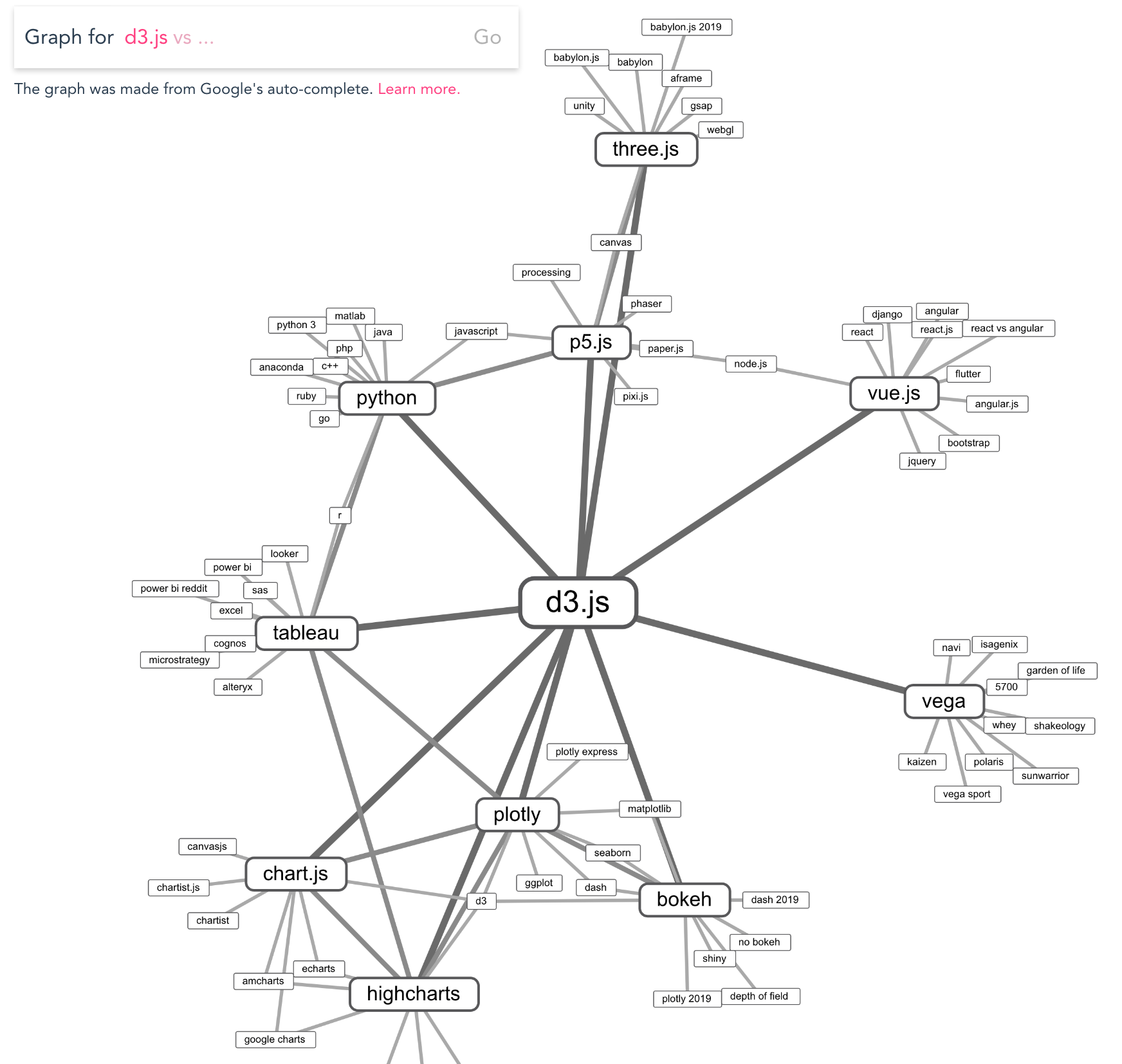
In the accompanying help section on the site Andrei signs off his description with “passionately, Andrei.” I think his design decisions highlight that passion for presenting data in a dynamic and interactive form.
Let’s focus on the animation: upon execution there’s a smooth, almost mesmerizing animation as results pop into view and float around the screen as if looking for a home.
The animation here is masking the time taken to scrape and parse the results from Google and it reminds me of the apparent historical reason for mirrors accompanying elevators.
As it settles the connection animation emphasizes the backbone or skeleton of the network. In this application the size of nodes and links don’t reflect anything more complicated than simply the degrees of separation from the initial query but it still provides visual variety.
Power users can generalize this project using the hidden “pattern” parameter to visualize other auto-complete phrases. However without leveraging the chain of topics these can lead in pretty underwhelming results. This is because generic outer searches can bear no relation to the original product or entity of interest.
By restricting the domain down to a specific subset of entities this app blossoms into one that provides countless surprises to the user. Now turning to the popular link-sharing community Reddit, Andrei took a smart use of a similarity metric to generate graphs of sub-communities (“subreddits”) related by comparing lists of users posting in each.
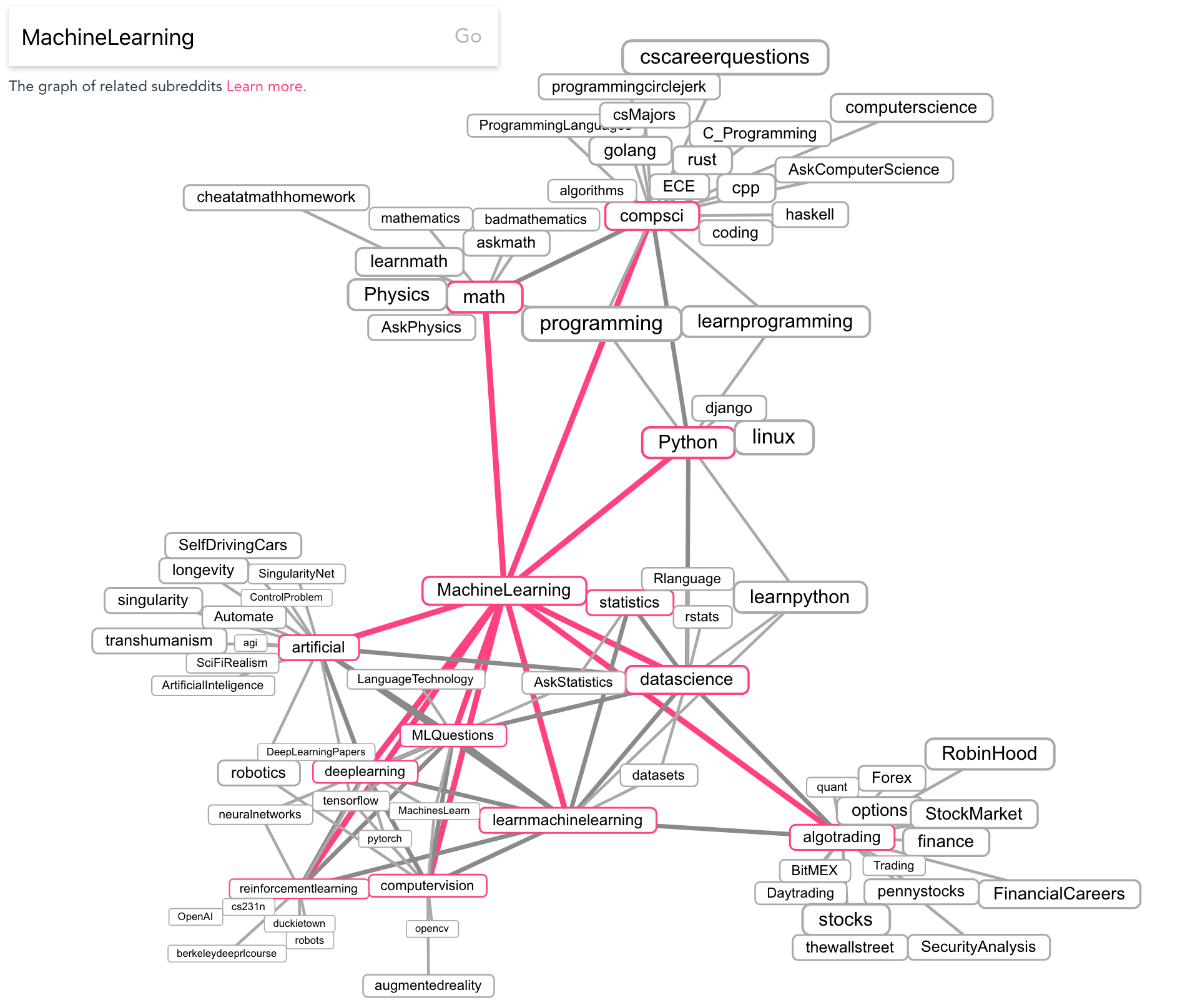
Context and interactivity is critical in applications like this and Andrei doesn’t skip a beat: a quick click of an interesting subreddit shows the latest discussion, while double-clicking on a node sends you down a rabbit hole by showing the related subreddits.
Andrei has countless other projects that I don’t have time to explore here but it’s well worth digging around in his Github profile. Here are a few (very) honourable mentions:
- Code galaxy visualizer - This has been around forever. A very fun application to navigate and explore a galaxy of code in the browser.
- npm.anvaka - An app to visualize the dependencies introduced by various npm modules. Also featured by the great repository npm Package Reposity from Pika.
- Just one piece of his modular JavaScript graph library, ngraph.path is an efficient pathfinding library implementing a number of algorithms.
- City Roads - Not strictly “graphy” but an extremely slick, stripped-down view of roads via OpenStreetMap. Seeing rivers and other waterfeatures slip in and out on zoom is very satisfying.
I’m looking forward to seeing what other projects Andrei cooks up in the future. Follow him on Twitter to keep an eye out.
Nodes
Neo4j released version 4.0 of their leading graph database this week. With the addition of sharding, security and the ability to easily run multiple databases at once it’s a compelling release. The Neo4j platform continues to be the most accessible graph database and their Sandbox and vast online content make it really easy to get started.
Jennifer Reif (Neo4j) has written a thorough summary of the best places to look online for information about the new release.
Another edition of source/target and another conference I wasn’t able to attend. This time it’s FOSDEM in Brussels earlier this month. Amazingly nearly 90% of the talks already have recordings online. The Graph DevRoom has a strong track record of excellent talks and there are a few on graph algorithm libraries this year worth a watch.
Links
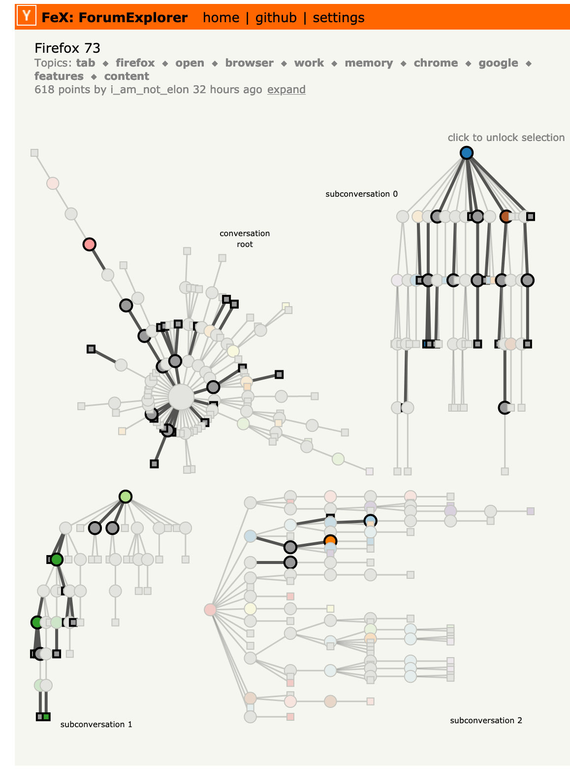
Released last year FeX: Forum Explorer is a graph-oriented browser for Hacker News comments built by Andrew McNutt. Instead of a page of nested, indented comments we can get a global view of all comments and how they relate.
Hacker News is known for it’s interesting approach to content moderation so it’s interesting to see that reflected in the comment graphs in such a nice dynamic form. Compare and contrast this comment graph on Brexit-related technology news with this comment graph around a new release of Firefox. Bonus points for the keyword and topic extraction and subsequent sub-graph highlighting and chunking; very nifty.
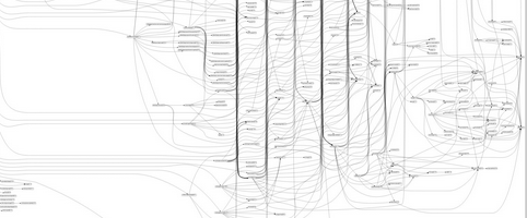
- Julien Vehent on Twitter posted a massive graph of the apparent dependencies of the react-scripts package for NodeJS. To me it really hammered home the visual deficiencies of hierarchy layouts, in this case generated by GraphViz. It’s a complex graph, so it must surely represent a complex, overwhelming system?
Julien subsequently deleted the original tweet due to an inaccurate interpretation of the complexity this represented. This inadvertently highlights the risk of jumping to conclusions when faced with an interesting graph, something I find easy to do as a graph practitioner.
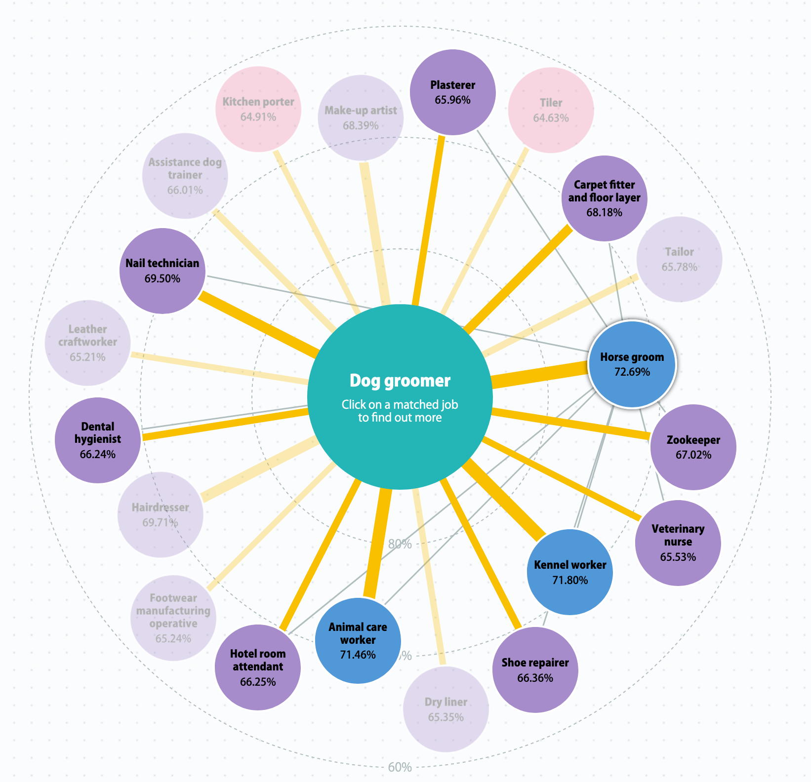
- Here’s a neat website from PensionBee to explore careers. It has a limited knowledge base but could help identify jobs that could be suitable for a change in roles. It looks like it’s written from scratch which is pretty uncommon.
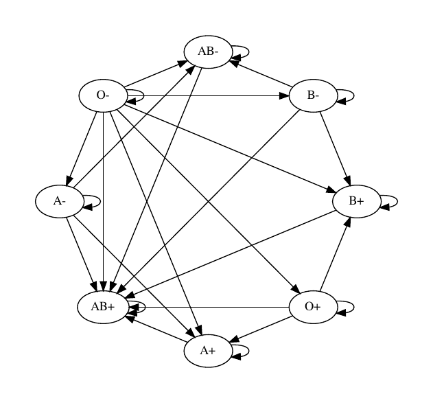
- I thought this was a fresh view of blood group compatibility drawn using Python. Is it any more readable than the traditional compatibility table? Probably not.
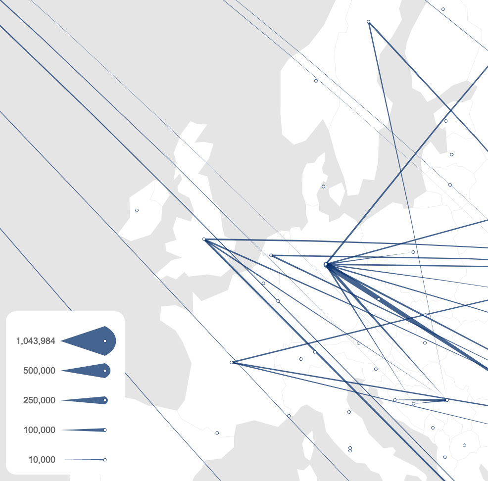
- Here is an example of a beautiful “flying meteor” effect to show an origin-destination plot for refugees back in 2012. Who said links need to be uniform width? This was built by Ilya Boyandin who continues to do excellent work in 2020. I’m looking forward to covering some more of their origin-destination plots next time.
Thanks again for subscribing, I hope you enjoyed this edition. Please tell your friends (the nice ones) and don’t hesitate to hit that unsubscribe button if this just isn’t your bag.