Hi, I’m Christian and this is a newsletter with interesting content and links orbiting the world of graph. I had too much stuff I wanted to write about this week so rather than overwhelm you all, I decided change tack and focus on some particularly visual topics.
Don’t forget you can respond directly to this email if you have any feedback or suggestions—I’d love to hear from you.
Graphs
Do you ever feel you’ve completely missed out on some quintessential pop culture? I regularly get this with movies. It turns out I’ve managed to somehow miss watching the vast majority of movies you see on top ten lists.
The Godfather? Jaws? Pulp Fiction? Blade Runner? It’s a Wonderful Life? Forrest Gump?
I haven’t seen any of them.
When these movies come up, I seem to be able to bluff my way through the core concepts or make at least one reference to it. Maybe I’m actually misremembering and I’ve seen them a long time ago? Weirdly, in some cases, the soundtrack has found its way into my psyche and buried itself for recall at the oddest moments. In almost all cases, I’ve probably seen something that has subtly (or not so subtly) parodied the story or feel of one of these “must-see-before-you-die” movies.
Due to the widespread self-isolation orders, I found myself finding time to watch all of the Indiana Jones movies and had this strange form of deja vu. It’s probably down to the unimpeachable soundtrack from John Williams; when the main theme swells near the end of the movie after being teased at length there’s a strong emotional resonance.
One classic centerpiece in these movies are the transitioning travel scenes. Indy’s plane is shown to be travelling between destinations with a red line marking the path along the way.

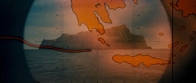
In 2020 the time taken to show this line crossing the globe is quite indulgent but I’m sure it was relatively impressive when originally shown in 1981. It also works on a separate level as it’s portraying 1930’s aviation in the Indiana Jones universe.
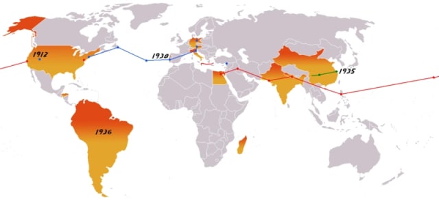
Of course this map is a graph, or more specifically an origin-destination graph. Here’s a collated version from all the movies:
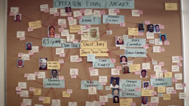
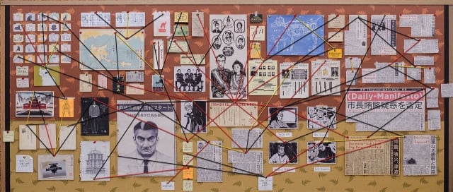
A similar (and also classic) visual set-design piece is the use of photos and papers on a wall connected by yarn attached with pushpins. Extra points if the yarn is red. Here’s one from HBO’s documentary McMillions showing the connections between Jerome Jacobson and those he recruited to claim millions of dollars worth of prizes via stolen game tokens.
You’ve perhaps seen this trope so many times without giving it a second thought but I promise you’re now going to notice these everywhere.
I’ve spoken before on the prevalence of what I thought were grimly called “murder boards” but I recently discovered they are more commonly known as “crazy walls.” Fundamentally, they’re a tactile, highly visible, analogue way to give the impression of complexity and conspiracy. They work well as a visual device to show off-screen analysis. They’re also a shortcut to indicate time has passed and that individuals are fully invested in the analysis of connections between key players. In other words, as a viewer, you can almost imagine yourself walking up to the wall and drawing the fresh connection that cracks the case wide open.
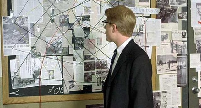
It’s always nice to stumble upon collections of things once you know the name for them. Phil Gyford has been collating excellent examples on his Crazy Walls Tumblr since 2011. It’s fun to scroll through and see the similarities between various walls. I suspect the most familiar example of a crazy wall is this one from A Beautiful Mind (and no, true to form, I haven’t seen it…)
There’s a loose classification at play here, suggesting some walls simply exist to expose a frenetic energy. The archetypal example of this comes from It’s Always Sunny in Philadelphia:

You probably recognize this one as a meme that is generally seen as a shorthand for “conspiracy theorist”.
On the other end of the spectrum we have extremely clean, organized boards such as these two from Wes Anderson’s Isle of Dogs.
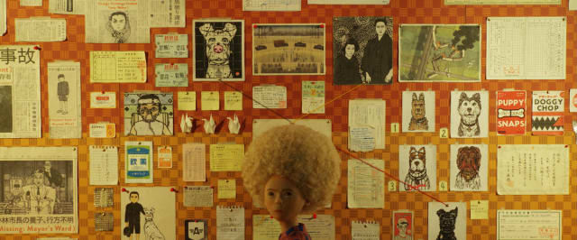
They’re reminiscent of the practice of knolling—another form that you probably didn’t realize had a name—and bring a sense of calm to the situation at play.
(I love good meta content so here’s one more crazy wall I couldn’t resist sharing: a crazy wall of TV crazy walls)
In writing this newsletter I’m exploring how real-world connections between people and things exist beyond the categorization into node-link diagrams or graphs. I think crazy walls are the closest thing we have to a physical, recognizable manifestation of the craziness of connections. While the vast majority of people have likely never bought yarn, a bulletin board and post-its to build their own crazy wall, the existence of them in popular culture is surprisingly familiar and in a crazy way, almost comforting.
Nodes
Usage of web conferencing has exploded in the past few months. Take popular web conferencing tool Zoom, used by more than 200 million callers in March, up from 10 million in December.
There’s something satisfying about selecting virtual backgrounds when using a webcam, a feature Zoom provides to those blessed with a powerful-enough laptop. I’m not sure whether it’s because it feels especially futuristic or just liberating to hide whatever mess may be behind your desk. Regardless, there’s quite the global competition to find the most subtle, hilarious or outrageous backdrops for your now-fully-remote workday.
All that’s to say here are a few Zoom virtual backgrounds you’re welcome to use to show off your graph credentials.
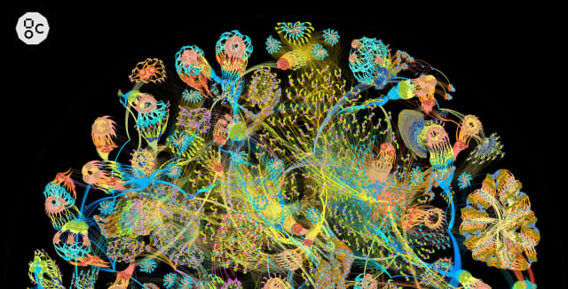
Let’s start off with something arty. Here’s an eye-catching neural network visualized as a large directed graph using Gephi. This was created by Matt Fyles (GraphCore).
Yet another example of something you won’t stop seeing now I’ve pointed it out: particles.js is a library used by literally thousands of websites as an atmospheric page background. You could make your own background here by why not rep the source/target color palette?

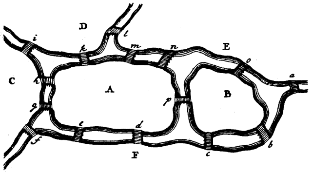
Familiar to anyone who’s taken an “introduction to graph theory” course, here’s Euler’s Seven Bridges of Königsberg. It was Euler’s birthday on the 15th, why not celebrate his legacy with this iconic map?
And here’s one more, strictly for fans of Neo4j… Here you’re the result of a Cypher query in the Neo4j Browser.

Oh and Phil totally beat me to the punch with his collection of crazy walls, all perfect for use as a virtual background.
Links
I missed this article from the DVS Journal Nightingale last year. In it Johnathan Dunne walks through using hive plots and similar techniques for the visualization and exploration of categorical data.
TiddlyWiki has been around for over 10 years but was featured on Product Hunt last week. It’s another example of a knowledge base where the core storage is of connected data. I recently found the plugin TiddlyMap to allow maps to be built on top of a TiddlyWiki instance.
NebulaGraph has a reasonable coverage of the differences between common graph query languages but as usual I find the comments from the Hacker News submission to be just as illuminating. Maybe I’m just drawn to anecdata but there’s a lot of interesting perspectives in that thread.
Miro is a remote collaboration tool for teams. Research Engineer Andrey Gasparian has posted a good primer on their blog looking at the use of graph visualization for understanding collaboration.
Thanks again for subscribing. Stay safe, I’ll see you all again in two weeks.