Graphs
One piece of lore about Steve Jobs, mainly perpetuated by his 2005 Stanford commencement address, was that his early exposure and interest in typography set him on a path of innovation and attention-to-detail that, ultimately, fuelled the growth of Apple.
As an outsider, the world of font design and typography has always daunted me. It’s hard not to feel intimidated by a topic that’s thousands of years old. I like to think I appreciate good typefaces when I see them but – like with other design elements – I struggle to understand how fonts should be evaluated and selected for maximum effect. Fortunately, I’ve recently found two resources to help me with this.
Adventures in Typography from Robin Rendle is a inspirational weekly coverage of fonts and types that have caught their attention. It’s always fun to read someone’s deep dive into a creative topic and I hope to pick up some of Robin’s enthusiasm along the way.
I also finally found time to digest two of Edward Tufte’s famous books on design, “Beautiful Evidence” and The Visual Display of Quantitative Information. Whilst not directly about typography, these are searing, authoritative resources on design and there are enough lessons in both to last a few lifetimes. May I be the latest in a long line of people to recommend them to anyone with even a passing interest in data visualization.
Vertex Complement
My typographical toe-dipping all came to a head last week when I started work on the new website for source/target. My current site is bolted on top of my personal site and cobbled together with some dubious build processes and questionably-crafted CSS. New(ish) year, clean slate etc. It was all coming along nicely until I hit a roadblock: of selecting complementary typefaces.
I’m told that fonts should have personality and complement each other. On one hand, I could just pick a couple at random that I think look nice but surely I should do the selection more justice than that? At a risk of sounding immodest, WWSJB?
Fifteen minutes of rabbit-holing on Google later–including this illuminating article–I emerged with some new instincts on choosing the “right” fonts for my site (I’m probably going with Proza Libre & Cormorant Garamond, thanks for asking). Of course, I was also distracted by the following table of suggested rankings of various typefaces, as published in U&lc from 1992.

Some readers will recognize this table as an adjacency matrix. By tracing the column and rows you’re rewarded by a judgement on how suitable each pair of typefaces are for combination.
Other readers may also find it reminiscent of Mario’s Picross from Nintendo. I’m not sure what the overlap is between these two groups of people I know it includes at least me.
Font for thought
There are at least two interesting characteristics of this matrix:
Firstly, it provides a judgement on mixing the same typeface as both the display (otherwise known as a header) and the body text. This isn’t a given in these matrices, the center diagonal is often blanked out as it’s not possible to cross an entity with itself – for example if you were encoding the likelihood of a win between tournament participants: I can’t beat myself at chess.
Scanning down the diagonal we can spot at least one example where it’s not recommended to combine two of the same typefaces. Matching Benbo with Benbo loks like a no-no.
The other characteristic is that various typeface pairings are deemed to be suitable one way round but not the vice versa. It reflects the opaque world of typography that the author decides that those worked as headers matched with body text but dissuades the opposite.
This table excels once the reader has a chosen a typeface wishes to find a suitable partner. I spotted the above two matrix characteristics with ease but found it much harder to generalize them: it’s difficult to trace the diagonal (especially on a screen) and almost impossible to mentally compare the elements mirrored by this diagonal.
Tufted Types
These challenges are mainly a result of the spare, stark styling of the adjacency matrix. I was curious if I could apply any of the advice from Tufte in building a fresh representation of this chart.
I was particularly interested in surfacing the actual typefaces in question. One of the key takeaways from Tufte is the value in making visualizations as easy to interpret as possible. One approach to this could be as simple as reducing the amount of flipping between pages to compare charts or find supplementary figures, references and footnotes.
This also reminded me of the design methodology promoted by Don Norman in his book “The Design of Everyday Things”, that of “self-documentation”. What if we do the usual transformation of adjacency matrix into a graph but, crucially, surface the actual typefaces in question in the chart?
By the way, it’s actually quite hard to find some of these fonts in 2021. Perhaps it’s because I’m on a Mac but fewer were already installed on my machine than I thought would be the case.
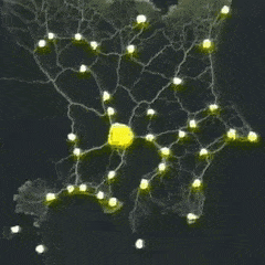
After the initial hairball view of all fonts connected to each other I decided to focused on the font pairs that had the lowest rankings, the “think again” pairings. By visualizing just these typefaces I can begin to understand why they may not go well together.

What if we take another step out and add additional nodes with examples of the two fonts together? The result is messy and overwhelming but our view of the pairings is looks a little like this:

I leaned on my trusty force directed graph for these example but I think the use of an alternative representation would be a good next step.
Links
- Incredible portraits of birds in flight
- An updated graph and dataset of the London Tube Map
- 50 years of Pascal – love the retro syntax flow diagram on show here
- Applying network analysis to Egyptology research
- A striking map of global internet infrastructure, updated for 2021
Nodes
I learned a new term this week. The “asymmetric dominance effect” is the counter-intuitive behavior where an additional, “decoy” option can result in a change in behavior.
There are clear examples of this in marketing and sales. Take the addition of a product tier with an lower, “anchor” price. By introducing this into the mix a consumer automatically changes their perceived value of the other tiers.
But the phenomenon isn’t limited to humans. It relates to slime mold and their apparent favorite food:
The slime mold likes the small, unlit pile of oats about as much as it likes the big, brightly lit one. But if you introduce a really small unlit pile of oats, the small dark pile looks better by comparison; so much so that the slime mold decides to choose it over the big bright pile almost all the time.
Something about your friendly neighborhood slime mold striving the largest number oats really captured my imagination. But there was something this reminded me of that I couldn’t place. Flubber? Alex Mack?
Turns out it was a video I first saw a few years ago: by emulating Tokyo and the surrounding areas with strategically positioned oats, slime mold was found to spread in a way that closely resembles the metro system for Japan.
Perhaps we need to take time to reconsider our infrastructure projects. I can see the headline now:
“Slime mold completes metro system replacement significantly under budget with surplus of oats”
TikTok, as per Nathan Fielder, "is a children’s dancing app.”
I’m not on TikTok, partially because I think I’d get addicted in fewer than 15 seconds. I have, however, noticed the increase in innovation and creativity on show in the countless 'toks uploaded daily. A follow-up article from Eugene Wei on the network effects of TikTok is an interesting deep dive. I liked this section:
TikTok beatmaker Ricky Desktop pictured, in his head, dancers performing some movement. Then he wrote a piece of music that included a musical cue intended to elicit that exact movement.
Then, later, some dancers on TikTok performed the movement he had pictured, exactly at the moment he had inserted the musical prompt. It’s not just that he choreographed the human body via music, but how he did it. Ricky Desktop is a marionettist manipulating human bodies not via strings but music.
The program WinAmp used to do software visualizations of music. TikTok is like Mechanical Turk for visualizing music.
Finally, over on Twitter this week, MC Hammer shared a research paper exploring citations across various scientific disciplines.
Yes, you read that correctly.
Quantum physicist and computer scientist Michael Nielsen highlighted some graphs of note from the paper:
I really wasn't expecting MC Hammer to become a source for ongoing research projects. But, well, here we are. This graph is striking, showing the share of citations to philosophy of science papers from other fields. https://t.co/WQD6hy1ari pic.twitter.com/bVqOGZD4A1
— Michael Nielsen (@michael_nielsen) February 24, 2021
As MC Hammer says,
Elevate your Thinking and Consciousness. When you measure include the measurer.
Last call for one minute of your time: the annual (sure) anonymous survey on source/target is still open! Your feedback has really helped me plan for the future with this newsletter.
Until next time! 🤹♀️