* knock knock *
A muffled voice behind the door: Hello?
* There are some shuffling noises before the heavy wooden door creaks open. Inside stands an old woman whose blank expression wrinkles into mild recognition. *
Teacher: Oh! Hello my dear. It’s Christian, right?
Me: Yeah, that’s right… Christian – I write that newsletter about graphs and networks, you probably signed up at sourcetarget.email a while ago. It’s really great to have you as a subsc…
Teacher: You still write that thing? Interesting.
Me: …Yeah, it’s been a sluggish source/target summer but I’m ba…
Teacher: You know, a lot of the newsletters I subscribe to have given up and stopped a while ago… I figured you had done the same? But tell me, what’s a newsletter without any new editions? Without subscribers? Without an author?
Me: Er, I’m not sure. I’m just here to deliver the latest edition. Sorry it’s been a while. You could always unsubscribe if you don’t think it’s worth it.
Teacher: Please do not be alarmed, your newsletter is fine! I must admit I sometimes fall asleep by the fire before I finish it but I do that with most books. Now, tell me: Do you know what a Socratic dialogue is?
Me: I think so? Isn’t it a conversation made up of questions to help illustrate a point?
Teacher: Indeed. Can you imagine why that might be helpful?
Literary Loops
I’m caught in a vicious cycle with the library down the road.
It starts with a book recommendation online or through a friend. I love hearing these as there’s such a strong signal to noise ratio: I’m likely to enjoy a book recommended by a friend or someone I respect.
First thing I do is check to see if it’s in the library catalogue and put a hold on it. Almost without fail I forget I’ve done this until I receive an email notification that it’s ready to collect. Once checked out it sits on my shelf as I work hard to clear the backlog of all the other books that have followed the same path. As the return date approaches I’m hit with an anxiety that I won’t finish it in time. Meanwhile, non-library books have a much longer shelf life so they sit abandoned as I struggle to plough through the more pressing borrows.
Despite the anxiety, I am grateful that my library loop has led to completing far more books this year than perhaps any other in my life. It means I can make my own hearty recommendations like the following heartiest recommendation of Ministry for the Future by Kim Stanley Robinson.
It’s speculative fiction crammed full of non-fictional content and a profound, heartening look at climate change. It explores what humans could do in the future to handle things a fair bit better than we seem to now. It’s a touch idealistic, sure, but I was taken by the idea of a carbon coin: a cryptocurrency backed by central banks to reward and promote ecological actions.
Cold Chillin’ Cold Chillin’
It’s taken me a long time to finish this podcast interview with cognitive scientist Joscha Bach. I have to listen in chunks as it’s dense; stuffed with ideas and non-sequiturs that take me by surprise. I sometimes consider ratcheting podcasts and audiobooks up to 1.25× speed but 0.5× may be more appropriate to take in the full breadth of Bach’s thinking.
Joscha Bach’s suggestions are aligned with the reality presented in Ministry for the Future: humans will persevere via the technology that will afford us life in the face of climate change.
In the podcast Bach describes cold cooling chains, an existing real-world network that will only become more prevalent. This is the idea that you pass through bubbles of air conditioning in your transit from A to B. Home to the car to work to the grocery store.
The global supply chain already takes advantage of cold cooling chains. Think of produce leaving factories in air-conditioned trucks, delivered to supermarkets directly into their refrigerated depots. As temperatures rise air conditioning use will increase, which, ironically, will contribute to more emissions from the use of air conditioning, requiring humans to adapt in other ways.
No Gas, All Brakes
Supply chains and manufacturing are an infinitely complex chain of dependencies. Billions of components are manufactured, transported and combined into products every single day. Any minor disruption of that chain can result in surprising impacts down the line.
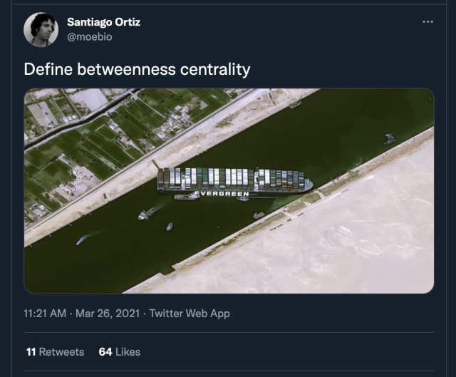
And supply chains have never been more visible than in the last two years. We’re already reminiscing about the toilet paper panic buying prompted by fears of impending supply chain collapse in early 2020. This visibility was a topic of global interest as we followed the sorry state of the Ever Given stuck in the Suez canal as an evergreen talking point.
And now, right on time for the return of source/target, my home country is hit by (at least two) major disruptions.
Petrol prices in the UK this week have reached their highest price since 2013 and a shortage has taken hold. Drivers are being begged not to fill water bottles with gas station petrol.These shortages combined with the rumors of them provide a vicious cycle of panic buying and finger pointing at the potential it’s a result of the B-word (Brexit).
Meanwhile the price of natural gas has grown 420% on an annual basis in September. This has lead to the indefinite closure of two US-owned plants providing over half of the UK’s food grade carbon dioxide. Aside from use in carbonated beverages it turns out this is the main way animals are slaughtered for British meat markets.
As succinctly put by Rusty Foster at Today in Tabs:
Each link in this chain is a distinct potential sub-disaster, involving risks to the U.K.’s overall heating and energy supplies, fertilizer supplies, and food supplies.
Just like cold cooling chains there’s something clinically compelling about a network made up of sub-disasters.

There’s likely to be an element of the bullwhip effect at play here. In short, the further down the supply chain you go the more likely you are to see larger variability in inventory levels. The result? Wild oscillations of availability and fulfillment.
In the studies conducted with a simple four-step supply chain, small variations in initial demand could lead to order amplitudes of 900 percent only four steps down the supply chain.
These studies demonstrated that the main cause for erratic fluctuations of order sizes and inventory levels in supply chains was actually not the amount of uncertainty of the demand function but the characteristic of the supply chain and the behavior of the supply chain managers.
Hunting of the Snark
Regular readers will recall the many submarine cable maps I’ve shared around here. These colourful spaghetti lines are popular as they are the closest thing to a depiction of the internet we’re likely to see. They remind us of the precarious invisible wires and cables that bind us across the globe.
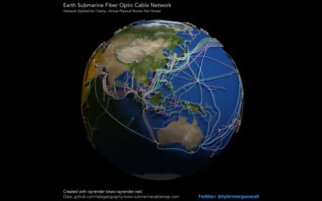
The latest popular map render was created by Tyler Morgan-Wall using a technique called “ray tracing” and has been shared across the very same network it depicts. It’s a fantastic piece of work, all the more impressive as it’s leveraging R, a programming language typically reserved for academic and data science number crunching.
Many were dismayed to see criticism of the work from the venerable Edward Tufte this week. His bizarre response is in contrast to the teachings that he himself has espoused for decades.
I’ve seen this before. Data visualization feedback can be dismissive and hurt the feelings of the creators. In a recent article Cole Knaflic notes that this is a distinctly asymmetric arrangement: it might take days to build a compelling visualization but mere seconds for an observer to dismiss it for an apparent mis-used chart type or color.
As in supply chains, one could think of rash critique by respected community figures as the start of a bullwhip effect of criticism. A small snide comment can be magnified by the characteristics of the medium delivered (in this case Twitter and other echo chambers). Think of an early career developer with limited confidence; noticing the full force of the bullwhip on others at the receiving end of ill-judged criticism. Perhaps they’ll decide it’s not worth putting their work out there.
Ben Jones has written about the Love Fest vs. Shark Tank scale of community feedback. On one end everyone responds with platitudes and positivity, but on the other extreme, observers are tripping over each other to dunk on the piece, or worse, the creator. A common take is to insult the author’s fundamental choice of chart type – choosing from a vast taxonomy of potential approaches – thereby falling into the trap that certain charts are inherently “bad” or never useful.
(I think source/target’s rule of “be nice” pushes it firmly into Love Fest territory.)
Both Jones and Knaflic advocate for a thoughtful, measured approach to providing feedback. A core tenet of each is asking whether the creator is prepared to receive notes at all – this simple step is a hallmark of good management so it makes sense that it’s a good idea when sharing feedback with peers. Another suggested approach is to engage in a Socratic dialogue. By asking questions and actually listening to the response you may uncover consideration or intent that may not have been obvious.
So, what about those “you used a pie chart therefore your visualization is bad” arguments? In his new article, “Data Visualization Has a Taxonomy Problem,” Elijah Meeks encourages data visualization practitioners to break out of their “taxonomic thinking” and consider the ingredients that make up popular chart types with their value and strengths rather than the classification of the chart type itself:
Avoid casual critiques based on chart types – Look more at the whole meal rather than the individual dishes.
Community Linking
When I scan my list of books read this year a few jump out with unbearable titles for reading in public. “The Courage to be Disliked” leads the pack with “How Not to be Wrong” as an insufferable close second.
Nevertheless, both are eye-opening explorations of psychology and mathematical thinking, respectively.
The Courage to be Disliked takes the form of a Socratic dialogue between a student and a teacher. It summarizes the psychology and philosophy of Alfred Adler, an Austrian medical doctor, psychotherapist from around the 1900s.
One notable suggestion of Adlerism is that when speaking to others one shouldn’t “praise or rebuke” – the idea is that these actions promote “vertical” relationships. By praising you are implicitly defining yourself as superior to others. You’re emphasizing that you’re in a position to be judging them. Instead, Adlerism promotes the cultivation of “horizontal” relationships through the expression of gratitude.
A community of peers expressing nothing but gratitude is the purest form of “Love Fest” I can think of. It also sounds impossible – I don’t think it’s reasonable to avoid praise or criticism.
I think the following progression of feedback has merit:
public display of gratitude
private discussion of visualization decisions and intent
suggestions for improvement, if creator is willing to receive them
Like the intricate supply chains that shape our daily lives Adler recommends recognizing that each action we take influences others in our community. This is applicable to data visualization communities but with a twist:
When Adler refers to community, he goes beyond the household, school, workplace, and local society, and treats it as all inclusive, covering not only nations and all of humanity but also the entire axis of time from the past to the future.
Adler’s community even includes inanimate objects, like the ones shuttled through our supply chains. We talk about a wide range of interconnected processes in this newsletter but with this definition Adler took network thinking to the extreme.
Chain Reactions
A butterfly effect of community behavior leads to supply chain shortages and unpredictable impacts. When a respected industry figure delivers an ill-conceived critique it starts a chain of criticism that descends into bullying and belittling. Snark begets snark.
Thanks for reading, see you in a few weeks!