I’m Christian (👋) and this is my bi-weekly (fortnightly?) newsletter with interesting content and links orbiting the world of graph
Graphs
At it’s best, the internet connects and inspires those with common interests. The stranglehold of social media on most web content in 2020 makes it easy forget that we have also enjoyed 40+ years of web forums, bulletin boards, Usenet communications and other discussion groups.
I’m not old enough to have really embraced Usenet but Andy Baio’s investigation into a weirdly specific group is worth the read — if you’re into that sort of thing.
Disparate interests can sometimes converge and intersect in fascinating ways. Take this tweet featuring a simple coincidence of initialism:
Putting "IPA enthusiast" in my dating profile that doesnt exist so when girls want to talk to me about craft beer I can smoothly redirect the conversation towards phonetics
— Michael Chertoff ❁ (@MichaelShirtOff) April 24, 2020
This week I’m going to thoroughly dissect the frog and look at graphs from two surprising angles: linguistics and craft beer.
“It’s pronounced ə”
The International Phonetic Alphabet (IPA) is a set of symbols that linguists use to describe the sounds of spoken languages. You’ve probably seen these in the dictionary (remember those?) at the top of a Wikipedia page as a way of clarifying the pronounciation of a particular entry. While actual pronunciations can vary wildly the IPA symbols — otherwise known as glyphs — help us classify groups of sounds that are roughly the same.
On the topic of accents, this video is quite the tour of the variety you’ll find across the UK and Ireland
For the unfamiliar, the characters can look pretty intimidating. Turns out there’s a cottage industry of instructional language videos on YouTube for those looking to learn English and adjust their accent.
I’ve been obsessed lately with developer Josh Comeau’s site — not only is it a fabulous collection of educational content but the user experience on the site is delightful. The first post I saw from his site was one suggesting the internet should be louder. Josh explains that while this can be a real annoyance on a lot of websites,
When done tastefully, sound can make a product feel more tangible and real.
Clicking around on Josh’s site I’d agree. Audio in graph visualization is underutilized and something I’d like to explore in the future.
Sound is also informative when presenting or explaining something inherently audible. The Interactive IPA Chart could be seen as a graph of vowels and other symbols that help one get a better feel for IPA:

It’s fun to slide up and down the close <-> open range and hear the tonal changes of sound. Note the ə in the center of the graph — this glyph is pronounced “schwa”. As per Wikipedia it’s the most common vowel sound in the English language.
You’ll find it lurking in lots of words:
- ‘a’, as in about [əˈbaʊ̯t]
- ‘e’, as in taken [ˈtʰeɪ̯kən]
- ‘i’, as in pencil [ˈpʰɛnsəl]
- ‘o’, as in memory [ˈmɛməɹi]
- ‘u’, as in supply [səˈpʰlaɪ̯]
- ‘y’, as in sibyl [ˈsɪbəl]
but it can even be “unwritten” as in the word “rhythm” [ˈɹɪðəm]
Graph Hops
IPA also stands for India Pale Ale — a name given to describe beer that was traditionally heavily hopped in order to last the voyage between the UK and India. As Bon Appetit notes in their “abridged version”:
British sailors, while sailing to India, loaded up barrels of beer with hops, because hops were a preservative. The hops hung around in the beer for so long that they lost their fruity flavor and left a bitter tasting beer. So … British IPAs are malty, bitter, and one-noted. […] These are best consumed on some kind of a cliff with sea mist spraying in your face.
As a Canadian newcomer unable to make it back to the UK this year I’m actually missing British IPAs quite a bit. My quest to find the equivalent over here is foiled somewhat by all the strong Canadian beer.
There are now a wide variety of beers that are classified as an IPA, not all of them are as bitter as traditional British ales. That’s why you’ll often hear conflicting opinions on IPA preference – how can a beer be both “too weak and bitter” and “extremely strong and floral”?
PopChart’s “The Magnificent Multitude of Beer” chart helps to clarify the classification of certain tipples. For a more gra(i)nular look this graph from Reddit user takeasecond provides a summary of the ingredients of over 6,000 different IPA recipes:
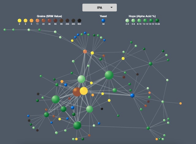
The node color maps to either the grain color or hop bitterness while the relationship width is determined by the number of times two ingredients appear together.
If a) this newsletter was American and b) each edition was a year it would be apt that edition #21 — predominantly about alcohol – would reach the legal drinking age. Neither is true so I’m not sure what point I’m making here.
Wash your craft out
The explosion in popularity of craft beer across the world hasn’t been unnoticed by Big Alcohol. There’s been a dramatic increase in acquisitions and mergers that may mean your favorite hand-crafted brewery is now owned by a multi-national conglomerate.
There have been a few attempts to map out the circumstances of “craftwashing” as it has been coined. Phil Howard updated his 2017 summary of the landscape to reflect a number of recent changes to the space.
Meanwhile, Mike at The Mad Fermentationist collated a web of brewery collections and has been updating it for a few years. Landscape maps with hundreds of logos always capture the imagination and his latest reflects the landscape as of December 2019.

After the rabbithole of research into linguistics, language and the IPA for this edition my head is spinning — it’s a rich domain with fascinating backstories for the language we use today.

As part of a supply chain webinar for Cambridge Intelligence I presented an application that took data from the Liquor Control Board of Ontario to visualize the various tasting notes of alcohol. I enjoyed building this demo and the recording is available here.
Links

- Submarine Cable Map, a fascinating look at the cables that connect us across the world.
- Cartography, a Python tool from Lyft to analyze infrastructure assets and the relationships between them
- Electoral College Decision Tree, in the aftermath of the exhausting US election cycle here’s a clear look at what could have been.
- Graph by Gensler, a collection of analytic tools to enrich the planning process for the design of spaces.
- Historical Network Analysis – a video introduction from Martin Grandjean
Nodes
My Little Crony

The name of the project is pretty inflammatory but this visualization from Sophie E Hill shows tight web of connections between “Tory politicians and companies being awarded government contracts during the pandemic.” It’s pulled together from a variety of sources and all the data and code is available on GitHub.
Hill’s great work has been picked up by a variety of media reports. It’s great to see how her graph has captured interest and prompted some interesting further analysis by others.
25 years young
Visual works from influential network scientist Albert-László Barabási and the Barabási Lab are featured in a new exhibit at Ludwig Múzeum in Budapest. Background for sections of the exhibit are being posted weekly on Instagram and there’s a long-form discussion over on YouTube.
25 Years of Network Visualization
— Albert-László Barabási (@barabasi) November 2, 2020
For the Ludwig/ZKM Museum Exhibit we prepared a timeline, to show the visual vocabulary of the BarabásiLab. In the coming week I will tell the story of each image within the timeline on https://t.co/L3W0NrMXIS#barabasilab pic.twitter.com/2Q9dEOmhr5
Not the first time I’ve featured hot takes from Conor White-Sullivan in this here newsletter but on the topic of inflammatory comments his suggestion that it’s “All downhill since [1995]” is pretty bold! What do you think?
Also from Barabási Lab and new to me is this earlier exhibit on the “(Virtual) Physicality of Networks” with a neat complementary website.
Thank you for subscribing, I’ll see you in gasp December!
Have you found something interesting you’d like me to share? Let me know! Why not share this edition with someone you think would enjoy it?