Graphs
If you were feeling charitable I suspect I could persuade you that everything is an infographic.
Your standard internet infographic of 2021 aims to be a number of things. It’s an eye-catching, sharable, bite-sized piece of content, typically confined to a tall—very scrollable—rectangle. It offers a glimpse into a topic through some core elements, helpfully dragged-and-dropped into the Canva page of life.
To put it simply an infographic is a mash-up of information and graphics. Let’s take this broad classification and run with it.
Diagrammatically speaking
Infographics are a bloviated term for diagram – a visual depiction of a process or situation. If infographics are diagrams then diagrams are infographics. Consider the instructional manuals from IKEA that aid DIY-ers with their modest construction projects.
There’s an argument that if you can remove the graphical elements of an infographic without creating any confusion for the viewer then it was never an infographic in the first place. You could build a Billy without the labels in an IKEA guide because the visuals are so informative, though it may be a challenge without any numbers, arrows or exclamation marks.
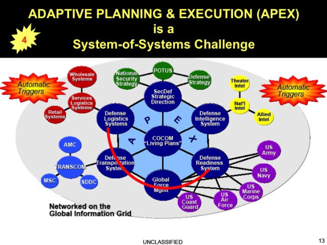
Paul Ford’s fantastic article on military infographics highlights a number of “incredibly cool and simultaneously insane” maps and networks used in US military training materials. The complexity in some of these is inspirational and terrifying – there’s no doubt they’re infographics though.
STOP
Road signs are infographics. Often distilled to a simple pictograph, their presence by a road or intersection is both graphical and informative. You could quibble that road signs are such an atomic piece of information that they don’t count as an infographic. There’s an assumption that solitary graphics can’t reach a threshold of information to deserve that term. “A pie chart isn’t an infographic” they’ll sniff. But frankly, who cares? It’s a graphic and it’s informative. Case closed. Furthermore how would one set that theoretical information density threshold to qualify? One datum per pixel? It’s preposterous.
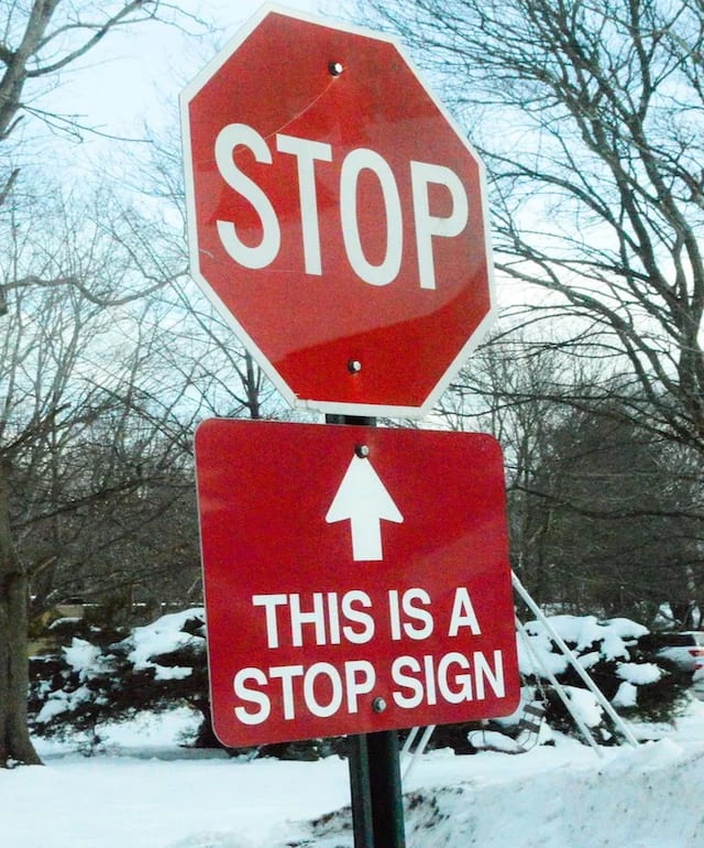
In fact, a lot of consideration went into the design of the humble stop sign over time. This included some intriguing thoughts on the shape of the sign itself, as illuminated by the podcast 99% Invisible:
“The recommendations were based on a simple, albeit not exactly intuitive, idea: the more sides a sign has, the higher the danger level it invokes. By the engineers’ reckoning, the circle, which has an infinite number of sides, screamed danger and was recommended for railroad crossings. The octagon, with its eight sides, was used to denote the second-highest level. The diamond shape was for warning signs. And the rectangle and square shapes were used for informational signs.”
Even the number of sides hints of the information provided in the road sign infographic.
While we may take this for granted today, Even the “number of sides” is yet another piece of information in the road-sign-as-infographic.
All your graphs are belong to us
For most websites the use of infographics is intended to prompt surfers to share a watermarked image on social media and similar with the aim of attracting more eyeballs.
The vast majority of infographics are static which promotes screenshotting and bit rot as various image compression algorithms take over and start the process I can’t be the first to coin as “dankification.”
If infographics are basically treated as memes that probably means memes are infographics.
Can I have your artograph?
What about art? Paintings? Photos? That’s a tough one. For the petty purposes of my argument I’ll say these are definitely infographics but the true answer is probably the fateful “it depends”. An observer with an awareness of materials or medium may find a painting to be as informative as your basic viral infographic. Content and composition in a photo may betray facts (aka information) about the subject in focus.
In the Renaissance, patrons used art to show off particular knowledge associated with wealth or solidify their social status. Commissioned artwork often depicted stories understood only to those with education or a religious upbringing. During Europe’s “Age of Enlightenment,” a neoclassical style became hugely popular after the discovery of Pompeii and subsequent popularity of the Grand Tour, which saw wealthy tourists return home with “souvenirs” from Antiquity. Greek and Roman aesthetics (think columns, vases, togas, and weird dolphins) conveyed carefully curated imagery that said a lot about the contemporary ruling classes’ ideals and interests.
Andrew Bird’s recent album – with the firmly-tongue-in-cheek title “My Finest Work Yet” – has the cover art of the artist in a photo-perfect match of a Jacque-Louis David painting from 1793. The original painting depicts Jean-Paul Marat,
a radical journalist during the French Revolution and one of the leaders of the insurgency against the Crown. He took frequent medicinal baths to soothe painful skin infections, and he wrote most of his most famous works while soaking in his tub. That’s where he was assassinated by the conservative royalist Charlotte Corday; shortly after, David painted him as a martyr, a stab wound to the chest stained his bathwater red. (source)
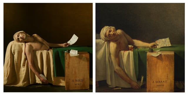
If you know what you’re looking for there’s a lot of information in the painting – it’s an infographic of sorts, but a subtle one. When an observer has knowledge of a work’s context – the artist, contemporary events, popular taste – this infographic can convey whole new levels of meaning. By invoking the original, Bird takes all this information and applies a fresh layer of intent through its use.
This stirs up memories of our discussion of medium vs. message back in #16. Just like the placement of our roadsign transforms a simple symbol into vital communication, the aesthetic reference in a painting or photo can tell us a lot.
(At this point I’ll refrain from the argument that “cave paintings are infographics” and point you to this wonderful Twitter thread. )
Attention, bibliophiles!
Okay well what about books? Are they infographics? Is that a resounding “no” I hear? I assume I’ve started to lose you here. It’s hard to argue that books are infographics. Their covers perhaps, with an on-trend cover design, title, author and blurb (perhaps even some notable testimonials) – now that’s an infographic. But why not the content of the novels themselves?
The more information we have takes us further from that summarized snippet of content. Infographics don’t have a minimum requirement for information shared; it is more accurate to say there’s an upper bound. Too much information and it’s no longer digestible with ease. This definition is easier to formalize through something like Kolmogorov complexity – if we can’t describe an object with a simple-enough algorithm then it’s probably not an infographic.
Death of the Poster
The argument for mass over-classifications aside, when I first mentioned the word infographics there was probably a particular you had in mind. There’s a significant downside to these colorful bite-sized morsels of information.
The vast majority of infographics are supplied in image form which renders screen reading technology without unreliable OCR inert. Infographics are far from accessible.
It’s common to see small print references at the bottom of infographics but this is often a few short words of a datasource or a long URL that no one is going to take the time to type out.
Infographics often prioritize form over function – for many their accuracy is an afterthought. Online their context is at risk with the very first share. In geospatial mapping there’s a concept of cartographic generalization where aspects of maps are summarized to reflect the current zoom level. This can lead to misrepresentation or confusion.
(An interesting topical, semi-related recent story.)
As we’ve learned through a quick dive into art (and road-sign) history, context is not always very obvious to a current observer.
Info Wars
Ultimately you’ll probably win the argument – my broad acceptance of most visual media as “infographics” is a bit of a stretch. Nevertheless it’s fun to think about!
As the media’s use of information visualization has become more commonplace our bar for what counts as informative and insightful is lowered. Too often short-hand for “researched and accurate,” infographics – whatever form they take – mimic detailed data analysis and help to fast-forward to the takeaways, with a significant cost.
Links
- River Runner - Watch the path of a raindrop from anywhere in the contiguous United States. Go with the flow.
- A network analysis of COVID-19 mRNA vaccine patents (PDF)
- All the Passes – interactive viz of 882,536 passes from 890 football/soccer matches
- Lighthouses of the world – it’s not live data but it’s still fascinating!
- What do you get when you build a network of landscape architects? Sounds like a joke in need of a punchline.
- A neon web 2.0 Gallery of Large Graphs from the University of Florida.
Nodes
Oh hey, it’s been a while eh? Due to various, mostly boring, reasons it’s been a challenge to get source/target out the door. It doesn’t help that I had the phrase “everything is an infographic” stuck in my head and couldn’t move on until I had turned it into, well, something. I hope to stick to my usual biweekly cadence from here on out.
If you wish to support this little project I’ve opened up “Pay-Whatever-You-Want” subscription option with my newsletter provider Buttondown. Just stick your email address again in this box and you’ll make me very happy.
Invisible Roommates
Ever look around and consider the vast number of connected devices sharing bits and bytes around and passing through your home? I’m a staunch defender of the humble light switch but even without wifi-enabled lightbulbs there’s glut of constant, invisible signals and traffic all around us.
Invisible Roommates is a delightful exploration of that idea: what if you could see the invisible networks of communication as they ping and pong? There’s unfortunately no production version but it’s a neat use of Augmented Reality tech. For more background check out the commentary here.
Since I learned the word “rhizome” to describe tree-like, organic network structures I’ve struggled not to drop it into casual conversations as if I’ve been using it my whole life.
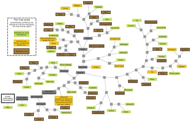
There’s no such thing as a tree (phylogenetically) explores what makes a tree a tree and provides a rich library of fancy biology words to add to my collection.
See also TimeTree, a public knowledge-base of the evolutionary timescale of life.
I had some great responses to the last newsletter!
On tracing the process of writing a novel, Duncan Geere shared this ace Chrome Extension for doing exactly that.
(Duncan and Miriam Quick just launched a new podcast on the topic of data sonification that’s worth a listen – it’s called Loud Numbers. Naturally I’m curious what a sonified network would sound like.)
Another timely extension I stumbled upon was Vandal – a wonderful little tool you can use to quickly jump to archived versions of websites from the Wayback Machine. I’ve already used this countless times.
The venerable Dr Albert-László Barabási wrote a piece for the New York Times on the invisible network of NFT transactions. He and his team minted and ultimately sold an NFT of the NFT network itself. I probably missed the boat on that one. Is it too late to do the same with one of my CryptoPunk networks? Probably.
Thanks for reading, see you in a few weeks!