Graphs
It’s Leonard Euler’s 314th birthday today. In network circles the grandfather of graph theory is perhaps best known for his 1735 solution to the problem known as the Seven Bridges of Königsberg. Using novel graph theory techniques Euler was able to show that a route across the seven bridges without crossing the same one twice was impossible.
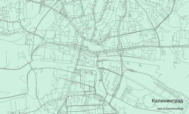
Euler’s work was fundamental for graph theory and I find it delightful to overlay the original problem statement over the roads and bridges that make up Königsberg, now Kaliningrad, today.
The problem was inspired by real bridges across real rivers, connecting real roads, and it sparked a domain that routinely builds roads and connections from messy, raw datasets.
Complex Visuals
In the world of visualization, there’s a tendency to put network graphs on a pedestal and expect some “aha” moment from the observer.
There’s also a tendency towards visualizations that look novel or flashy. This isn’t unique to network visualization but in a rush to create something eye-catching we trip over ourselves.
I’m guilty of this! Building clear graph visualizations requires constant re-evaluation of the visualization purpose and the intent of the data presentation.
In Edward Tufte’s influential book “the Design of Quantitative Information” he suggests that effective data presentation should allow for viewing at three different levels.
What is seen from a distance, an overall structure usually aggregated from an underlying microstructure.
What is seen up close and in detail, the fine structure of the data
What is seen implicitly underlying the graphic
His book was written before the explosion of technology and tooling that enable intricate, interactive visualizations today. New approaches come with new pitfalls but Tufte’s core principles still resonate, especially for network visualizations.
Wait a minute
There are many data analysis projects that meet Tufte’s conditions for effective design.
Historian Cameron Blevins has released a dataset tour de force and accompanying website tracking the spread of post offices across the USA.
Between 1848 and 1895 the federal government wove together a “gossamer network” across the West, a sprawling and fast-moving web of post offices and mail routes that connected the region’s far-flung settlements into a national system of communications. The US Post was the underlying circuitry of western expansion.
This circuitry tells a story of colonization through thousands of dots placed across a map of the USA, sliced across pivotal moments in time for the country.
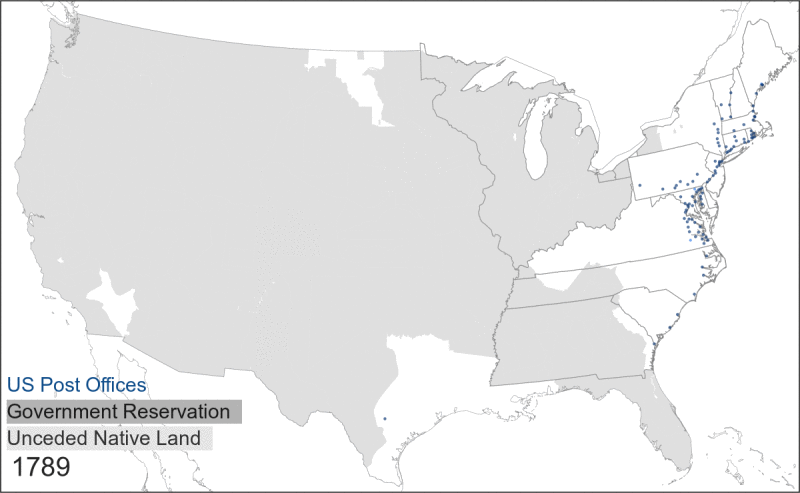
Most of the maps omit the roads from the time so it’s up to the observer to imagine the route between the post offices - this isn’t hard to do! I love Dan Cohen’s summary of the spread of post offices in his newsletter.
Blevins’ data highlights, perhaps better than any other evidence, how the westward expansion of the United States was strongly tied to state power rather than individual or local activity by European settlers, as it was the Post Office infrastructure (linked, of course, to the military and other levers of the state) that enabled the kind of communication network and support lines that eventually led to the seizing of native lands. (Just look at those tendrils shooting west from the Mississippi.)
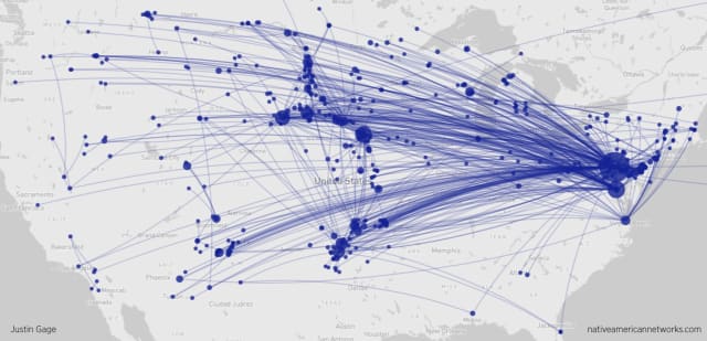
Cohen also highlights a complementary project from Justin Gage that explores the correspondence and visitation networks of Native Americans.
Despite colonial control and confinement, western Native Americans spread ideas and information important to them along vast communication networks.
Africa, Eurasia, Americas, Antartica, Australia, Reddit
The map of Königsberg above is from source/target favorite Andrei Kashcha’s City Roads project which allows any cityscape to be visualized in a bare, zoomable form of roads, bridges and paths.
Kashcha’s latest project eschews real roads in favour of inferred connections across an artificial continent representing online communities. Map of Reddit is the confluence of all the stuff he does best, leveraging real social networks, smart technology choices in impressive interactive visualizations.
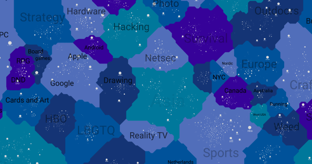
If you click a subreddit in the map you get a links that bridge to other subreddits with a strong crossover of comments. Once you start exploring it’s hard to stop! This application gives the best indication of the vastness of a social network like Reddit than any other attempt I’ve seen.
I’ve touched upon a real-world routing application of graph theory, the use of network analysis for deep historical research and the emulation of these techniques to explore online communities.
A recent post from Matt Webb highlighted something a little different: maps of urban layouts extracted from ‘mental images’ through sketches and interviews.
Web draws from lecture notes on the work of Kevin Lynch and highlights one example of Boston:
Here’s an example of one of Lynch’s maps: Boston.
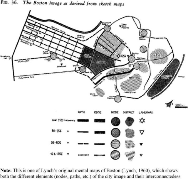
What you’ll see from that map is that it’s totally recognisable as a city, and you could totally use it to navigate, but it’s also what you would scribble on the back of a napkin. It’s also way more memorable. If you gave me a glimpse of Boston from Google Maps and asked me to sketch it for someone else, I can’t imagine it would include any of the salient details. But given a Lynch map, I bet I could pass on the most relevant bare bones, just from memory.
Webb notes the use of five elements to build up an image of a city: Paths, Edges, Districts, Nodes & Landmarks. Sound familiar?
Links
I really like this thread of graph drawing experimentation – it shows how difficult it is to balance aesthetics with clarity
A six-second GIF illustrating herd immunity. This is originally from 2017 but has found a new virality in 2021
Nodes
It’s trendy for those with the time and inclination to wrestle ownership of data from the giants of technology like Google. There are a number of vendors catering to this crowd but the approach remains inaccessible for your average consumer.
This map of personal data infrastructure from @karlicoss provides a fascinating look at how complex it is to undertake this ownership.
Dig a little further on their site and you’ll find an elaborate, home-grown personal knowledge management implementation in the same vein.
Oh hey, there are quite a few events coming up I should highlight:
- The Knowledge Graph Conference is back for 2021 and has an interesting line-up of keynote speakers including Albert-László Barabási and Teresa Tung.
- Grakn Orbit 2021 is next week.
- I’m presenting at B-Sides Vancouver next month on the use of graph visualization in a variety of cybersecurity use-cases.
- and, finally, NODES 2021 from Neo4j is back on the 17th of June. I like the variety of talks at this event.
There is so much diversity when it comes to the ideas and people working in the graph space. It’s great to see when conference line-ups reflect and encourage this diversity. Lots of work still to be done. If you know of an event that can use some extra attention, please reach out!
I’ve spent a lot of time over the last month working on the new home for source/target and I’m pretty proud of the result. With a dedicated site I have a space for the newsletter on the web and am better able to showcase projects and related materials to the wider world.
Take a look and let me know what you think. I have a laundry list of tweaks and fixes to make but I’m relieved to say the bulk of the work is done!
Thanks for reading, see you again in a few weeks!