Graphs
I’ve never asked a question on Yahoo! Answers and now it’s too late. The site was put into read-only mode and was wiped clean off the internet on Tuesday.
It’s strange when sites that you consider to be “part of the furniture” of the internet disappear. I wasn’t an active user, only an occasional viewer, but the mere existence of Yahoo! Answers in my search engine results was comfortable and familiar.
Yahoo! is notorious for killing off the internet’s darlings. Back in 2009, Geocities – the formative free website host and third most visited site on the internet in 1999 – was dumped. Approximately seven terabytes of hand-carved websites were lost.
How are we supposed to feel when a vast array of individual creativity, aging back 16 years, is deleted from the internet without care or ceremony? Should we accept it as inevitable or be seeking to preserve and protect?
Visual Corrosion
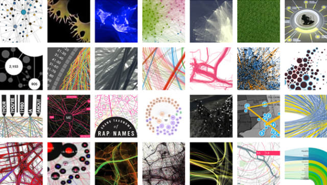
Manuel Lima is a renowned speaker and author who specializes in information design with a clear passion for network graphs.
Lima’s site Visual Complexity is a compendium of visualizations going as far back as 2005. I finally took a closer look a few weeks ago. It’s a smorgasbord of color and networks with hundreds of thumbnails to draw you in.
Over on the “links” page there’s a dense list of hyperlinks to related blogs and topics. It’s reminiscent of the original, human-curated Yahoo! directory of links. Faced with a wall of potential gems I did what I always do: ran down the page, and opened a new tab for each link. I was ready to find my new favorite projects and sites.
But I was dismayed to find that many of these links were dead. Defunct. Kaputt. I was repeatedly 404’d and, in a few instances, redirected to domain squatted sites and, in one case, an extremely NSFW site.
It’s not Lima’s fault, internet links are brittle and prone to breaking. It’s common for me to find a link to a promising page on network analysis from around 2010 and find it eradicated from the 'net.
The Wayback Machine from the Internet Archive is a valuable resource in these circumstances but firing it up and pecking through the years to find the right version of the site sucks the joy out of that which had caught my eye.
Though it’s fun to check out website design of the 90s and 00s,after a while of waiting for pages to load and crossing fingers I’m prone to getting distracted and losing interest.
Decaying Bytes
Bit rot is a term that describes the degradation of digital media over time. You and I have first hand awareness of bit rot: the .DOC file that wouldn’t open after conversion to .DOCX, the 32Kbps MP3 that you can’t believe you ever listened to, the snarky meme that’s been repeatedly screenshotted to oblivion…
Canadian author and artist Douglas Coupland introduced me to the term in his essay of the same name. He notes:
A friend of mine works as an archivist at a large university that collects rare documents of all sorts. She tells me that a major issue with collecting documents that were created after about 1990 is that the really desirable “papers” don’t physically exist–or rather, they do exist, but they’re lying comatose inside a 1995-ish laptop. Not only that, but the structured electrons that constitute any given file inside that 1995 laptop are drifting away as electrons apparently do. Depending on a laptop’s architecture, its drive will erase itself at a half-life rate of about fifteen years.
As Coupland notes, bit rot isn’t unique to purely online, digital media, I sometimes wonder about the CDs and DVDs burned in the late 90s. Back then the humble CD was a futuristic disc of dense bits and bytes that we assumed would last forever. We now know this to be foolish and risk losing a generation of media to the whims of a ring of plastic and shiny layer of aluminum.

Paul Gordon, Senior Film Conservator at Library & Archives, Canada featured in a recent documentary, “Four Days at the National Preservation Centre” laments the challenges of bit rot.
Hundred year old hard drive? I don’t think it would spin up. And would you be able to read the files on it? I don’t know. We have trouble reading the files from the 90s and 80s as it is.
Graph, they rot
Bit rot on the World Wide Web is the link rot we endure when clicking on old hyperlinks to dead destinations. This in turn leads to graph rot: what was once a densely-connected ecosystem of interests starts to lose it’s kinship and connectivity.
Many have studied this behavior in network science, we can explore what happens to graph properties when nodes are deleted and links are no longer there. This so-called “node deletion” has wide-reaching applications:
- Testing attack tolerance for a computer network of thousands of distributed hosts.
- Modelling the spread of epidemics by observing the impact of social distancing and self-isolation of individuals.
- Understanding a physical supply chain with inaccessible locations due to seasonal weather patterns.
In the case of the broken links on Visual Complexity the result is the diminished spread of ideas coupled with the impression that our community isn’t as tight-knit and active as it once was.
An ugly portmanteau
It’s not a coincidence that the most interesting and dynamic graph projects are driven by data scraped from websites and resources while they’re still active.
Take the podcast example I shared a few weeks ago, this is scraped from iTunes to create podcast neighbourhoods of interest.
Clubhouse Social Graph, a new project from Travis Fischer, Tim Saval, and Tokyo does something similar: it draws from the official APIs of the buzzy new audio-only social network app to build up interactive graphs of users and their followers.
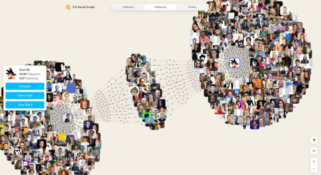
Profile headshots in an interactive, animated graph like this are a shorthand for the people and connections that make the platform as compelling as it is.
Another coincidence: both of the above examples use the same core library to show their graphs. It’s easier than ever for developers to build semi-scalable applications for online consumption, I’ve come to build these again and again. It’s ridiculous but I’m going to coin a new term for these apps: “scraphs” – a blend of scrapes and graphs.
As side projects and guerrilla marketing campaigns these scraphs are unlikely to be around forever. Yet interestingly, the scraped data will more likely live on and have a higher chance of being archived because it has already been saved privately.
When using sites and services we have an awareness that there’s data lurking in the periphery (in site databases, APIs, storage, etc). In the case of Geocities and Yahoo! Answers all that data representing interactions with and between real humans is gone.
Closed Questions
Funny story: without thinking I went to scrape Yahoo! Answers to build up a network graph of related questions for this newsletter, only to find it was already gone. The Archive Team planned to archive as much of it as possible but with little warning or support from Yahoo! this was set to be a tall order.
In his essay Bit Rot, Douglas Coupland describes a world where each draft of a novel is retained and archived for posterity:
Well, here’s a thought: many writers email themselves a copy of their novels at the end of every day, using the cloud as a backup mechanism. Imagine if one were able to take all of those daily backups and then place them into a sort of stop-motion animation. One could see how an author constructs their work by looking at words per day, words cut and pasted, paragraphs deleted, items suffled about, typos, notes to self, and then, when the editing process begins, one could watch how a novel is hacked and pruned and reshaped—an organic process displayed in a dynamic organic mode. This would be a fascinating new way of appreciating a book’s creation—a visual language to describe a verbal process.
I’d love to see that scraph.
Links
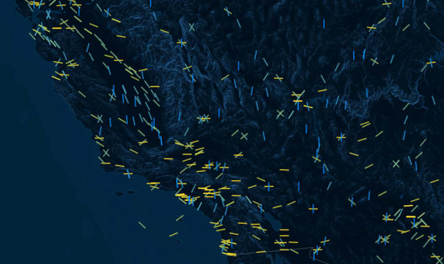
Trails of Wind: the architecture of airport runways
New proof reveals that graphs with no pentagons are fundamentally different
SkyKnit: when knitters teamed up with a neural network
Nodes
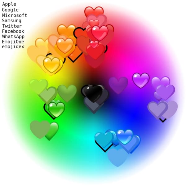
“Did someone say Emoji?” from Jennifer Daniel is a favourite new newsletter of mine. I enjoyed this recent edition, especially the color variance exploration of emoji hearts across various platforms. I had no idea that these weren’t standardized and that perception of colour spaces can vary across different cultures.
Bruno Gonçalves launched a newsletter earlier this year to provide background on some graph data science. I have plans for something not-dissimilar to this — it’s nice to see how someone else approaches it.
I love the eclectic, home-grown aesthetic of this video game level scraph. Scraping data from the Fandom Wiki for the fan-made sequel-of-sorts to a popular RPG, this graph is a cluttered but endearing map of the various game levels and creators of each.
Things have been a tad slow around here as I’ve been prepping my talk for BSides Vancouver next week. Pre-recording talks for online conferences is a joint curse-blessing: there’s no risk of live performance glitches but it’s hard to break the cycle of slide tweakage and repeated audio takes.
Thanks for reading, see you in a few weeks!