In this edition I bring a good/bad design technique to life in graph form, see the future impact of climate change across the USA and continue to curate the curators.
Hi, I’m Christian and this is my bi-weekly (fortnightly?) newsletter with interesting content and links orbiting the world of graph.
I’ve been busy this week with lots of little tiny changes to the source/target archives—the sort of little tiny changes that no one will ever notice but still take a remarkable amount of time. I think after over 10 years of hacking around with CSS I should probably take the time to learn the basics.
Graphs
Following some unknown pull of the universe, I downloaded the developer beta of the latest macOS this week. Named after Big Sur, California, it’s slated for release later this year.
I don’t usually bother guinea-pigging these things but something about the promise of a fresh UI drew me in.
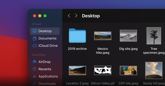
For Big Sur and recent macOS releases the common refrain from users is that Apple is making their desktop OS into a mobile operating system piece by piece, one curved bezel and enlarged dialog at a time.
Updates to the interfaces of the products we use are, as a rule, immediately and vigorously objected to by users. This backlash to new designs can sometimes be the death knell for a website or company. Just ask Digg: the social bookmarking site had enjoyed meteoric growth until 2010, when it began to die a slow death after a complete rewrite and slight functionality pivot left it’s millions of daily users cold. It’s still limping along in it’s latest incarnation, but not long for this world.
Success of other migrations are harder to evaluate: Strava took two years to renege on the removal of it’s “chronological feed”, which forced users to see their friends’ activities in an inscrutable order determined by some omniscient algorithm.
oh look, Cody ran 3.2km three months ago. Thanks Strava
If you scroll down to the comments on release announcements it won’t take long to find a detractor sharing a familiar sentiment:
“It’s like they’ve never even used the site themselves”
This of course isn’t the case. Unless a company is particularly negligent a whole process of design and re-development has been undertaken by a bevy of designers, editors, developers, engineers and managers.
This doesn’t mean the organization is unimpeachable in their decisions, it’s just they deserve the benefit of the doubt. You have to assume the organization is attempting to maximise some important metric with their new interface. It’s often the metric itself that’s ultimately misguided.
In The Design of Everyday Things, Don Norman introduced the “Iterative Cycle of Human-Centered Design” — a flywheel of making observations of a set of target users before generating ideas, prototyping, testing them before returning to observation. I see it as a flywheel because each stage of the process strongly influences the next as well as other concurrent product design processes.
Originally published in 1988, it’s an exceedingly well-regarded book that looks at the relationship between users, objects and products. One takeaway (there were many) that I found particularly humorous was Norman’s law, a succinct and familiar description for anyone who’s ever designed and built a product.
A project is behind schedule and over its budget the day it is started.
This and many other observations have changed (in a small way) how I see the world. I therefore shouldn’t be too surprised to have found some overlap between Norman’s book and Atomic Habits by James Clear.
perhaps by design (pun intended)
Clear outlines how small incremental improvements to an everyday routine that can make it easier to start and stick to a new habit. One example is that by designing your living space to make it easy to take the steps required to accomplish your habit—a guitar on a stand, an already-rolled yoga mat—you’re setting yourself up for success
Norman taught me that good design is hard to get right and Clear affirmed that, when executed well, it has the ability to be both transformative and invisible.
I’ve discussed how fresh takes on the design of popular products can be polarizing. In the last few years, Apple has moved away from overt skeuomorphism, a fascinating attempt to take real-world interfaces and transplant them into digital spaces.

The more egregious examples of this are long gone but examples of skeuomorphism persist, whether it’s the floppy disk save icon or the manilla file-folders that very few people use in their day-to-day. In his article “The Comeback of Fun in Visual Design” Michael Flarup highlights the playful aspects of Apple’s design shift in 2020 and showcases some modern skeumorphic components of icons.
Neumorphism caught my eye earlier this year as a bold, somewhat polarizing take on user interfaces. Reminiscent of pristine sci-fi dashboards and Swedish portable synthesizers and looks both futuristic and tactile.
For equal parts academic interest and fun I wondered what it would be like to apply neumorphic techniques to a network graph. Inspired by Adam Giebl’s interactive tool I put together a similar tweakable app to play with some of these stylings against the classic Les Miserable character network dataset.

“I didn’t have time to make it work in Chrome, so it just works in Firefox”
I think my little app misses the point a touch. The interactive knobs and scales to change the design are inarguably the bits that should be neu-ified rather than just the network graph itself. Nevertheless I think it’s a novel take on network graph design that refreshes the playfulness of an interactive visual analysis application.
Links
- Vessel Finder — a live view of boats and vessels as they travel across the globe
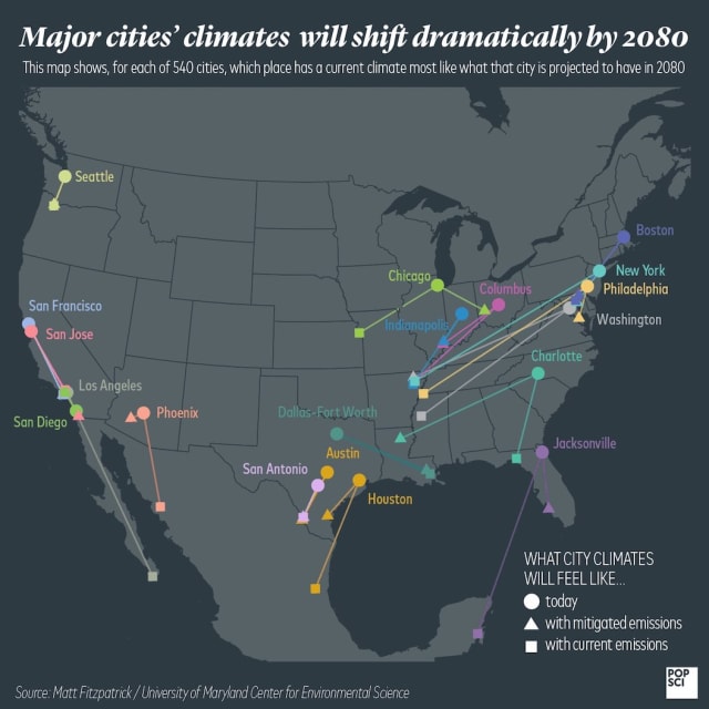
Climate change shifts — new to me, this article presents a number of origin-destination maps giving an idea of the projected temperature of towns across the US in 2080. (h/t Luz Ka)
At first I wondered why there weren’t any arrows to indicate direction of change but then I realized the reason for that should be obvious.
- Palladio — a flexible tool to build network views of raw columnar data in the browser (h/t Brandon Locke)
Nodes
This week I’m listening to the audiobook of Andy Greenberg’s Sandworm, a riveting true-crime take on the introduction and growth of various cyberwarfare techniques over the last 50 years.
On Wednesday millions of Garmin device users lost access to their accounts due to a suspected cyber attack. Customers are only just managing to sync their fitness activities after five days and Garmin has reported that there’s no indication that any customer data was accessed by the attackers.
As the outage was initially reported, Daniel Cuthbert took some time to explore the footprint of Garmin’s servers using network forensics tool Maltego and various web services. He tweeted some of his findings along the way.
Brandon Locke has released an open source tool NERTwork to extract, label and visualize the co-occurrence of entities in text documents. He’s provided comprehensive steps to run the tool and a few choice examples of visualizations resulting from applying NERtwork to some key historical texts.
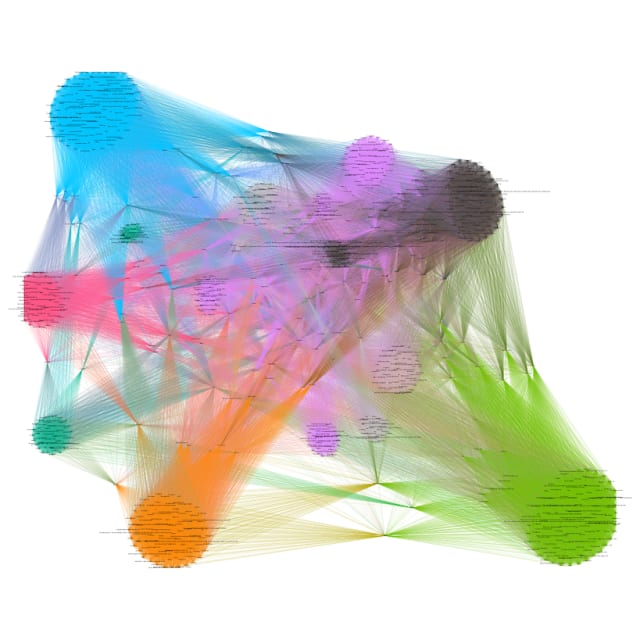
Co-occurence networks are a fundamental technique for understanding the shared connections between large collections of documents through the common extracted entities: in this case people, places and organizations.
NERtwork uses the Stanford Named Entity Recognizer (NER) which is a great tool but can produce exceedingly messy extracted entities. Locke recommends using OpenRefine to make the process of moderation and refinement a little easier.
One of my favorite newsletters is “Data is Plural” from Jeremy Singer-Vine — it’s a curated list of datasets sent out every other week.
Data is Plural may perhaps be the first newsletter I actively subscribed to. What was yours?
Recommending Data is Plural in my newsletter is an example of what I think of as “curation-all-the-way-down”. Individuals & organizations lovingly curate rows and columns in their datasets. These are in turn curated and promoted by others with a keen eye for interesting content. Then I’m here just curating the curators.
Shared the other week was the citation graph from the Caselaw Access Project; this dataset gives a full summary of the legal cases cited in court decisions. It’s a vast dataset covering 43 million citations.
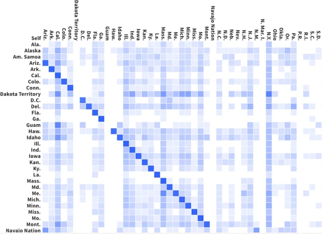
Caselaw Access Project frequently release visualizations of their graph and I found this map and grid (read: adjacency matrix) view to be a particularly interesting aggregation of some core patterns in the dataset. Certainly a lot easier to digest than the 43 million source records.
This reminds me of the viral “Every State’s Least Favorite State” graphic from earlier this year—a visualization that would be greatly improved by shedding the confusing colour legend and using, I don’t know, a graph or something.
Whew, I wrote more than I expected this week. Let me know if you found it interesting! See you again in two weeks ☀️