This week in source/target I’m installing Perl, admiring graph-iti and learning about graphs in other languages.
Hi, I’m Christian and this is my bi-weekly (fortnightly?) newsletter with interesting content and links orbiting the world of graph.
How are you holding up? A warm welcome to all my new subscribers, it’s nice to see you.
Graphs
My younger self had no idea that most of his professional life would be spent using chat applications just like the ones he used to chat with friends after school. As a remote employee (going on 6 years) Slack is my main medium of communication with colleagues across the world.
I’m a particularly chatty Slack user and I blame a childhood spent on MSN, AIM, IRC and chat rooms. I type on Slack in a very conversational way:

I sometimes wonder whether it would be better to communicate in full paragraphs of fully-contained thoughts but that feels so formal for the medium. It also doesn’t seem to be my style.
For the many millions of Slack & Microsoft Teams users around the world, one way to express a style is through emoji reactions to posts and messages. Back in the 90s & 00s we had display pictures to represent us in cyberspace. However the _\~true~/_ outlet for creativity was found in the status & away messages. Taking advantage of a toolbox of characters and symbols one could craft an ASCII masterpiece:
,.-~*´¨¯¨`*·~-.¸-(source/target)-,.-~*´¨¯¨`*·~-.¸
Why are there so many weather emoji?
Faced with toxic air from wildfire smoke floating up from Washington, California & Oregon last week I spent some extra time on a personal project from earlier this year: Twitter bots that post weather maps in emoji form.
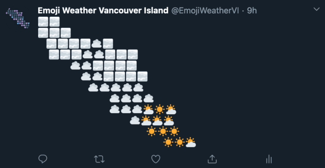
Using emoji for weird little projects like this is the logical extension of the age-old ASCII aesthetic. One key difference is that we have a wide array of multicolored glyphs at our disposal.
Oh and I know what you’re thinking, “isn’t the plural of emoji actually “emojis”? I note your right to tack an “s” on the end, but respectfully disagree. We don’t say “I’m going to go eat some sushis” do we?
Winning the Internet
Back in source/target #13 I threw out the phrase “curating the curators.” I should have known this was an entirely unoriginal sentiment—19,100 Google results and counting.
Two weeks later Russell Goldenberg and the excellent data visualization & visual essay website The Pudding launched a newsletter entitled “Winning the Internet.”
The idea of the newsletter is simple: they aggregate links from the most popular link-sharing newsletters—a daunting list of over 100 newsletters including one of my favorites, bnet—and produce a breakdown of the most-shared links of the last 7 days.
As they put it:
We decided to curate the curators. What’s one more newsletter, anyways? No more link FOMO, just the statistically best links + cute charts, weekly. That’s our pitch. Subscribe! Or don’t ¯\_(ツ)_/¯.
That little shrugging chap is a great example of the sort of emoticon that thrived on MSN. It’s actually a subtype of emoticon known as a “kaomoji”— unlike :-) , :-D , :o( and similar there’s no head turning required to visualize the emotion portrayed of those 9 characters of text. A smiling shrug.
The aesthetic of “Winning the Internet” is firmly rooted in the world of chat rooms: gratuitous text art combined with the unique approach of plotting line graphs using ASCII.

To me the color palette and form evoke an era of The Matrix and CRT monitors. In many ways the generation of these plots was the first multi-platform graphics system. As long as you used a monospaced font, the chart would look mostly the same regardless of the text editor, platform, device or screen.
Did you see the recent Foone thread on running Doom on a digital pregnancy test? I’ll just leave this here.
These line charts give a neat, if rudimentary, look at the popularity of each linked article over time but there’s a facet of the data that isn’t represented in these plots. If we created a graph of the newsletters and the articles they link to we would instead be able to see:
- The most popular articles
- Commonality between newsletters sharing the same links
- Potentially-overlooked links from newsletters we know we enjoy
At source/target we’re no strangers to building graphs like this. What if we make it extra difficult and attempt to match the Winning ASCII plots? Can we generate an ASCII network graph from the connections?
ASCII does it
Of course there’s a tool for that. Graph::Easy is a 16-year old Perl module that can be used to generate ASCII graphs. It’s a unique library; I couldn’t find very many libraries that exported to ASCII and it was impossible to find anything I could run directly in the browser. In a world of CSS 3.0, WebGL and WebComponents this makes sense!
It’s been a long time since I’ve written any Perl code so it was a mild gauntlet to get it to run on a laptop mainly equipped for web development. Parsing the data from Winning the Internet was a easier: there’s a helpful RSS XML feed of the latest edition of the newsletter which was easy to convert to the right format.
The bulk of the work for little tasks like this comes from shuttling between file formats. My vague plans of building a web application that built an ASCII graph from arbitrary newsletter feeds introduced a JSON step into an already convoluted pipeline:
+-----+   +------+   +-----+   +-----+
| XML |-->| JSON |-->| DOT |-->| TXT |
+-----+   +------+   +-----+   +-----+
So here we have the full Winning Graph in all it’s ASCII glory:
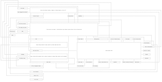
And yes I appreciate the irony of providing this as an image – click it for the full plain text version.
There’s a live, online version that updates with each newsletter update. Thanks to Georgi Gerganov for serving a helpful API against a Graph::Easy instance.
It’s a unique view of connected data with a number of limitations. For one, the layout seems to make nodes with a high degree quite large to squeeze in all the links. It also has zero ability for interactivity in the current form. Despite these and other limitations I think this approach has a certain -~=_=_=_charm_=_=_=~-
Links
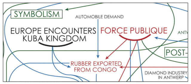
- A MoMA article Hank Willis Thomas’s Colonialism and Abstract Art graph
Netzschleuder, a new network data catalogue and repository from @tiagopeixoto
A graph <-> timeline hybrid experiment in d3.js from @markiaaan

A LinkedIn group for Women in Graph
Wikipedia corner: Krackhardt kite graph
Nodes
Community Building
The Knowledge Graph Conference Slack has been re-born under the enthusiastic facilitation of Ellie Young. It’s a welcoming, active group for those working with or interested in learning more about Knowledge Graphs. There are lots of ways to connect with the community but the first step is to join here.
Network Effects
Sameer Singh’s profile describes him as a “Network Effects Advisor” — his blog at breadcrumb.vc is home to a number of articles discussing the role networks play in company management and venture capital. I enjoyed this article on innovation and market-building through the lens of network effects.

This post from Ben Thompson at Stratechery back in July follows a similar train of thought. He notes the result of new Slack features that enable collaboration across multiple organizations:
… the more companies that take advantage of Slack Connect the more of a moat Slack has. That’s the thing about social networks: their best feature is whether or not your friends are on it, or, in this case, whether or not the companies you are working with are using Slack.
And if you’re interested in reading (even) more analysis on the graphs that underpin the largest social media companies today, I recommend this coverage of TikTok from Jackson Mohsenin.
Consistency
A new notebook from Mathieu Jacomy demonstrates how distances between nodes in force directed networks remain broadly the same despite a change in node positions.
Jacomy has a treasure trove of a blog. I recommend this post summarizing a paper on tensions in the network science community, this post on what we do when perceiving networks and this post on the role of big data visualizations (“digital glitter”).
Graph vs. Graph
I sometimes search for content suitable for source/target on the usual sites and have to manually parse through references to graphs (read: plots and bar charts) and graphs (read: source/target).
It’s usually enough to add “network” to my query to find relevant results but it’s a bit of trial and error. I recently stumbled on a YouTube comment thread and learned this isn’t a problem in all languages:
“In Dutch we actually have 2 different words: ‘grafiek’ is a graph with a function plotted on it, ‘graaf’ is a graph with vertices & edges.” - Peter Van Camp
"In Portuguese we also have two different words. Vertices and edges are in a “grafo” while x-axis and y-axis are in a “gráfico”. - Nuno Salvaterra
"well in greek we also have two words, “grafos” for GVE graph and “grafima” for a coordinates graph, the word graph literally means “write” " - Theofilos Mouratidis
“Same in Spanish. Grafo y gráfica/o” - Alex Blanco
In Polish, there are also two different words: the plotting of a function on the coordinate plane is called a “wykres” (etymologically meaning something like ‘drawing out’), while the verices-and-edges kind is called a ‘graf’. - Kuj2
I’m interested to learn of other examples — do you know of cases in other languages?
         - ----------------------------------------------------------------------
       /    __   __        __   __   ___   / ___       __   __   ___ ___      /
      /    /__` /  \ |  | |__) /  ` |__   /   |   /\  |__) / _` |__   |      /
     /     .__/ \__/ \__/ |  \ \__, |___ /    |  /~~\ |  \ \__> |___  |     /
    /                                   /                                  /
   / ----------------------------------------------------------------------
I’m finishing up this week’s source/target on the equinox, marking another milestone in a disorientating and unnerving year. Stay safe and well, I’ll see you in a few weeks.