Graphs
Back in December of 2019 I received an email from Air Canada alerting me that I hadn’t reached some modest minimum number of points for the year and would therefore be losing my “status”. I was mildly disappointed but understood that I wasn’t travelling enough for whatever status I’d missed out on to make a tangible improvement on my life.
Six months later, the number of flights taken on a single day in April had plummeted to a 10-year low.
I have thousands of points spread across countless different point schemes. Groceries: swipe, airlines: scan, pharmacy: tap, coffee shop: stamp.
It took me a while to understand that the primary benefit of these points isn’t for the consumer, they’re a way for corporations to promote a sense of loyalty — thereby likely selling more in the future — with the added benefit of being able to track consumers across purchases. As a customer, I only receive a small reward for the sizable gains made on the other side.
Cost Networks
Points are hard to track and understand. Companies mildly obfuscate the true value of their points to disorient customers as they strive to get a good deal. There’s a rewards scheme here in Canada where 1000 points are worth approximately 1 cent. I’m not horrendous at mental math but it still takes a second to translate before realizing you’ve earned some pretty low value points despite those tantalizingly high numbers. Obscurity-via-too-many-zeroes.
At first it may seem that these rewards schemes are walled gardens: points earned with one retailer can’t typically be redeemed at another. This is only half true. By undertaking what is known as a “transition event” one could sever ties with one airline and become a fervent fan of another via one simple transaction.
I now pronounce you my #1 favorite airline.
This possibility to swap and transfer leaves us with a tangled network of value translations mapped across the thousands of companies willing to trade points for other points.
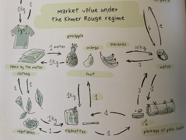
It’s not dissimilar to the system of “barter” where items are assessed by their comparative value. Take this excerpt example from “Year of the Rabbit,” Tian Veasna’s graphic novel describing “one family’s desperate struggle to survive the murderous reign of the Khmer Rouge in Cambodia”.

Many assume systems in this style were the precursor to modern currency-based economies but there’s very little evidence this was the case.
Back to the present day we can use graph theory to understand our best option in these translation networks. In this graph each of the links has an accompanying points cost. By finding the minimum distance between two points we can find the minimal cost for maximal benefit.
Origin-Destination Networks / Travel Routes
The most tangible network in the world of points are those of humans taking flights. Origin/destination networks give us a fascinating look at migration and travel for people around the world.
In a pre-9/11 world it was remarkably common for people to fly using tickets issued for a completely different person. There are possibly apocryphal tales of entire basketball teams racking up points for a single, well-point-endowed, person. More concrete and fraudulent was the NBA referee travel expense scandal of 1994.
Airline points used to be precisely aligned with the number of miles flown across the planet. Eventually, most airlines introduced a minimum miles policy: even the shortest flights would reward the intrepid road warrior businessperson.
Just like the shortest path in our cost network, humans are wired to find approaches that will maximize our reward for as minimal effort as possible. And that’s exactly what happened:
Flying back and forth between two short-leg cities, a rewards ticket to Hawaii could be earned in just eight continuous hours of flying. “One of the most popular ones was Dallas to Austin, people would do that eight, nine, 10 times in a day.” Source
It’s weird to think that these pointless (pointful?) jaunts aren’t technically as bad for the environment as one may think. Common commuter routes are likely to have empty seats ready to be paid for and sat in:
Airline seats were perishable; planes take off, full or not.
Nevertheless, these airport hops wasted time, burned extra fuel and artificially inflated demand.
Affiliate Networks
The illuminating podcast series The Missing Crypto Queen tracks journalist Jamie Bartlett as he investigates the murky world of OneCoin. Marketed as a cryptocurrency, there’s no evidence of any bona-fide blockchain underpinning OneCoin and it’s now widely-regarded as a Ponzi scheme.
The podcast documents how a network of affiliates promoted educational packages that sold for between €100 and €225,500. Each package includes “tokens” which can be assigned to “mine” OneCoins. US Prosecutors have alleged OneCoin brought in approximately $4,000,000,000 worldwide.
It’s safe to say credit card point rewards schemes don’t classify as a Ponzi scheme – although it’s interesting to learn that they are unregulated – they are, however entangled in the intricate world of affiliate marketing. To give one example, by promoting a credit card, bloggers and others receive commission on the purchases or commitments ultimately made as a result.
Clear for flight
With continued COVID disruption I expected some sort of points collapse event. Perhaps each of these networks – the points barter web, the human ambition to travel and the interlacing world of affiliate marketing – are keeping the points plane in the air for now.
Nodes
Graph theory with King Arthur
I’ve used the intuitive diagram sketching tool Excalidraw in the past. It’s free and well-suited for both small visuals and complex, collaborative diagrams. Their review of 2020 gives a good summary of it’s breadth of and includes this beautifully curated intro to graph theory from Anas Ait Aomar. Check out the full notes here.
Finding the funding
One of the most remarkable things about the internet is just how reverse-engineer-able it is. If you want to understand how a website works or find the host for some piece of content the developer tools are right there. Sure the underlying code will likely be minified but the fact you can view it and observe it is surprising.
In this tutorial video, Mathieu Jacomy and Jonathan Gray show how the ad network hostnames can be scraped from websites to gain a greater understanding of funding sources for these sites; in this case, sites about anti-vaccination. It’s a solid application of the “follow the money” adage and worth a watch.
The Digital Methods Initiative tool used in the video is Tracker Tracker and Gephi is used for the graph analysis and visualization.
Graphing Gunther
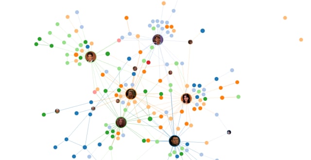
Last up we have a project from Keith McNulty. He scraped every script from the hit sitcom Friends and plotted a graph of the interactions between each of the characters. I like that you can step through each of the seasons and the “minimum number of scenes” filter bar.
These visualizations are pretty popular. I spotted a similar one for The Office over on /r/dataisbeautiful that was a lot less well-received in the comment thread; most criticism being about the apparent inaccuracy of the data scraping approach.
Turns out graph visualizations are a fun pastime — just don’t annoy the fanbase!
I’m Christian (👋) and this is my bi-weekly (fortnightly?) newsletter with interesting content and links orbiting the world of graph.
If you’ve reached this far I’d love to know what you thought of this week’s edition. Hit reply or hit me up on Twitter. See you in a few weeks.
