This week we take a look at a graph of space station inhabitants, showcase a mind-mapping tool built with love, and go back to school with the fundamental question: “why bother using graphs at all?”
Hi, I’m Christian and this is my bi-weekly (fortnightly?) newsletter with interesting content and links orbiting the world of graph.
Happy Thursday! To all the new subscribers, welcome to the club! I recommend taking a peek at the archive to get a feel of how we do things around here.
I’m finding I have lots of amazing content and topics I want to share. I want to keep the signal-to-noise ratio high but I’m toying with the idea of sending out new editions every week. What do you think of that? I’d love if you would hit reply to this email and let me know.
Graphs
Users of visual graph analytics know that the use of networks to explore data is a force-multiplier for recognizing patterns and understanding relationships. But what do we actually mean by this? What is it about this visual representation of connected data that makes it superior to other forms of visualization?
I took some time this week to look into this deceptively simple idea and I’ll be focusing today on a few analytic tasks that would be difficult (or even impossible) to undertake using non-graph visualizations.
Step Three: Get Insights!
When using data visualizations in an analytics context it’s important to remember the underlying deliverable expected from viewing the visualization. All too often you’ll see something akin to the famous “Step Three Profit” trope:

Even without the ridiculous “???” step, the above plan has so much “magic” it’s unbelievable. What insights? Do you expect to only model your data once? The finality of step three implies that there’s a logical conclusion to your work: In reality the analytics hotel will be open for business forever, even if you’ve checked out.
I’ve somehow only just realized I’m this close to ripping off the Eagles with that tenuous metaphor
Of course individuals don’t start their analytics journey outright planning the above, the magic expectations slip in, often due to time constraints. Visual graph analysis with the above approach is unlikely to result in an actionable output or deliverable. Instead, working backwards from the decision or output to be made is the key to designing insightful applications and unlocking smart analysis.
In reality the flow could look more like this:
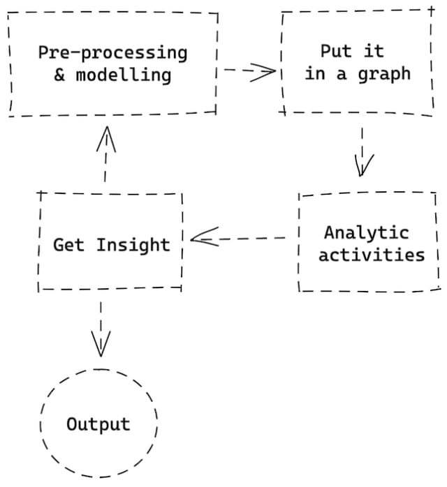
This diagram could be drawn countless ways but note the key differences from before: we’re in a loop generating insights, there’s an expectation that we’ll need to remodel our data and there’s less hand-waving when it comes to actually executing pre-processing to set the stage for graph analytic activities.
This isn’t all too dissimilar from Don Norman’s “Iterative Cycle of Human-Centered Design” I highlighted in #13.
It also brings to mind the classic OODA loop you’ve probably heard mentioned by the gruff Chief Security Officer who was never at their desk pre-Covid
Grasping Tasks
So we’ve graduated from “???” to Analytic Activities. These are collections of tasks and subtasks undertaken to understand a visualization: in our case, a node-link diagram.
We do these tasks without even thinking about them. I think it’s helpful to give them a name and identify them as the baseline of our capability when reading graphs. These considerations may seem rudimentary but it’s worthwhile going (metaphorically) “back to school” to remind ourselves of the subconscious techniques we use.
There’s extensive research and categorization of these tasks — I’m going to draw from “Task Taxonomy for Graph Visualization,” a paper from Bongshin Lee et al. and highlight a few.
It’s fun to see the familiar food web example used as one example in that paper to illustrate their points.
I hope it will be pretty clear that the following tasks are vastly easier to complete using graphs.
Adjacency Task
This is so fundamental to graph analytics it feels weird even typing this, but here goes… By modelling and visualizing data as a graph we can see that nodes connect to each other. There. I said it.
The adjacency task is an example of a core topology task: we’re using the network structure to highlight patterns and in this case we declare a relationship between two nodes.
Accessibility Task
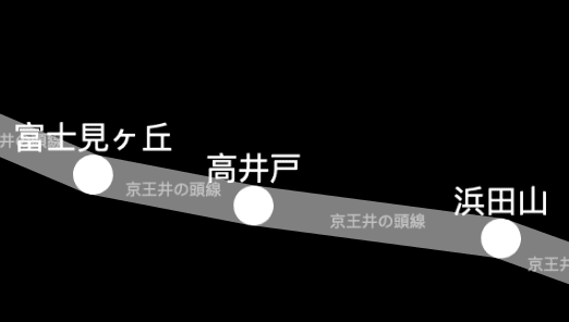
Described as the repetition of the Adjacency task, here we identify whether a node is “reachable” from another.
Common Connection Task
Another topology task, a Common Connection task is seeing and understanding where there’s commonality in interactivity or classification, based on whether two nodes have the same neighbours.
Pathfinding Task
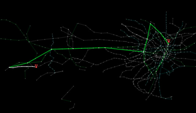
Bongshin Lee et al. refer to Pathfinding as a “Browsing” task and to me it’s the logical extension of Adjacency & Common Connection: we can visually or procedurally trace a path between two nodes, classically used for route planning.
General Overview Task
I think this one is even more subconscious and typically comes first: when we observe a graph we immediately instinctively recognize a number of factors: size of network, number of distinct components, distribution of disconnected component sizes
Have you ever noticed these fundamental tasks as something you do when you look at a graph or have you chalked it up to intuition?
Links
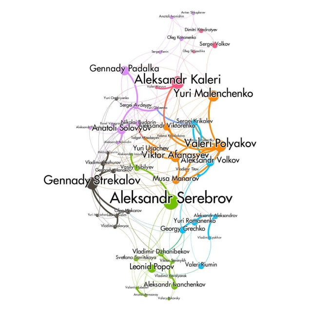
Justin Walsh (ISS Archaeological Project) walks through the creation of this visualization of “crew relationships on Soviet-Russian space stations."
An interactive tool from Frederik Jørgensen to teach the theory behind various graph width metrics. (GitHub)
New New York Times tweets whenever a word appears in the New York Times for the first time. This new animated visualization brings the process to life.
Nodes
A delightful tool
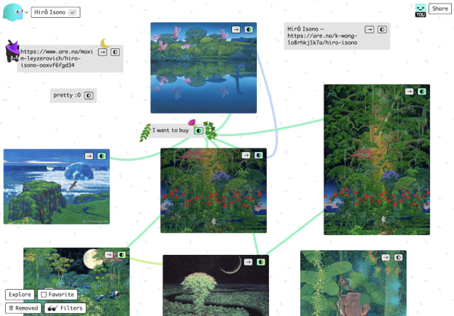
I’ve fallen in love with this tactile, organic mind-mapping tool from Pirijan Ketheswaran, one of the co-founders of Glitch. Kinopio is described as a “visual thinking tool for new ideas and hard problems” and allows you to build and collaborate with others on rich cards of text, images and media. Links can be drawn between cards to make connections between them.
Kinopio takes the endearing Glitch aesthetic one step further as a sort of mash-up of Apple Hypercard, Web 1.0 and Japanese video games — it’s probably not a coincidence that the name is the same matches a popular Super Mario character. I think it has an incredible UX and has great potential as a learning and thought-supporting tool.
To get a feel for the versatility here are a few spaces to start: My guitar setup, My mind garden & plantasia.
Kinopio is quite distinct from the gamut of note-taking-apps-with-a-graph view (see #1, #10) primarily because you curate the graph from the outset rather than see it built up from your notes.
Check out Ben Tsai’s introduction for more details and don’t skip Pirijan’s blog for some behind-the-scenes process notes on building this dynamic tool.
Oh and here’s a depiction of this very same edition of source/target re-built in Kinopio!
Blockchain flow of funds
Lots of blockchain visual analytics companies jumped on the “Twitter hack post-mortem” bandwagon last month to show off their credentials in the wake of a breach targeting high-profile celebrity accounts. One of the best articles I’ve seen is from Elliptic as they walk through some interesting Bitcoin graphs and what they actually show us.
A home for my projects
Most of these will be familiar to Sourcerers (still pushing that) but I have a new project page to collect all my source/target projects in one place. My neuomorphic graph visualization prototype app from #13 now works in Chrome so check it out if you weren’t able to before.
TikTok social graph
I could have sworn I had already shared this fascinating article from a few weeks ago but I thoroughly recommend this (longish) read on the relative superiority of the social graph that’s catapulted TikTok to semi-global-domination (for now).
Turing Test results
The results are in from my (again, unscientific!) graph drawing Turing Test from last time — looks like source/target readers fared a little better than the original study that inspired this trial: 65% of participants guessed correctly! A few people answered exactly wrong which (to steal a joke from one participant) suggests I’m actually a computer. Beep boop.
As ever I’d love to know what you think of source/target, hit reply to let me know.
Stay safe & see you soon!