Hi, I’m Christian and this is a newsletter with interesting content and links orbiting the world of graph.
Part of my motivation to start this newsletter was to give myself an outlet for working on and sharing personal graph projects. Eight editions in and these mythical projects have failed to materialize—until today!
Graphs
In his 2008 book, “In Defense of Food” author Michael Pollan provides the following seven words as diet advice:
“Eat food, not too much, mostly plants.”
Craving more? As Pollan noted in an interview with NPR:
“That’s it. That is the short answer to the supposedly incredibly complicated and confusing question of what we humans should eat in order to be maximally healthy,”
Pollan’s advice may be short but each clause does some heavy lifting.
This is an example of a purposefully simplified approach to take for personal moderation but what about moderating the behavior of others? A familiar example of this task can be seen in moderating online environments where individuals post and share content. Ideally, such chat rooms, forums and comment sections would have a code of conduct that each piece of communication can be judged against. Unfortunately, the real world isn’t that simple.
Everything in Moderation
Moderators tasked with keeping conversations on-topic can wield a seemingly-intoxicating amount of power online. A moderator of a niche group of, say, Doctor Who fans on a private server, may be able to censor or remove content with an assumed superiority over non-moderators in the group. I’ve mentioned it before, back in source/target #2, but this recent article on the moderation approach taken by Hacker News is particularly interesting.
There are a variety of tools at a moderators disposal, depending on the website in question. These tools can be wide-reaching: from rudimentary account management steps like disabling accounts to strange psychological approaches like shadow-banning.
In my nostalgia-tinged image of the internet it’s easy to assume that most individuals online are acting in good faith, but in reality, there are quite a few factors at play. Apparent anonymity (or pseudo-anonymity) on online forums (fora?) can give individuals a sense of invincibility as they provoke or “flame” others. A less aggressive but more widespread version of this has entered the popular lexicon as “trolling”—individuals who purposely cause discord for fun or malicious political, societal reasons.
Motivation for questionable behaviour online can also be borne out of financial incentive. Seemingly helpful messages could be obscuring a brand or company planting seeds of good intent and familiarity with users. You can find many possible examples of this on Reddit’s “r/HailCorporate” subreddit (one of many sub-communities on the site), a community with the unofficial slogan: “Let us show you the ads you didn’t know you were seeing.”
In online moderation there are a few different types of collusive, pre-meditative bad behaviour. Sock-puppeting refers to the coordinated effort to present multiple opinions or personas that give the impression of a wider base of support. Users are said to be brigading if they rally others to manipulate or influence decisions or actions. Examples of this can vary wildly. For example, it could be through organized downvoting to reduce visibility of an opinion or the harassment of an individual in the real-world. Incidentally, brigading is outlawed as per “rule #2” of Reddit.
Front Page of the Internet
Reddit has had its own share of content and policy challenges since inception. This has led to moderation challenges and the site has often found itself on the backfoot as it responds to allegations of bias and general failure to act. One incident that comes to mind was from 2016, when the CEO was found to have edited the comments of others in various posts on the site. This, unsurprisingly, led to outrage from users as they realized their comments and messages weren’t as immutable as they perhaps thought. This illuminating interview with ex Reddit product head Dan McComas was striking, especially in his summary of the overall contribution of the site:
”I Fundamentally Believe That My Time at Reddit Made the World a Worse Place”
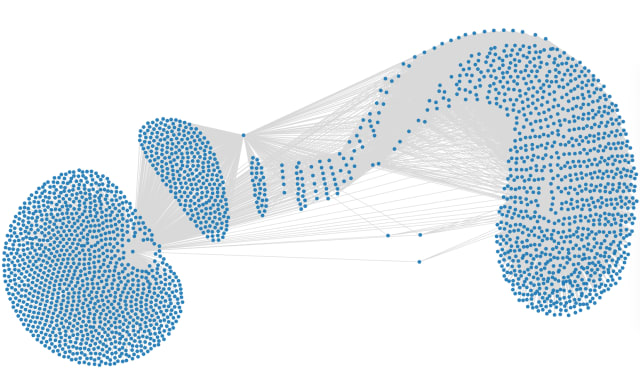
Just last week a screenshot was posted on Reddit (and reposted many times) that drew attention to the overlap between a small number of moderators on some of the most popular subreddits. This revealing screenshot in turn sparked moderation as it was seen as an example of targeted harassment against the moderators themselves. When I saw this screenshot I immediately thought the one-to-many mapping of subreddits to moderators would lend itself quite nicely to some graph-thinking. There are hundreds of thousands of subreddits moderated in turn by thousands of individual users—the overlap between these would surely show interesting trends and features of subsets of the Reddit community.
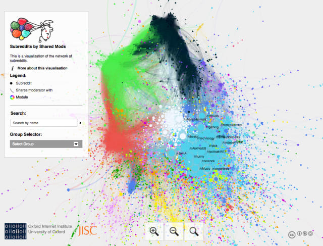
As both Reddit and graphs have been around for a fair amount of time there’s a vast array of prior work on this topic. Here’s a great approach from 6 years ago with an accompanying list of other examples. The most recent example graph analysis on the topic I found was this from last week.
As the data for these examples are either not readily available or somewhat stale I took the opportunity of a long weekend at home to brush up on my web scraping skills (trying out a few new technologies in the process). I used RedditMetrics to get a list of subreddits in descending order of popularity and parsed through each in turn to get a list of moderators using Reddit’s built-in Moderators API.
I find it difficult to restrict the scope of a graph-related research project, especially before getting a feel for the shape and volume of data you’re set to be using. After a weekend of scraping, munging, modelling and early visualisation I’m ready to take a deeper dive into the 2020 subreddit/moderator graph and look forward to sharing more with you in two weeks.
Nodes
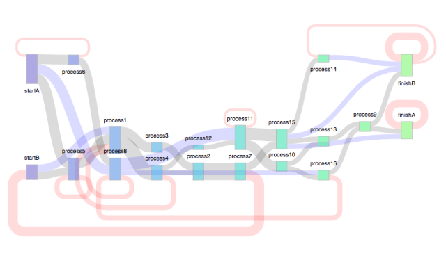
I love Observable as a platform for guided code walkthroughs with editable and interactive web examples. In this notebook Tom Shanley has gone into considerable detail as he walks you through his deconstruction and exploration of additional capability for his d3-sankey-circular fork of the d3-sankey library.
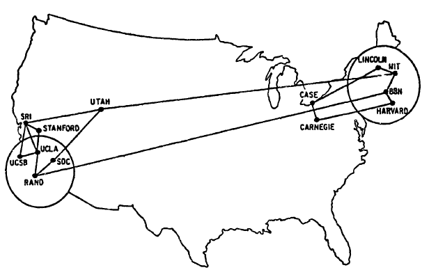
I read a letter to the editor today from a 17-year-old who described the challenge of working with “old technologies” like email. If email is “old” they have probably never heard of "ARPANET” – the precursor to the internet. Here’s a charming, hand-drawn, origin-destination graph of it’s form fifty years ago :
- I’m not sure of the origins of this but there’s a new tool called Gremlify that allows for browser-based prototyping for those using the TinkerPop stack. Graph database company Neo4j set such a high bar for exceptional developer onboarding experience so it’s nice to see a solid graph environment for others outside of their ecosystem.
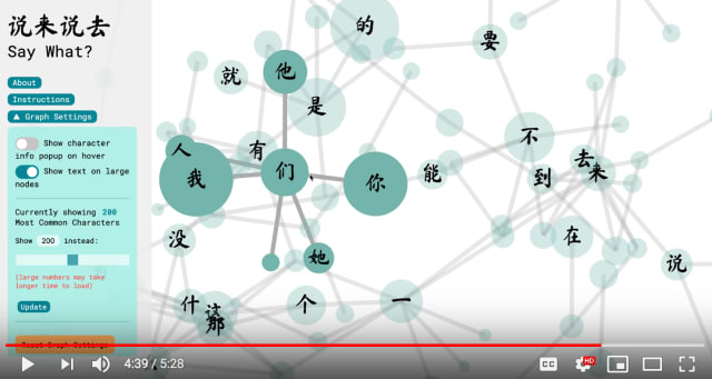
There are some extremely fresh, innovative data visualization approaches in this Interactive Data Visualization Final Project showcase from MIT. One of my favorites is this example of a graph exploration of the frequency of Chinese words from Beining (Jenny) Zhang.
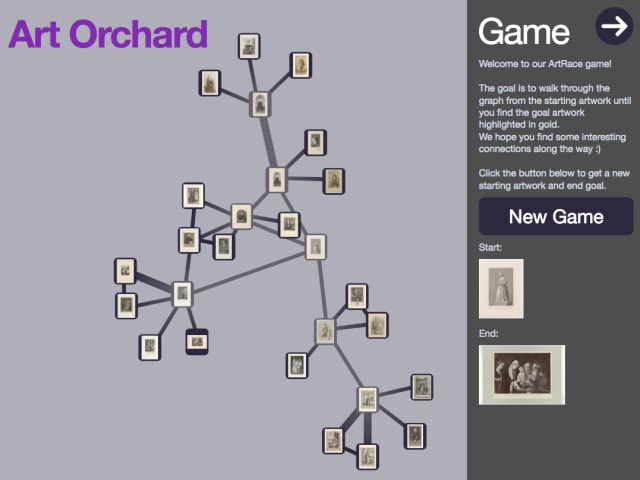
The UN has suggested that COVID-19 may force the closure of one in eight museums globally. Also from the MIT showcase check out cool gamified depiction of art gallery data in graph form from Diana Nguyen & Darius Bopp. You can try it out live here. I’ve played with the extremely comprehensive Rijksmuseum API in the past—exposing this data to the public is a savvy way to promote and raise awareness of these important institutions.
Links

- Straying heavily into the world of graph-adjacent art I stumbled upon an amazing collection of classic fireworks illustrations this week from pyrotechnist Jinta Hirayamas. I love the small card format and color palette of these—I want to know everything about them. Follow the instructions on that blog post to get to the high-resolution PDFs.
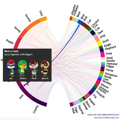
- Chord Diagram aficionado Shahin Rostami has created this colorful version of the mappings between personality and species in the wildly popular Animal Crossing game from Nintendo. Incidentally this is the first time I’ve seen data visualization like this behind a Patreon paywall.
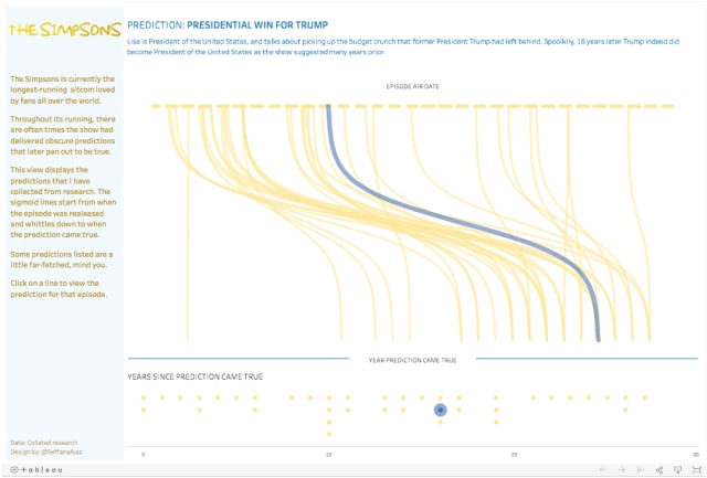
- Fans of The Simpsons or, let’s face it, people with any awareness of pop culture, will be aware of the various “predictions” that have come true over the last 30 years. (I’ve just realized I’m only 2 months younger than the Simpsons, weird.) It’s perhaps more of a timeline than a graph but I like this Tableau visualization from Seffana Mohamed-Ajaz matching events in Springfield and when they seemed to come true in the real world.
Thanks again for subscribing. Stay safe, you’ll hear from me again in two weeks.