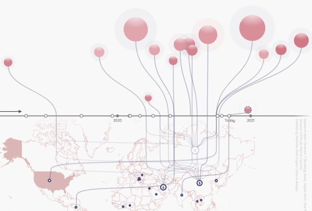
I’m Christian (👋) and this is my bi-weekly (fortnightly?) newsletter with interesting content and links orbiting the world of graph
It’s a wet and dark week here on Vancouver Island. Edition #20 of source/target feels like a minor milestone. This edition we’re looking at migration graphs, I’d love to hear what you think.
Graphs
Every year, like clockwork.
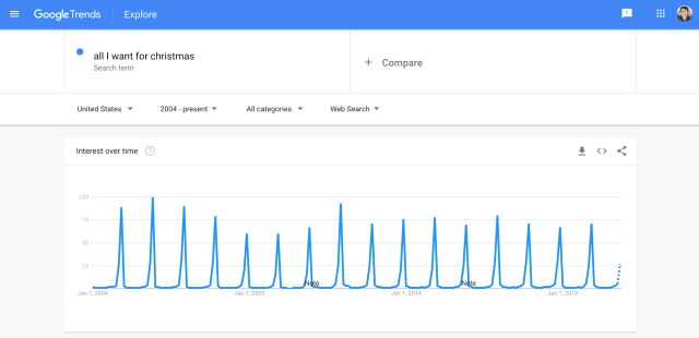
This regular pattern of searches for the Mariah Carey holiday megahit is a neat reminder that some things are inevitable; after a distressing year there’s some stability in our song choices.
“That’s it, we’re moving to Canada”
A similiarly humorous Google trend was the spike in searches for “how to apply for canadian citizenship” reported after the first US Presidential debate earlier this year. The taller peak of similar searches was well reported back in 2016 and there was indeed a noticable uptick in permanent residency applications from Americans in 2017.
Migration
My partner and I moved to the west coast of Canada just over a year ago. We packed our car and took our time on a two week drive across the country. Choosing not to go via the USA we stuck to the Trans Canada Highway with some diversions.
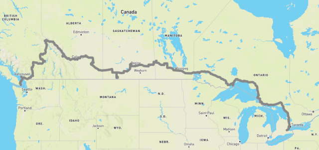
We now live in one of the mildest and most temperate part of Canada. As we head to winter there’s an influx of “snowbirds” — Canadians who would usually spend the cold season in the southern states of the USA but who are stuck above the border for the foreseeble future due to the pandemic.
Migration across the country is something that’s tracked by Statistics Canada and released as part of their comprehensive Open Data platform. I was curious how much the pandemic has changed usual migration so took a look this week.
Here’s an interactive origin/destination map showing the relative net migration between the different provinces and territories. You can pick two quarters and see the relative difference in migration patterns, between them.

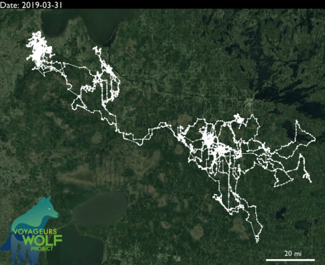
Migrations in nature aren’t aware of state and country lines. One of my favorite examples of this are from the Voyageurs Wolf Project, a group that tracks wolves and their prey around Voyageurs National Park in Northern Minnesota.
At first glance this looks like a pretty random walk but when combined with other wolves in the area we get an idea of the territory clusters.
For more details check out this Q&A from an Wildlife Biologist from the Project. If you’re itching for more wolf content check out American Wolf.
The Voyageurs Wolf Project get extra points for this absolutely adorable video of wolf pups practicing their howling.
Links
Nodes
Closed Triangles
At the beginning of the year I fell into a pandemic-induced rabbithole of productivity & life hacks, gurus & guidance. One interesting suggestion I read was to take time to introduce people in your life who may have mutual interests. This is the sort of networking I can get behind. Sparking fresh and insightful connections between those you know is a favor that is likely to endear and assist as you seek like-minded people and opportunities.
This 2019 article from Valdis Krebs explains this activity through a graph lens: it’s your responsibility to “weave” graphs by closing triangles of contacts.
Contagion
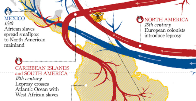
Lots of flow maps this week. This infographic from Lapham’s Quarterly is a brief and topical look at some contagious diseases throughout history.
Graph PS
Some of the most impressive visualizations of nature GPS tracking data I’ve seen are from 422 South. Check out their bee, bird and shark visualizations!
Graphs in Google Calendar?
This newsletter typically focuses on data visualizations that push the envelope in some way — usually an innovative approach to readability or interactivity. Sometimes visualizations are delivered in surprising places.
Aircal is a script that takes a directed-acyclic-graph of Airflow schedules and exports them for use and visualization in Google Calendar. Graphs don’t always have to look graphy to be useful.
Accidental Art
This tweet from September seems apt for those following the US election this week.
I have to admit this is not quite what I was going for pic.twitter.com/HY0fi93z1s
— Charlie Smart (@charlie_smart_) September 30, 2020
Thank you for subscribing, I’ll see you in a few weeks.
Have you found something interesting you’d like me to share? I’d love to hear from you!
Why not share this edition with someone you think would enjoy it?
