I’m Christian (👋) and this is my bi-weekly (fortnightly?) newsletter with interesting content and links orbiting the world of graph
I always look to provide a subtle theme for each edition of source/target. This week the theme is far from subtle: I seem to have a gravitational pull towards Wikipedia.
Graphs
“Howl’s Moving Castle” was the first Studio Ghibli movie I saw. One rainy Sunday morning I became idly aware of a trippy animated cartoon with a fantastical storyline playing on a nearby TV. It reminded me of the Pokémon anime I’d grown up watching but it was so much more compelling.
It’s pretty reductive to call Studio Ghibli the Japanese version of Disney but that’s the easiest way to explain them to those who are unfamiliar. Even if you’ve never seen any movies written and directed by Hayao Miyazaki you’d recognize some of his more famous characters. You’ve likely met your neighbor Totoro via, I don’t know, some child’s backpack or The Internet At Large.

It took me a while to make the connection between the wildly popular “Spirited Away” (aka “The Best Animated Film of All Time”) and the film I ended up watching that drizzly Sunday morning. Years later, I was again surprised to learn that Howl’s is based on a story by British novelist Diana Wynne Jones, an author I’d read a fair amount.
I’m not sure I know anyone who detests Ghibli movies. Is this an example of one of those personality questions you can ask to check if your interests align with someone else?
There’s a manually-curated dataset on GitHub that caught my attention the other month. It’s called the Studio Ghibli API and it allows REST requests to be made against an endpoint in order to get the films, people, locations, species and vehicles featured in the movies. I wondered at the time how this data would look in graph form?
It turns out the answer is: “not very good”. Getting a classification of a character in a movie as “Human” is helpful for tutorials or mockup applications. But it doesn’t make for an edifying graph to know that so many Ghibli characters share the same species.
One way the Studio Ghibli collection strays from the Disney comparison is there are very few sequels. (There are also, to my knowledge, 0 animated CGI blockbuster remakes on the cards.) This also means the data from the Studio Ghibli API has very few connections across different clusters of characters and the movies they are in.
The final nail in the coffin for using the Studio Ghibli API for graph purposes was that the data was getting to be quite stale. It would be much harder to fill the gaps of movies and details than to build the graph itself.
For an upcoming talk I’m giving at Neo4j’s NODES conference (register for free here!) I’ve spent a lot of time working with the Wikipedia/MediaWiki API. This API allows you to make queries against both the full edit history of Wikipedia pages as well as the content of the pages and categories on the site.
MediaWiki actually underpins a lot of the Wikis you’ll see online, including Fandom, a place that houses many exhaustive pop culture wikis including Wookiepedia, the Pokémon Wiki and, you guessed it, Ghibli Wiki.
The Ghibli Wiki is extremely comprehensive, and that gave me an idea. What if I scraped the dedicated Ghibli Wikipedia instance to get the data I need to build a “Ghibli graph”? I could collect the movies, characters and all other pertinent parties and build a graph of the connections between them.
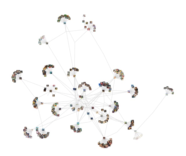
This worked surprisingly well, especially when I picked up the images associated with each movie and character along the way:
I like this but felt I could do more to highlight the joy from seeing all these characters clustered and linked across different movies. Switching over to a 3D graph helped me to achieve this goal: there’s a lot of fun to be had panning and zooming around a 3D map of the Ghibli universe, a Ghibli Galaxy if you will.
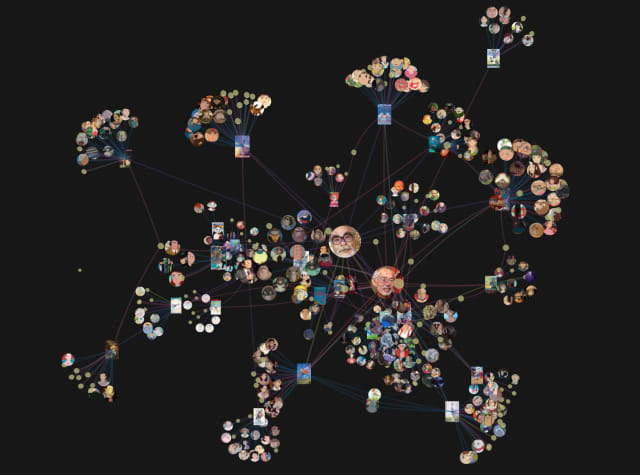
I had a lot of fun tweaking the 3D render of this graph. I like how the sphere nodes for the movie characters came out. Check it out here and let me know what you think.
“The Graph Returns” (um, The Cat Returns) was the best Ghibli graph pun I could come up with. I feel there has to be a better one out there? “My Neighbour Nodetero”? If you can think of any please write in ASAP.
Links
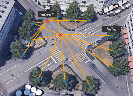
Using graph neural networks to monitor tree health
Graph based applications for academic discovery
Real time dashboard of Belgian startup tweets
Wikipedia corner: Human disease networks
Nodes
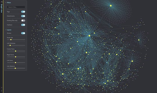
Obsidian have completely revamped the graph view in their Markdown-based connected note taking tool. A question from the release announcement on Twitter prompted an interesting response from Conor White-Sullivan, CEO of Roam Research. I think Conor is right to have prioritized other features ahead of their graph view but they are definitely lagging in terms of performance, usability and elegance.
The team behind Obsidian has also released a way to publish notes in a clean web application — one which keeps a dynamic navigation graph on every page. I see this as an interesting push into productizing the buzzy world of “digital gardening.” Check out this example from Nick Milo to see “Obsidian Publish” in action.
Obsidian’s choice to treat the graph visualization as a first class component will pay dividends as they grow.
The team at TerminusDB have documented a project as part of the DBpedia Autumn Hackathon for this year. In it they look to blend DBpedia — an extract of the structured content that underpins information in Wikipedia — and a dataset I was unfamiliar with. Seshat, a project that aims to:
bring together high quality datasets describing every human society that has existed since 10,000 BCE, covering all aspects of social evolution. the most current and comprehensive body of knowledge about human history in one place.
It’s unusual to see a project explore the intersection of knowledge graphs with archaelogy & anthropology. I didn’t expect the article to end with a deep dive on the “Late Antique Ice Age” and I learned a new word along the way:
polity: a form or process of civil government or constitution / a form or process of civil government or constitution or an organized society; a state as a political entity.
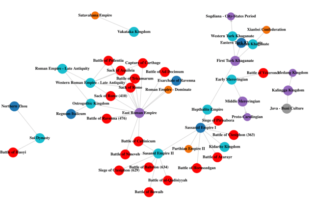
Check out their resulting visualization of the matched polities from Seshat along with historical battles from DBPedia. Red nodes indicate battles while blue and purple nodes show polities with and without standing armies, respectively.
The article ends with a modest aim for the project:
Documenting and enriching this data allows for deeper understanding of the drivers of resilience and will hopefully allow us to better understand how societies can prepare for cataclysmic change.
Who doesn’t want to be prepared for cataclysmic change?
That’s all from me, thanks again for subscribing to source/target! You’re the best.
Why not share this edition with someone you think would enjoy it?
