Her dog was by her side; a blur of gray fur with a red bandana draped loosely at the neck. Should I ask her? She’d probably think I’m hitting on her? Or at least think it’s some sort of scam. I guess that’s what I’d think. After rattling around in my head, the question had finally taken shape:
“Would you mind taking a picture of this goose and emailing it to me?”
The goose was nestled at the edge of the cliff, mostly obscured in the long grass. It was gazing out over the ocean with an expression of pure… just kidding, I had no idea what it was thinking. Geese are notoriously aggressive; ready to hiss and stomp and chase at a moment’s notice. Canada Geese have been known to risk death to protect their offspring.
But this goose was… pensive? It looked over the strait and into the misty distance where it merged with the mottled, inky-gray sky. Far below, I could just about spot two ducks on the beach.
The woman had reached me. I opened my mouth and before I could say anything she smiled. I thought of how I looked. Some random guy in running clothes, slightly damp from the rain, staring at a goose, staring at the ocean. My agape mouth morphed into a smile and before I knew it she was past me. I had missed my chance.
When I run I don’t carry my phone. My internet-addled brain could do with some time away from screens, from notifications, from little red dots demanding my attention. I get a bit of flak for this, especially on runs where it’s getting dark and I’m a little lost and I’m back much later than I said I would be.
This does mean I miss out on taking photos of weird little scenes like the goose. Here’s my artist’s impression of the scene. I hope it brings some of that magic moment to life.

Humans are prone to spot patterns in the noise of their day-to-day life, it’s called frequency bias. I thought back to all the goose encounters I’d had this year – I was suddenly much more aware of them than, perhaps, ever in my life.
I had seen them blocking a patient line of traffic with an adorable gaggle of goslings. Plonked defiantly on the top of a bus as a driver struggled to chase them away. I had been surprised by one hissing at me as I ran too close on a path.
The Goose on the Cliff was an archetypal Canada Goose. You’re probably already picturing its black and white head and muddy gray body planted into the ground with stocky, scaly feet. The Provincial Museum handbook “The Birds of British Columbia: №6 Waterfowl,” first printed in 1958, reliably informs me that there are at least four subspecies of Canada Goose (Branta canadensis):
- honker
- western
- lesser
- cackler
but I’d be damned if I could tell you the difference.
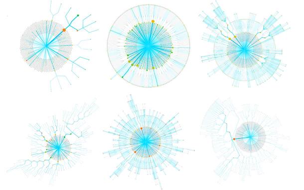
![A circular tree-like structure with various species of geese around the edge of the network - labelled "a". It's clear they're all connected in some way. There's also a histogram plot labelled "b". The caption says: a Neighbour-joining Network of the True Geese using the ordinary least squares method (with default settings) in SplitsTree version 4.1.4.2 [15], based on genetic distances. b The comparison of degree distributions indicates that the Anser-network is more complex compared to the Branta-network as it contains relatively more nodes with four and five edges. Drawings used with permission of Handbook of Birds of the World.](https://sourcetarget.email/optim/assets/st44/goose-family-tree.png "A gaggle of geese [source](https://bmcecolevol.biomedcentral.com/articles/10.1186/s12862-017-1048-2/figures/3)")
Known, in part, for the impact of their defecation on otherwise beautiful, swimmable lakes, the Canada Goose doesn’t always migrate. Environmental changes such as losing a nest can lead them to fly thousands of miles with surprising alacrity: some have been known to fly 1,500 miles in just 24 hours. A protected species, they can be found across all the provinces and territories in Canada.
")
The grass around The Goose on the Cliff was flattened. Perhaps it was nesting and set to be joined by a number of offspring in the coming days.
Canada Goose young are “precocial”, which means they are born in an advanced state, ready to forage and feed themselves on tender shoots and insects. I would soon see many goslings in the nearby park, enlarged ducklings and tufty teens.
Within a few months they will be ready to migrate with their parents.

My goose awakening of 2022 was kicked off by a surprising first appearance.
As a recent transplant to the West Coast the menagerie of ocean life is still novel to me. Seals carrying salmon home to their litter, squid picked up by their beak by a beach bum in a baseball cap, seagulls picking up crabs and dropping them from great heights to smash their shells to access the tasty treat inside, starfish in shallow tide pools…
One species I have a slightly repulsed, distant respect for are the prehistoric barnacles I see clinging to the rocks at low tide.
Barnacles start their life as larvae floating in the ocean, seeking a spot to land and make their home. Once ready they secrete a cement to affix themselves to a rock, boat or animal. The creature then forms a calcite shell made up of a collection of interlocking plates. These are adjustable, acting as a sort of garage door that opens or closes depending on the tide or if a predator is near.
After a hike on beautiful Sandcut beach on the south-west side of Vancouver Island, I was inspired to flick through another British Columbia Provincial Museum handbook on barnacles (№7). Therein I spotted an illustration of the exact stalked barnacle I had found on the beach: Goose or gooseneck barnacles. Eaten by First Nations communities for centuries and considered a delicacy in Europe, they make a prehistoric, otherworldly impression with their flesh and scales.
.jpg)")
I assumed the naming was simply borne of a visual similarity – the barnacles are indeed reminiscent of the gray and white neck of the goose. But in 12th century Europe the ties were deeper: the nesting and migratory patterns of the Brant Goose led observers to the dubious logical conclusion that the two had to be one and the same creature.
Page 8 of the barnacle handbook contained a similar illustration from the same era, depicting the curious growth of geese as fruit from the branches of some sort of fabled barnacle tree. This created confusion about whether geese should be classified as plant or animal: something of intense religious importance to dietary observances on holy days. If a goose was basically a tree then surely it could be eaten on days that meat was forbidden?

Charles Darwin of “On the Origin of Species” fame, more recently of source/target fame, originally dedicated his time to researching the varieties of our humble barnacle. His work in 1859 ultimately severed the barnacle ←→ goose connection.Thankfully, we still have lots of medieval art to show for it.

There’s a name for when barnacles and other microorganisms attach themselves to human vessels or structures: biofouling. Unsurprisingly for a human word, there’s an implicit conflict in the name. These creatures are causing costly drag in boats and ruining our nice paintwork. The term leaves no room for the reality that we’re just passing through a world that barnacles have been cementing themselves to for over three-hundred million years.
Ocean scientist Juli Berwald’s article The Web of Life turns a critical eye to what is popularly known as the Tree of Life, derived from Darwin’s work.
")
Staring at the figure, something clicked for me: every individual and every population contains many genes, each with its own evolutionary history and gene tree. All those gene trees will always result in disagreements, in fuzziness, in reticulation. Vernon had been looking at the forest every time he looked at an individual.
… today’s corals are a product of Darwin’s classical natural selection when [ocean] currents are slack, and of hybridisation when they are strong. Species separate and merge, and more so over long expanses of time and space.
[What we think of as] “species” are not units, they are bits of a continua. What comprises a “bit” is arbitrary – a taxonomist’s opinion. Arbitrary, and in truth forever variable in space and time.
Some barnacles are destined for bigger things. Whale barnacles are an elusive form of acorn barnacle that manage to affix themselves to a convenient part of their namesake mammal. By alighting on the chin or forehead of whales they’re in prime position to collect plankton from their gargantuan host.
Whales have been known to accumulate 450kg of barnacles – a mass that seems significant but pales in comparison to the weight of the whale itself.
Whale barnacles can grow to be the size of a small orange and we’re unable to collect specimens without damaging the whale’s skin. Humans have therefore struggled to research whale barnacles; in the rare cases where live specimens are found on beached whales, researchers have only managed to keep them alive for a few short weeks.
“If you’re into barnacles, they’re pretty extraordinary”
— Michael Moore (veterinary scientist at Woods Hole Oceanographic Institution)
This doesn’t mean that scientists haven’t been creative. In one fascinating study, researchers took microscopic drill bits to the calcium shell of whale barnacle fossils in order to extract samples from a range of different depths.
Just like the rings of a tree trunk show the relative growth of the tree, the biological makeup of these samples reveal a faint but definitive backstory of whale migration. A “well-preserved whale barnacle is the perfect time-traveling tracking device”:
Here’s why that’s cool: when in their evolutionary history baleen whales started migrating remains an open question.
One hypothesis suggests that it happened around three million years ago, when massive ice sheets started spreading across much of the northern hemisphere. The colder temperatures would have frozen whales out of some of their habitats and put more constraints on where plankton could flourish in Earth’s oceans. And that would encourage the whales to start making longer and more directed journeys to seek out shelter and food.
A fossilized whale barnacle is a unique window into this behavior in a whale that’s been dead for hundreds of thousands of years.
The Goose on the Cliff was keeping a beady eye on the passing dog, its neck contorted in an impossibly uncomfortable kink. We weren’t far from where I’d seen a pod of whales one sunrise late last year.
What leads you to find a place to settle, to put down cement roots and attach yourself to something, somewhere?
And what brings you to build your plates, your armor, your exterior shell, hardened and tessellated shut, in preparation for the oncoming… what?
Perhaps you’re the boat, untended and unmaintained, carting around extra weight you neither appreciate or benefit from?
Or are you the whale, encrusted and entrusted to bear an undeniable burden, a secret pact in the ocean’s depths.
This week’s edition was inspired in part by Undrowned by Alexis Pauline Gumbs and Busy Doing Nothing by Rekka Bellum and Devine Lu Linvega. I recommend them both.
After two and a half years, source/target is taking a few months off for summer – I’ll see you again in September.
]]>

")


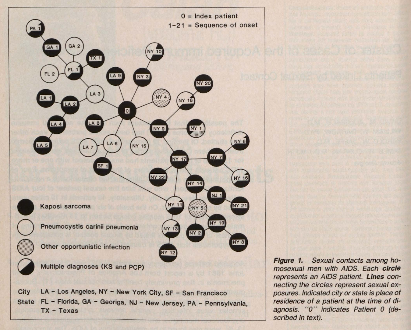
 Who Shall Survive? *Center*: redesigned network, indicating the number of incoming connections (dark blue=0, white=3 or more) *Right*: redesigned network, highlighting girls (orange) and boys (white). [source](http://www.martingrandjean.ch/social-network-analysis-visualization-morenos-sociograms-revisited/)")


")

")

")
")
")


")
]")


, a professor in [Computer Science](http://www.cs.utah.edu/) at the [University of Utah](http://www.utah.edu/), created [The Illustrated Guide to a Ph.D.](http://matt.might.net/articles/phd-school-in-pictures/) to explain what a Ph.D. is to new and aspiring graduate students. [Matt has licensed the guide for sharing with [special terms under the Creative Commons license](http://matt.might.net/articles/phd-school-in-pictures/#license).]")


")
. - [source](https://web.archive.org/web/20170819082639/http://www.indianajones.de:80/multimedia/texte/Indiana_Jones_Wallpaper_2.php)")
")
")
")
")
 Position of all strokes made during the final of the 2016 Olympic Games and B) The corresponding badminton stroke network for the final of the 2016 Olympic Games. - [source](https://www.sciencedirect.com/science/article/abs/pii/S0960077920302344)")
")
")
")
]")
 [[source](https://esajournals.onlinelibrary.wiley.com/doi/full/10.1002/eap.1919)]")
]")


")

")

]")
]")
 has a good introduction")
]")
]")
]")

]")
]")
 this thing out. It's amazing.")
]")


 and [without](https://cjlm.dev/cryptopunks/accessories?links=1) links.")


 and all the CryptoPunk transaction graphs.")
 all the CryptoPunk transaction graphs.")

 depicts speculators as brainless monkeys in contemporary upper-class dress. [[source](https://en.wikipedia.org/wiki/Tulip_mania#/media/File:Jan_Brueghel_the_Younger,_Satire_on_Tulip_Mania,_c._1640.jpg)]")


")
") ]
]
")
: a visual zeitgeist for the second half of 2020.")

, Figure 1, 1937")


 ]
]

")


 ]
]


]")
")


 exploring gender portrayal in film.")


]")
]")


 answers.")


...")
 Fast.Co Design). Incidentally I just published my (non-skeuomorphic) reading list – check it out [here](https://cjlm.ca/reading-list/)")

]")


 Visualization by